In the world of design, critique is an essential tool for growth and improvement. It's a process where designers present their work to peers, mentors, or clients, and receive constructive feedback. A well-executed design critique can lead to a more refined and effective final product. In this article, we will delve into the intricacies of design critiques, explore various examples, and provide insights into how to conduct and benefit from them.
Understanding Design Critiques
A design critique is not a simple review or a platform for criticism. It's a structured conversation that aims to identify strengths and weaknesses in a design, suggest improvements, and foster a deeper understanding of design principles. The goal is to enhance the design's functionality, aesthetics, and overall user experience.
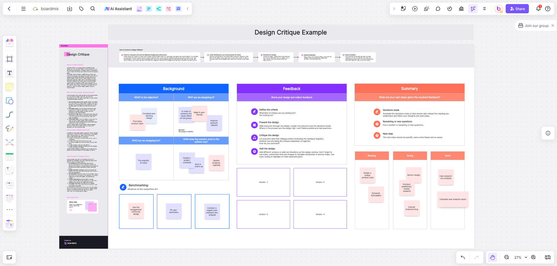
The Importance of Constructive Feedback
Constructive feedback is the backbone of a successful design critique. It should be specific, actionable, and focused on the design elements rather than the designer. The feedback should help the designer understand how their work can be improved and why certain changes might be beneficial.
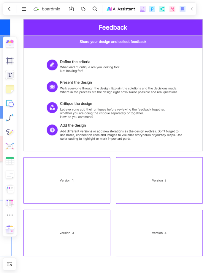
Elements of a Design Critique
1. Presentation: The designer presents their work, explaining the concept, design choices, and the intended audience.
2. Observation: Participants observe the design, noting its visual elements, usability, and overall impact.
3. Discussion: A facilitated discussion takes place where feedback is given, questions are asked, and the designer defends their design choices.
4. Reflection: The designer reflects on the feedback, considering how to implement the suggestions or defend their original design intent.
10 Examples of Design Critiques
Design critiques are invaluable in the creative process, as they offer a platform for designers to receive feedback, refine their ideas, and improve their work. Here are ten examples of design critiques in practice, spanning various design disciplines:
1. Logo Design Critique
A new startup is looking for a logo that represents their brand's innovative spirit. The designer has proposed a modern, abstract logo with a unique color palette. Critics suggest that the logo's abstract elements should be more representative of the company's core values and that the color palette could be more aligned with the brand's youthful and innovative image.
- Strengths: The logo is memorable and stands out from competitors, with a color scheme that aligns with the brand's personality.
- Weaknesses: The abstract elements might be too complex for some audiences to understand at first glance.
- Suggestions: Simplify the design elements to ensure the logo is universally understood and consider adding a tagline for clarity.
2. Web Pag Layout Design Critique
Let's consider a web design project for a local bakery. The designer has created a clean, user-friendly website with a focus on showcasing the bakery's products. The critique focuses on the clarity of the call-to-action, the readability of the text, and the overall user flow. Suggestions include simplifying the navigation menu and increasing the contrast between elements for better visual hierarchy.
- Strengths: The site is visually appealing with high-quality images of baked goods, and it has a responsive design that works well on mobile devices.
- Weaknesses: The navigation is not intuitive, and the 'About Us' section is buried, making it hard for users to learn more about the bakery's story.
- Suggestions: Reorganize the navigation to prioritize user experience, and feature the 'About Us' section more prominently to connect with visitors on a personal level.
3. Mobile App UX/UI Design Critique
A prototype for a fitness tracking app is critiqued for its intuitiveness and functionality. The designer has focused on a minimalist interface to reduce distractions. Critics recommend adding more visual cues for new users, improving the data visualization, and ensuring that the app's performance is optimized for various devices.
- Strengths: The app is easy to navigate, and the minimalist design ensures users can quickly access their data.
- Weaknesses: The lack of visual cues might make it difficult for new users to understand how to use certain features.
- Suggestions: Introduce subtle animations or tooltips to guide users through the app's functionality without compromising the minimalist aesthetic.
4. Print Ad Design Critique
A print advertisement for a local event is reviewed for its visual appeal and message clarity. The critique points out that the font size is too small for readability and that the event details should be more prominently displayed.
5. Product Packaging Design Critique
A new line of organic snacks is being packaged, and the design is critiqued for its shelf appeal and sustainability. Suggestions include using more eco-friendly materials, incorporating a stronger brand identity, and ensuring the nutritional information is easily accessible.
6. User Experience Flow Design Critique
A UX designer presents a flowchart of a customer journey on an e-commerce site. Critics suggest adding more touchpoints for customer support and highlighting personalized recommendations to enhance the user experience.
7. Interior Design Concept Critique
An interior design concept for a corporate office is critiqued for its functionality and aesthetic appeal. Feedback includes recommendations for better space utilization, improved lighting, and the integration of more ergonomic furniture.
8. Fashion Design Critique
A fashion designer showcases a new collection. Critics evaluate the garments for their style, construction, and marketability. They suggest adjustments to the silhouettes, fabric choices, and accessory pairings to better align with current fashion trends.
9. Motion Graphics Sequence Design Critique
A motion graphics artist presents a promotional video sequence. The critique focuses on the animation's pacing, storytelling, and technical execution. Suggestions are made to enhance the visual effects, sync the animations more closely with the audio, and ensure a smoother transition between scenes.
10. Exhibition Design Critique
An exhibition design for a museum is critiqued for its visitor engagement and educational value. Critics recommend incorporating interactive elements, improving the flow between exhibits, and ensuring that the design supports the narrative of the exhibit.
In each of these examples, the design critique serves as a critical step in the design process, allowing designers to gather diverse perspectives, identify areas for improvement, and ultimately create more effective and appealing designs.
Conducting a Design Critique
1. Set Clear Objectives: Define what you want to achieve from the critique, whether it's improving aesthetics, functionality, or user experience.
2. Choose the Right Participants: Involve people who can provide valuable feedback, such as peers, mentors, or target users.
3. Create a Safe Environment: Encourage open and respectful communication, ensuring that the designer feels comfortable receiving feedback.
4. Facilitate the Discussion: Guide the conversation, ensuring that feedback is constructive and stays on topic.
5. Document the Feedback: Keep a record of the critique for future reference and to track the design's evolution.
How to use a design critique template in Boardmix?
Benefits of Using Boardmix to Create Design Critique
1. Collaboration: Boardmix allows you to easily collaborate with team members or clients on design projects. You can invite them to the board and they can provide feedback or suggestions directly on the design critique.
2. Visual Representation: Boardmix provides a visual canvas where you can create your design critique using shapes, labels, and sticky notes. This visual representation helps in clearly communicating your feedback and ideas.
3. Organization: With Boardmix, you can organize your design critique into different sections using shapes and labels. This helps in structuring your feedback and making it easier to understand.
4. Customization: Boardmix offers various customization options, allowing you to personalize your design critique. You can choose different shapes, colors, and styles for the elements in your critique, making it visually appealing.
5. Easy Sharing: Once you have created your design critique, you can easily share it with others by sending them a link to the board. They can view and interact with the critique without needing to create an account.
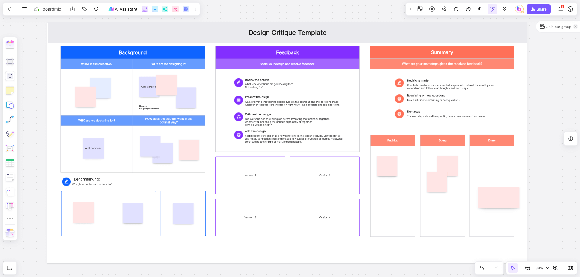
Steps of Using Boardmix to Create Design Critique
Creating a design critique is a simple process since there are many ready-made templates incuding design critique template in Boardmix. Here are the steps you can follow:
1. Open Boardmix and log in to your account.
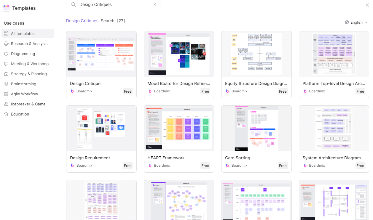
2. Create a new board or search for design critique in the Template library.
3. On the board, click on the "Shapes" icon located on the left-hand side toolbar.
4. Select the desired shape from the shapes menu.
5. Draw the shape on the board to represent the design critique example template.
6. Next, click on the "Text" icon located on the left-hand side toolbar.
7. Click inside the shape and add labels for each section of the design critique example template, such as "Design Elements," "Usability," "Visual Appeal," "Functionality," etc.
8. Now, you can start adding sticky notes or text boxes to each section of the template. Click on the "Sticky Note" or "Text Box" icon located on the left-hand side toolbar.
9. Click inside each section of the template and add relevant information, comments, or suggestions for design improvements.
10. Repeat this process for each section of the design critique example template until you have captured all the necessary details.
11. You can also customize the colors and styles of the sticky notes or text boxes to make your design critique example template visually appealing and easy to navigate. To do this, click on a sticky note or text box and select the desired options from the toolbar that appears.
12. Once you have completed your design critique example template, you can save it by clicking on the "Save" button located at the top right corner of the board.
That's it! You have successfully created a design critique example template in Boardmix. Now you can use it to provide feedback and suggestions on design projects, collaborate with team members, and improve the overall design process.
Conclusion
Design critiques are a powerful tool for designers to refine their work and grow professionally. By understanding the process, setting clear objectives, and conducting critiques with care, designers can turn feedback into a catalyst for creating exceptional designs. Remember, the goal is not to find fault but to enhance the design's potential, ensuring it meets the needs of its users and stands out in the competitive landscape. Boardmix provides a user-friendly platform for creating design critiques that promote collaboration, visual representation, organization, and customization. For a more in-depth exploration or to apply these principles to a specific design project, consider engaging with a seasoned design critique expert or participating in a design critique workshop.


