UX Affinity Diagrams play an instrumental role in simplifying user experience design. These diagrams can facilitate the categorization and synthesis of complex user research data, form customer journey map based on their user experience, enabling designers to uncover patterns and draw insightful conclusions. By bridging the gap between data and design, UX Affinity Diagrams based on pre-designed templates serve as a valuable tool in creating user-centric designs that are both functional and engaging.
1. What is UX Affinity Diagrams?
UX Affinity Diagrams, also known as KJ Diagrams, are a brainstorming and organization technique used in User Experience (UX) design. UX Affinity Diagrams simplify the User Experience design process by providing a structured approach to organizing and analyzing ideas. By grouping related concepts, designers can identify patterns, themes, and relationships between different elements within a design, making it easier to refine and optimize the user experience. This method also allows designers to involve stakeholders in the ideation process, ensuring that their input is considered during the design process.
Affinity Diagrams streamline the design process by assisting in idea categorization. Ideas from brainstorming sessions are usually disjointed and scattered. The use of these diagrams helps categorize these ideas into different groups based on their relation and relevance. This creates a clear UX roadmap for the project and enables designers to focus on individual elements without losing sight of the bigger picture.
Thus, UX Affinity Diagrams are an indispensable tool for simplifying and optimizing user experience design processes.
2. How UX Affinity Diagrams Simplify User Experience Design
In a field that often deals with extensive user research, affinity diagrams serve as an organizing tool to streamline complex inforamation. Designers often grapple with vast amounts of disjointed issues and data - ranging from user interviews, observations, survey results to usability testing feedback. Affinity Diagrams are used to organize this scattered data into coherent clusters based on inherent relationships or common themes.
This systematic classification enables designers to visualize connections between different data and issues, leading to a more comprehensive understanding of user behavior, needs, and motivations. Insights drawn from these relationships guide the development of user personas and inform design decision-making. The visual structure allows designers to easily update and re-arrange information as new data comes in or when different design issues arise. This flexibility is crucial in the dynamic and evolving nature of UX design. By transforming abstract and disorganized data into a tangible and structured format, Affinity Diagrams act as a bridge between user research and design solutions. They ensure that user insights do not get lost in translation and directly feed into creating a design that resonates with users.
In conclusion, the value of UX Affinity Diagrams lies in their ability to simplify and focus the UX design process. By harnessing these powerful tools, designers can facilitate better communication, drive efficient processes, and ultimately, create design solutions that truly address user needs.
3. Cases: The Versatility of UX Affinity Diagrams Across Varied Industries
EdTech Industry
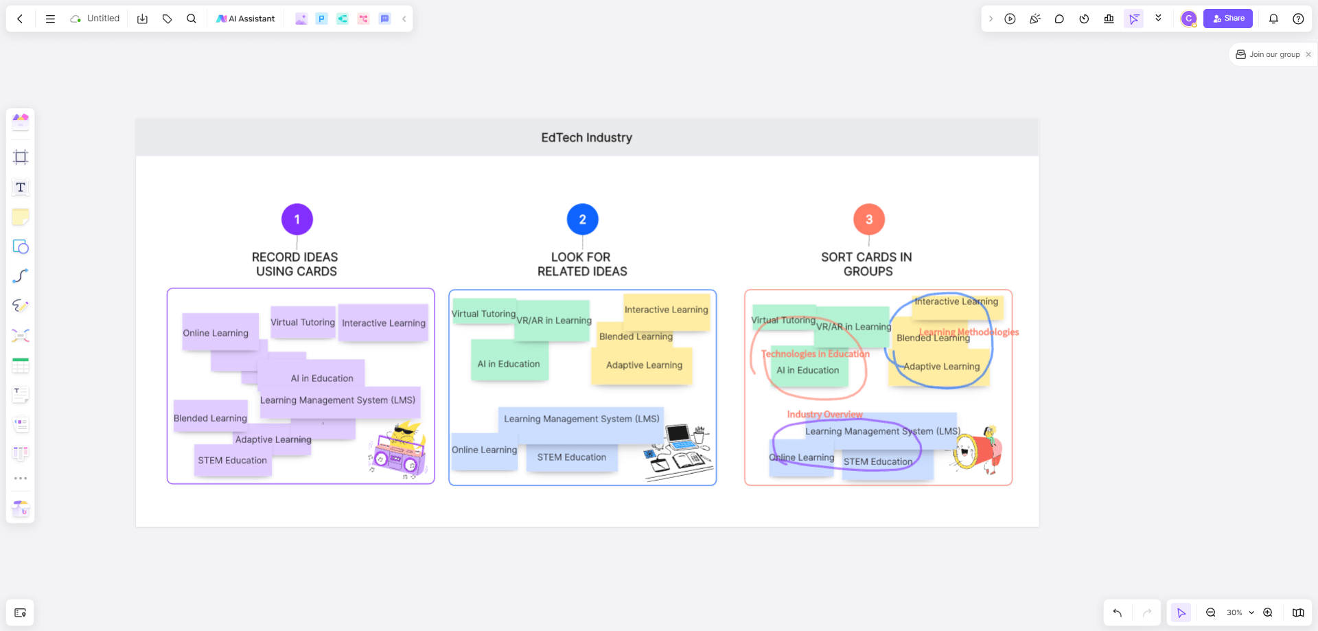
An online learning platform was dealing with low engagement rates from students. A mixed-method approach involving surveys, user interviews, and analysis of usage data was adopted to understand the problem.
Using Affinity Diagrams, the information was organized into themes like 'lack of personalized learning', 'uninteresting content', 'inadequate student-teacher interaction', and more. Insights gleaned from the diagrams informed the redesign of the platform. Personalized learning paths were introduced, the content was made more interactive, and features that enabled better student-teacher interaction were incorporated.
Movie Industry
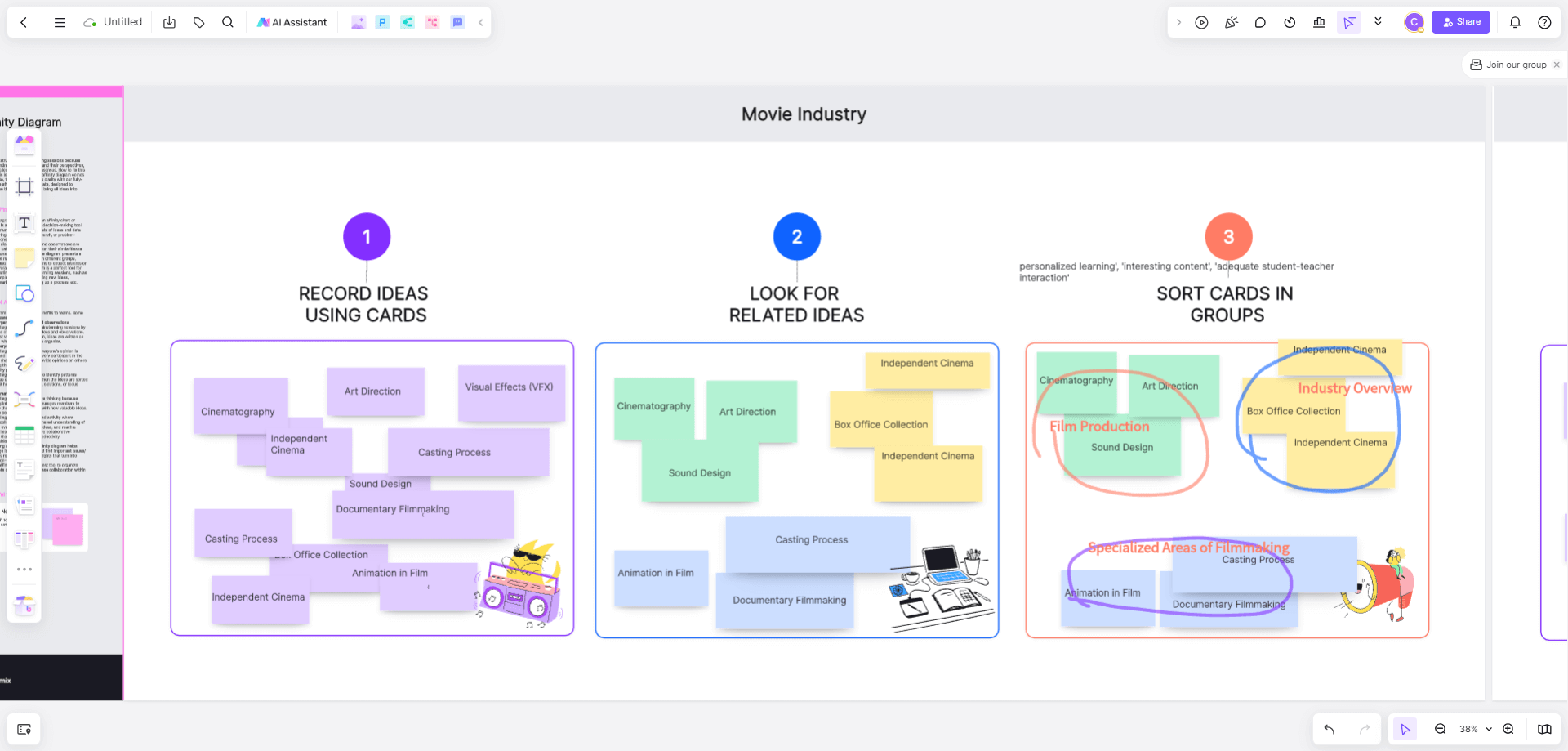
In the movie industry, the use of UX Affinity Diagrams has proven incredibly versatile. It is often applied in the pre-production phase when screenwriters and directors brainstorm ideas, character development, and plot lines.
By allowing them to visualize thoughts and connections on a shared platform, these diagrams streamline the conceptualization process. It enhances creative collaboration, reduces redundancies, and ensures all voices are heard, driving the creation of a well-rounded and compelling screenplay. By employing UX Affinity Diagrams, they were able to group user feedback into categories like 'content discovery issues', 'streaming quality problems', and 'lack of personalization'.
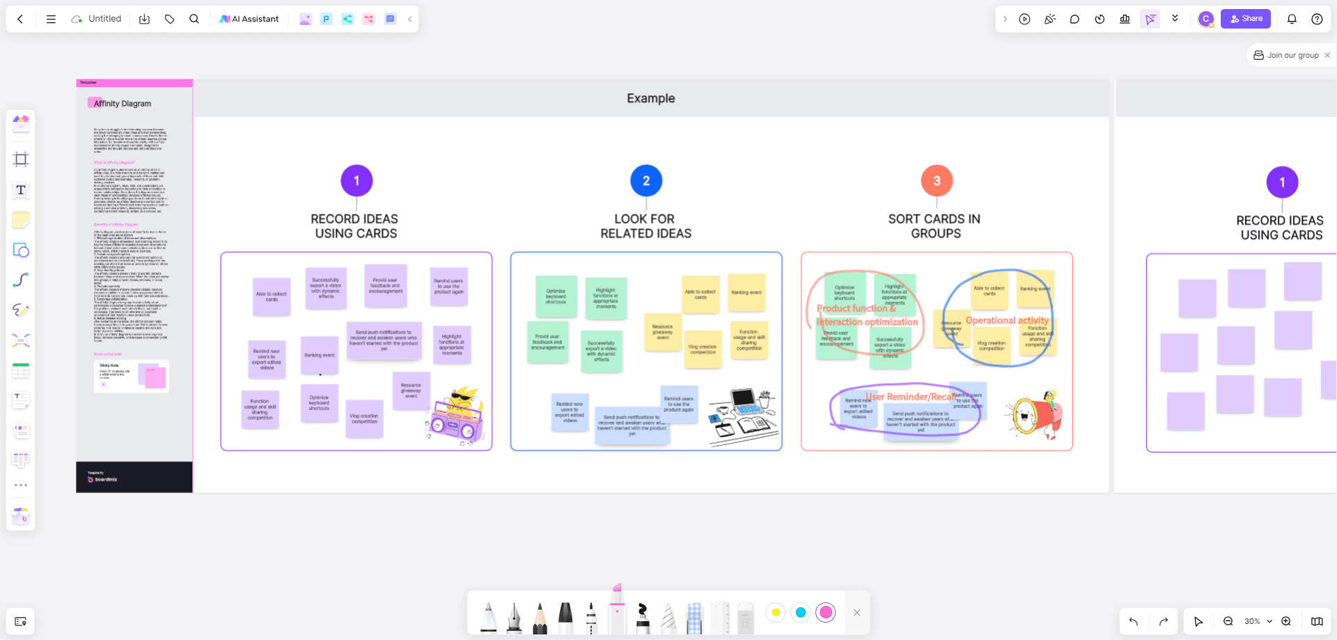
4. Step-by-Step Guide: Creating Your Own UX Affinity Diagram with Boardmix
Creating a UX Affinity Diagram is an essential part of user experience design. It is a tool that organizes user research data into a digestible format. One popular platform for creating such diagrams is Boardmix. Here's a step-by-step guide to creating your own UX Affinity Diagram using Boardmix.
Create Notes for Each Piece
On Boardmix, each piece of your data will be represented by a 'note'. Make sure each note contains a concise summary of a specific piece of data or insight from your research.
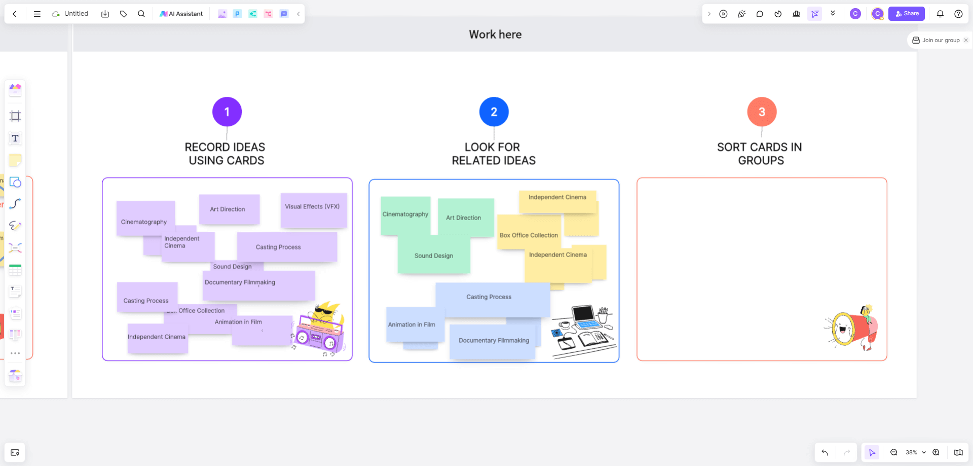
Organize Notes into Groups and Name Each Group
The core of creating an Affinity Diagram involves organizing the notes into meaningful groups. Start by moving similar notes close to each other. As patterns emerge, group related notes together. This process can be done manually or with the help of the 'auto-group' feature on Boardmix.
Once you have created groups, name each group in a way that captures the essence of the data it contains. This will serve as the theme for that group and help users understand what kind of insights the group holds.
Review, Refine and Share Your Affinity Diagram
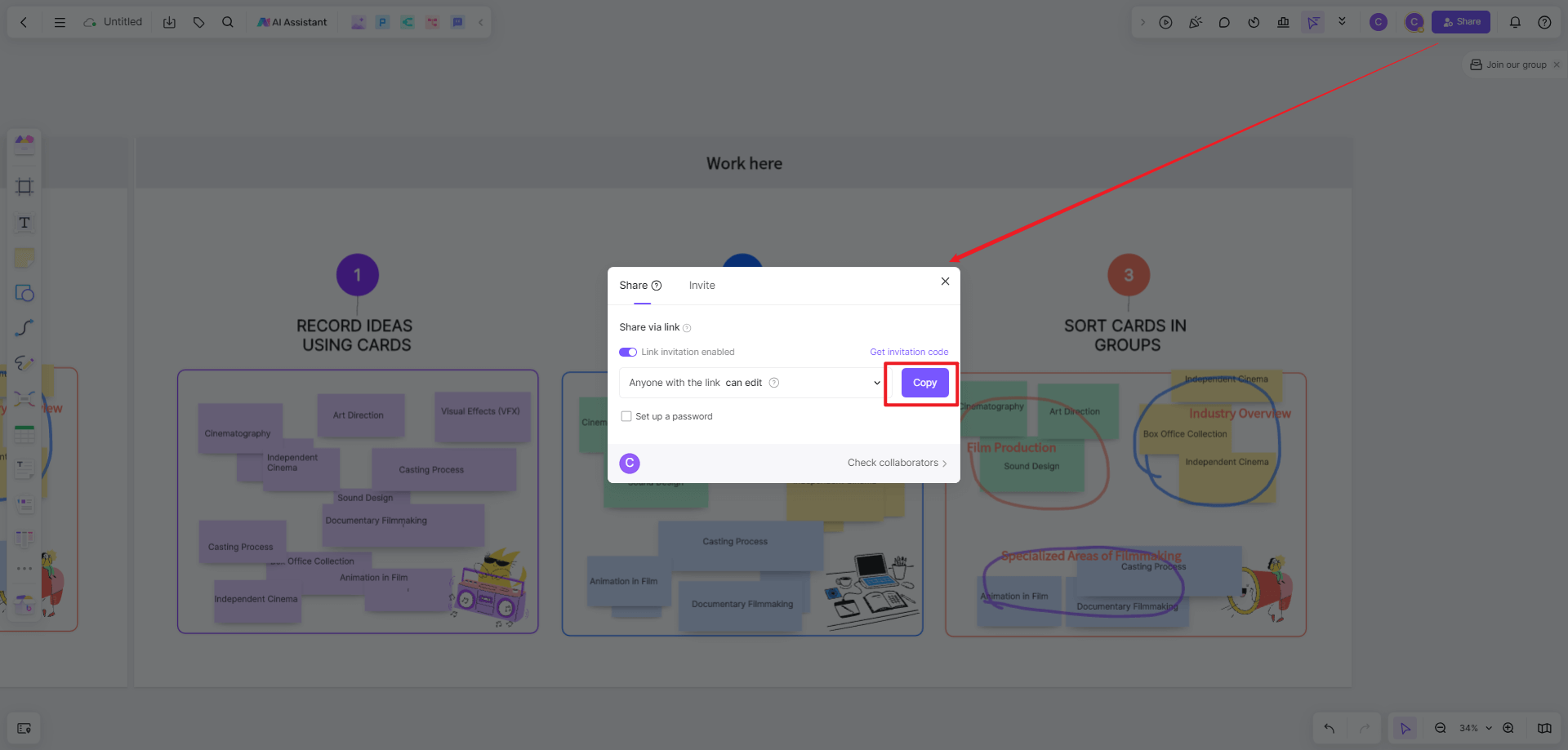
After all groups are named, take some time to review and refine your diagram. This may involve reorganizing some notes, regrouping them, or renaming the groups for clarity. Once you are satisfied with your Affinity Diagram, you can share it with your team directly from Boardmix. The platform offers multiple sharing options including sharing via email, generating a shareable link, or exporting it as an image or PDF.
Creating a UX Affinity Diagram on Boardmix not only organizes user research data but also enhances team collaboration in understanding user needs and creating effective solutions.
5. Shape the Future of User Experience Design with UX Affinity Diagrams
UX Affinity Diagrams are a valuable tool for simplifying and streamlining the User Experience design process. By providing a structured approach to organizing and analyzing ideas, designers can identify patterns, themes, and relationships between different elements within a design, making it easier to refine and optimize the user experience. As the field of User Experience design continues to evolve, UX Affinity Diagrams will play a crucial role in shaping the future of user-centered design.
UX Affinity Diagrams, thus, not just contribute to shaping user-friendly products but also underpin the very future of User Experience Design by ensuring it remains firmly rooted in empathetic understanding and user satisfaction.