The process of converting raw, intricate data into a format that is easily comprehensible and meaningful is known as data visualization. A popular tool in this process is the use of charts. Charts are graphical representations of data that allow us to understand complex data sets and uncover trends and patterns. Among the various types of charts, one that offers great flexibility and functionality is the Clustered Column Chart. This article provides a deep dive into the basics of clustered column charts and guides you on how to create them. Keep reading.
What Is a Clustered Column Chart
A Clustered Column Chart is a compelling data visualization tool used to compare multiple categories of data across several data series. In a nutshell, this type of column chart presents data in the form of vertical bars that are grouped into clusters.
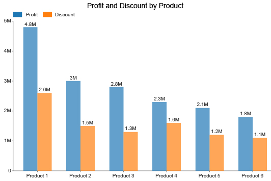
Image source: ChartExpo
Each cluster or group corresponds to a category, and each vertical bar within the cluster represents a different data series. The length or height of the bar mirrors the quantitative value it embodies. This arrangement aids in clearly distinguishing between different categories and data series, thereby facilitating comprehensive comparisons.
When to Use a Clustered Column Chart
Choosing the correct chart for data representation is crucial in delivering precise and comprehensible insights. A clustered column chart is most effective when:
- You have multiple data series that you want to compare across different categories.
- The categories being compared are nominal (unordered) or ordinal (ordered) data types.
- The number of data series and categories are not excessively high, as too many bars can make the chart cluttered and challenging to interpret.
- Common use-cases include comparing sales figures for multiple products over several months or years, analyzing population demographics across different regions, and evaluating academic performance across different subjects or departments.
Benefits of Using a Clustered Column Chart
Utilizing a clustered column chart offers several advantages:
- Multi-dimensional Comparison: It allows comparison across multiple data series and categories simultaneously.
- Visual Distinction: Clear visual segregation between different categories and data series facilitates better understanding and comparison.
- Versatility: The chart can be used in various contexts, from business and finance to academia and research.
- Effective Communication: A well-constructed clustered column chart can communicate complex data trends efficiently and convincingly.
How to Create a Clustered Column Chart
The process of creating a clustered column chart generally involves these steps:
- Identify Data: Determine the data that needs to be visualized. Ensure that you have multiple data series for comparison across different categories.
- Choose Software: Decide on the software tool you'll use to create the chart. Popular options include Microsoft Excel, Google Sheets, or online graph makers like Boardmix.
- Create Chart: In the software tool, select the option to create a 'Clustered Column Chart'. Input your data correctly, ensuring each data series aligns with its corresponding category.
- Customize Chart: Modify the design elements of your chart as needed. Add a suitable title, label the axes appropriately, adjust colors for distinction, and ensure legibility.
- Interpret & Share: Finally, interpret your clustered column chart to draw conclusions and share it with your audience.
Create a Clustered Column Chart in Minutes with Boardmix
There are numerous data visualization tools available in the market. However, Boardmix stands out for various reasons. It offers a user-friendly interface, powerful data analysis capabilities, customization options, and impressive scalability. Moreover, Boardmix facilitates seamless collaboration with your team, which is crucial for businesses aiming for efficient and productive operations.

Now that you have an idea about what a clustered column chart is and why Boardmix is your go-to tool for creating one, let’s proceed to the step-by-step guide.
Step 1: Launch Boardmix
Open Boardmix on your computer and log into this platform.

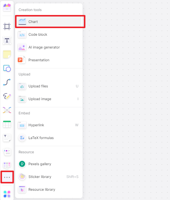
Step 2: Select Chart Type
Navigate to the 'Chart' option from the left sidebar. From the drop-down menu, select the clustered column. This action prompts Boardmix to generate a blank clustered column chart for you.
Step 3: Import Your Data
The next step is to import your data into Boardmix. You can either input the data manually or upload an excel file or other data file formats compatible with Boardmix. Ensure that your data is clean and organized for an efficient chart-making process.
Step 4: Insert Data Into Chart
Now it's time to insert your data into the chart. Click on the chart to activate the 'Chart Tools' toolbar. After that, click on edit icon. A window will open where you'll be able to input your data series and categories.
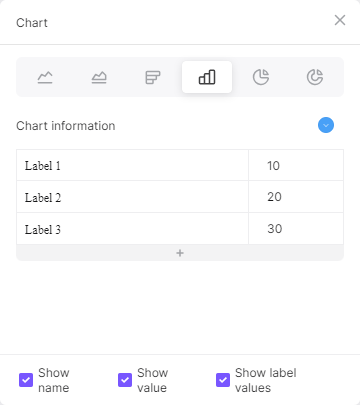
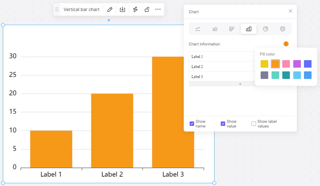
Step 5: Customize Your Chart
After inserting your data, customize your chart as per your liking. Boardmix offers numerous customization options, such as color schemes, chart styles, and labels. Remember, the main aim of customizing your chart is to make it more comprehensible and appealing.
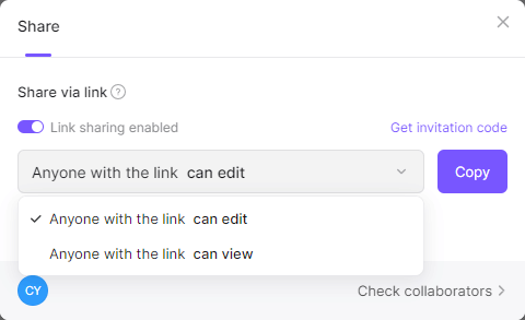
Step 6: Share Your Chart
Once you're satisfied with your clustered column chart, you can share it with others for review or collaboration. Don’t worry about losing your file after exit the editor. All your files are saved to cloud automatically.
Creating a clustered column chart with Boardmix is not as complicated as it may seem. With these straightforward steps, you can have your chart ready in just a few minutes. Whether you're an experienced data analyst or a novice looking to present data professionally, Boardmix is an excellent tool that caters to all your data visualization needs. Just try it out now!