Data visualization has become an essential component in processing and interpreting vast amounts of data in business. One effective way of illustrating and comparing data is through the use of a stacked column chart. This guide will provide you with a comprehensive understanding of what a stacked column chart is, how to make one in Excel, and the pros and cons of using this type of chart in Excel. You’ll also learn a one-stop stacked column chart maker that help you a lot. Let’s dive in.
What is a Stacked Column Chart
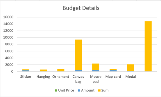
A stacked column chart is a graph that presents numerical proportions in different categories where each bar represents a total. The individual bar is segmented into smaller parts to show separate values, which combine to form the entire category's total value. This type of column chart is efficient in displaying the relationship between individual sub-items to the whole, making it easier to comprehend and analyze the data.
How to Make a Stacked Column Chart in Excel
Creating a stacked column chart in Excel is a straightforward process. Below is a step-by-step guide on how to go about it.
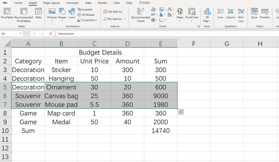
Step 1: Prepare Your Data
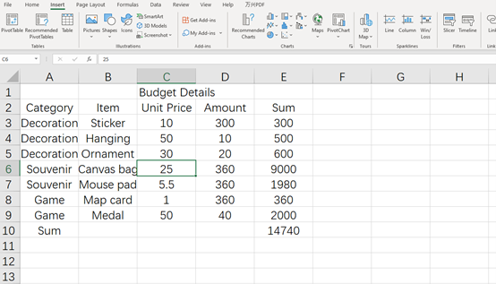
Start by preparing your data. It should be organized in a way that it has row or columns of sub-categories and corresponding values.
Step 2: Select Data
Select your data by clicking and dragging across all cells containing the relevant data. Make sure that your selection includes both the row and column headers as they’ll be useful when generating the chart.
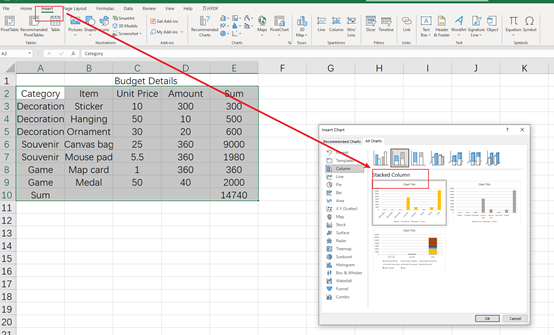
Step 3: Insert Stacked Column Chart
Once your data is selected, navigate to the ‘Insert’ tab on the Excel ribbon, and then select ‘Column’ from the ‘Charts’ group. After that, choose 'Stacked Column.'
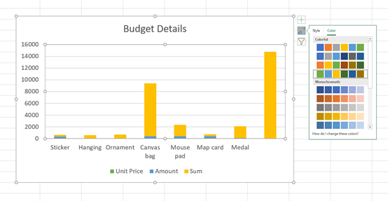
Step 4: Customize the Chart
Excel generates a basic stacked column chart from your data. You can then customize the chart by adjusting the colors, adding a chart title, modifying the legend, inserting labels, among other options located under the ‘Chart Tools’ section.
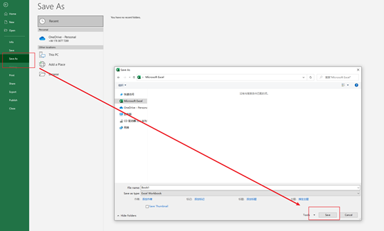
Step 5: Save Your Chart
Once you've customized your stacked column chart to your satisfaction, don’t forget to save your work. Click on 'File,' then 'Save As,' and choose your preferred location to save your chart.
Pros and Cons of Making a Stacked Bar Chart in Excel
While making a stacked bar chart in Excel has many advantages, it also comes with some drawbacks.
Pros
- Visual Clarity: Stacked column charts clearly illustrate the part-to-whole relationship in data.
- Comparability: It's easier to compare data series within one category.
- User-friendly: Excel provides an easy-to-use interface for creating stacked column charts.
Cons
- Comparability Challenge: Although it's easier to compare data within one category, it's challenging when trying to compare data between categories.
- Overplotting Risk: If there are too many segments in a column, it may become confusing and hard to interpret.
- Dependency on Proper Data Structuring: The efficiency of creating a stacked column chart in Excel largely depends on how well the data is structured.
In conclusion, stacked column charts are useful data visualization tools, especially when working with categorized data where you need to showcase the contribution of each sub-category to the total. Despite the few challenges, Excel offers a versatile and user-friendly platform for creating these charts. It all depends on how you structure your data and your customization preferences.
Boardmix - A Versatile Stacked Column Chart Maker
In the current data-intensive age, tools like Boardmix that offer efficient data visualization methods are crucial. Not only does Boardmix make the process of creating a stacked column chart hassle-free, but it also provides a platform for effective data interpretation and presentation. With its user-friendly interface and vast customization options, it's an invaluable tool for any individual or organization seeking to harness the power of data visualization.

Boardmix rises above the myriad of other stacked column chart makers for several reasons:
- Ease of Use: Boardmix features a user-friendly interface, making it easy to navigate and create impressive stacked column charts. It doesn’t require prior knowledge in coding or extensive technical skills to operate.
- Versatility: Boardmix supports various chart types apart from the stacked column charts. This includes line charts, bar charts, pie charts, scatter plots, and more.
- Data Integration: Boardmix allows easy importation and synchronization of data from various sources, including spreadsheets and databases. This enables real-time data visualization.
- Collaboration Features: With Boardmix, you can share your charts with colleagues for seamless and real-time collaboration. This makes it a valuable tool in team projects.
- Customization: Boardmix provides extensive customization options that enable you to modify your charts to suit your specific preferences. This includes color schemes, fonts, styles, sizes, and more.
In summary, Boardmix is a powerful stacked column chart maker that marries functionality with simplicity. With its intuitive interface, high customizability, and diverse applications, Boardmix is changing the way we view and interpret data. As data becomes more ingrained in our daily lives, tools like Boardmix will continue to play a crucial role in enabling us to understand and leverage this invaluable resource. Just sign up and give it a nice try!