When it comes to absorbing and retaining new information, comparison charts can be extremely useful tools. Whether we are trying to understand a new topic, make an informed decision, or simplify complex information in a more digestible way, comparison charts are must-have tools for effective learning. In this article, we will provide 10 practical examples of comparison charts created with the Boardmix tool to help you understand how you can use them in your own learning or teaching.
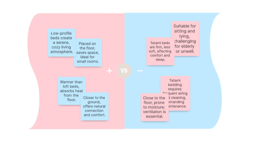
Create a comparison chart on Boardmix
What is a comparison chart?
A comparison chart, also known as a comparison graph, is a visual tool used to compare different options or ideas against each other. Typically, a comparison chart will have two or more columns, each representing a different option or idea. Then, in the corresponding rows, you will list the features or details of each option to make them easier to compare.
Comparison charts are useful in a variety of situations. They can help simplify complex information, make decisions based on direct comparisons, visualize patterns and trends, and summarize information in an easy-to-understand format.
Structure of the Comparison Chart
The comparison chart is primarily made up of three essential elements: the criteria, the categories, and the comparative information.
The criteria refer to the aspects or features that are to be compared. These can be anything from price to quality, depending on the topic at hand.
The categories are the different items or entities that are being compared based on the established criteria. For example, if you are comparing different brands of mobile phones, the brands would be the categories.
The comparative information is the core of the comparison chart. This is where you present the data or facts that demonstrate how each category measures up against the established criteria. It is here that you can highlight the differences and similarities between the categories.
To create an effective comparison chart, you should start by clearly defining your criteria and selecting your categories. Then, research and gather all the necessary information for each category in relation to each criterion. Once you have all this information, you can begin filling out your comparison chart.
10 Examples of Comparison Charts
Here are 10 practical examples of comparison charts that can be used in a variety of situations.
- Animal and Plant Cell Comparison Chart
This comparison chart details the difference between animal and plant cells. For one, animal cells are eukaryotes, lacking a cell wall and chloroplasts, but possessing centrioles. In contrast, plant cells are also eukaryotes, but they have a rigid cell wall and chloroplasts for photosynthesis, although they lack centrioles.
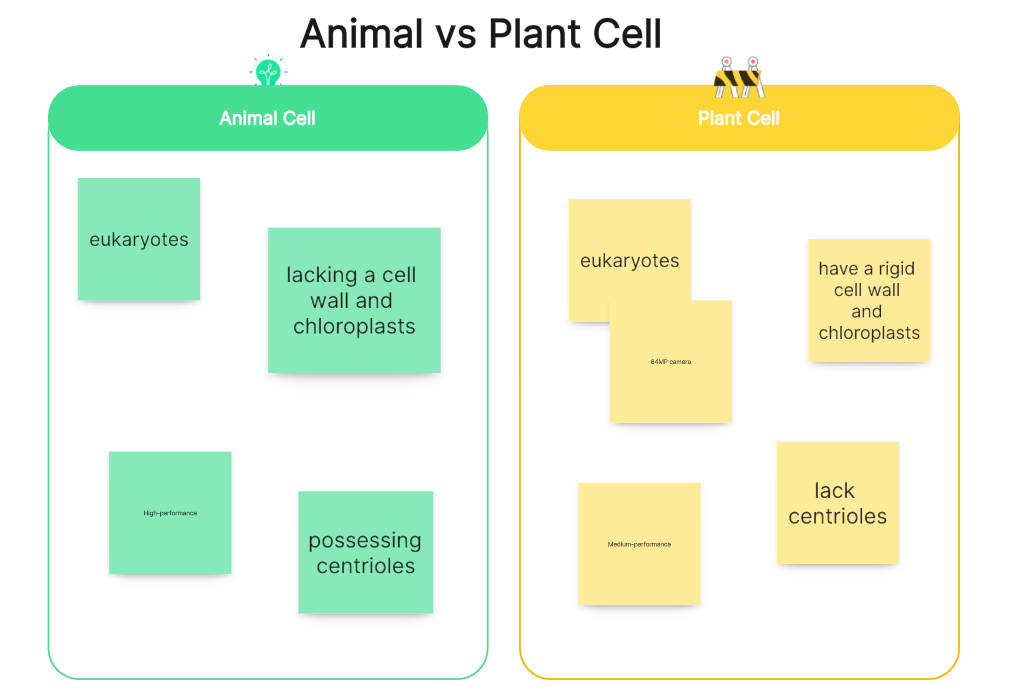
Create an animal and plant cell comparison chart on Boardmix
2.Short Story and Novel Comparison Chart
This chart compares the differences and similarities between a short story and a novel. Generally speaking, a novel is a longer, more detailed type of narrative, with multiple characters and plots that unfold over several chapters. On the other hand, the short story is a short and concise narrative that focuses on a single event or character.
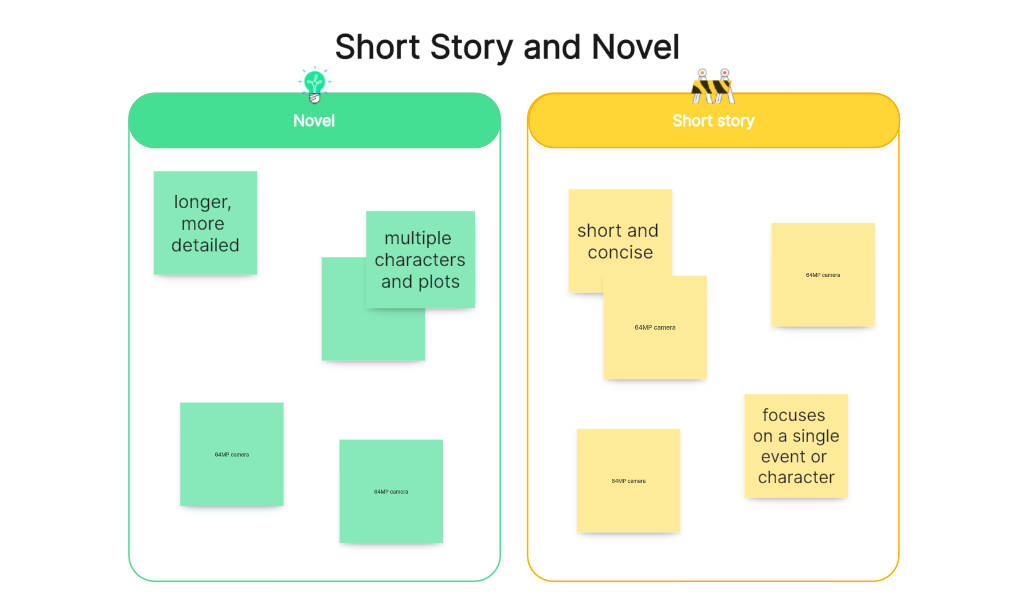
Create a short story and novel comparison chart on Boardmix
- Comparative Chart of Baroque and Renaissance
This comparative chart focuses on two important artistic and cultural periods: the Baroque and the Renaissance. In it, we could highlight the differences in areas such as period, purpose, culture, and architecture, among other aspects. For example, in terms of architecture, the Renaissance was characterized by its balance and symmetry, while the Baroque opted for opulence and drama.
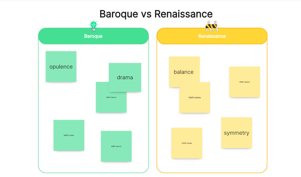
Create a Baroque and Renaissance comparison chart on Boardmix
- Comparative Chart Between Mexico and Countries It Borders
In this comparative chart, we will analyze key aspects such as the economy, culture, geography, and politics between Mexico and the countries it borders. For example, we can compare the per capita population of Mexico with that of the United States, Guatemala, and Belize. We can also examine cultural differences in terms of language, food, and traditions. In terms of geography, we could analyze the diversity of landscapes from mountains to coasts. And finally, in the political realm, we could contrast government systems and international policies.
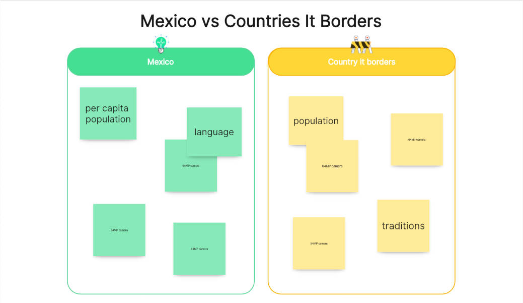
Create a Mexico and countries it borders comparison chart on Boardmix
5. Comparative chart of reptiles and amphibians
This comparison chart focuses on the distinction between two groups of animals: reptiles and amphibians. On the one hand, we could highlight the characteristics of reptiles, such as their scaly skin, their dependence on solar heat to regulate their body temperature, and their mainly oviparous reproduction. In contrast, amphibians are characterized by having a moist and permeable skin, being ectothermic, and having an aquatic larval phase in their life cycle.
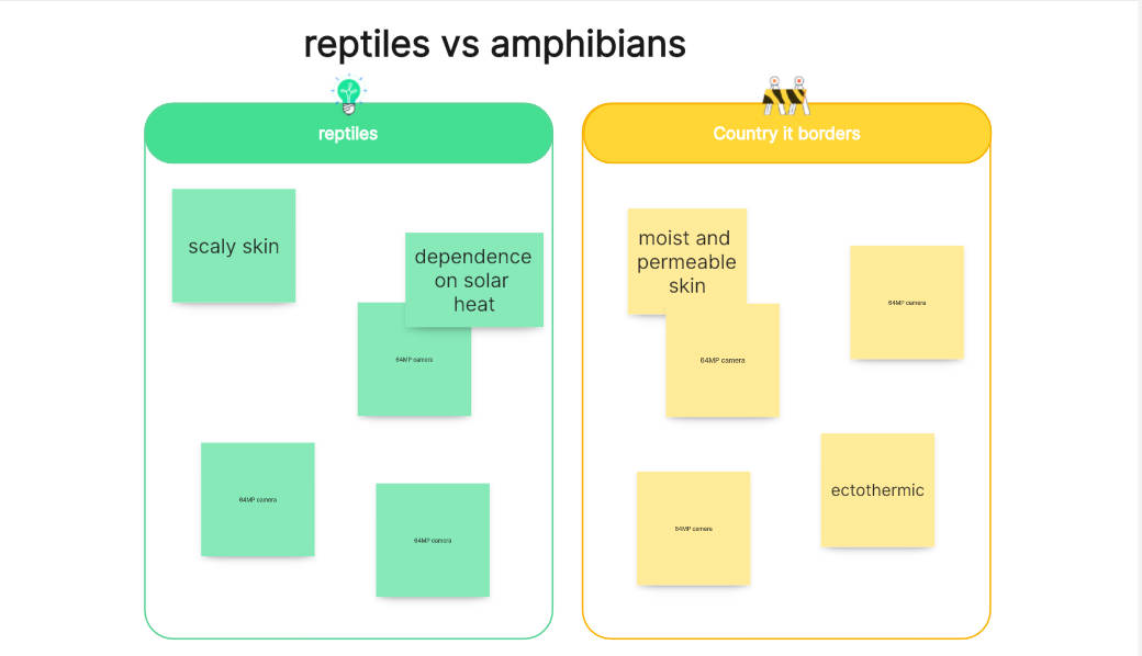
Create a reptiles and amphibians comparison chart on Boardmix
- Comparative Chart of Aztec, Mayan, and Inca cultures
This comparison chart details the three main aspects of Latin American cultures, which are architecture, sculpture, and painting. For example, let's talk about architecture. The Aztecs, famous for their stepped pyramids and monumental temples, displayed an architectural style marked by religious symbolism. On the other hand, the Mayans, known for their planned cities and astronomical complexes, reflected in their architecture a deep connection with cosmic cycles. In contrast, the Incas stood out for their impressive stone fortresses and agricultural terraces, a clear example of their advanced engineering.
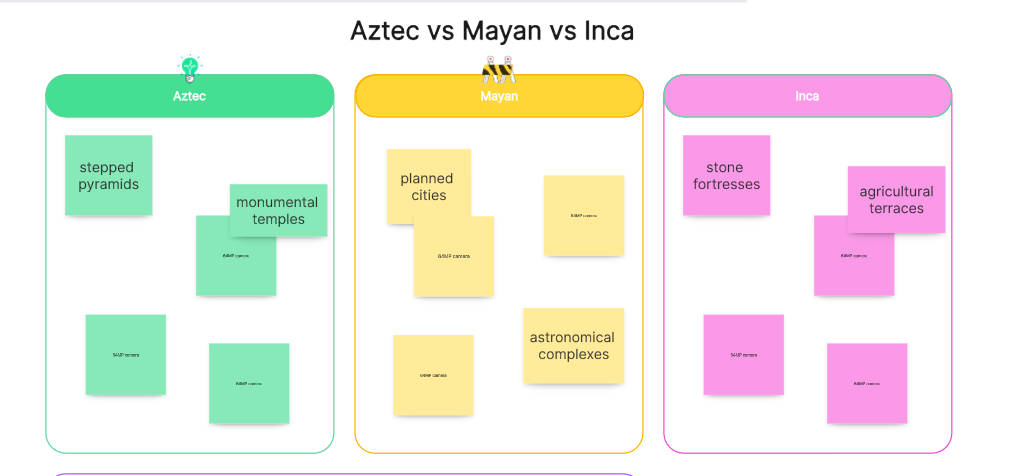
Create a Aztec, Mayan and Inca cultures comparison chart on Boardmix
- Comparative Chart of Operating Systems: Windows vs Mac
In the world of computing, Windows and Mac are two giants competing for user preference. Windows is known for its compatibility with a wide range of hardware, while Mac stands out for its intuitive design and focus on security.
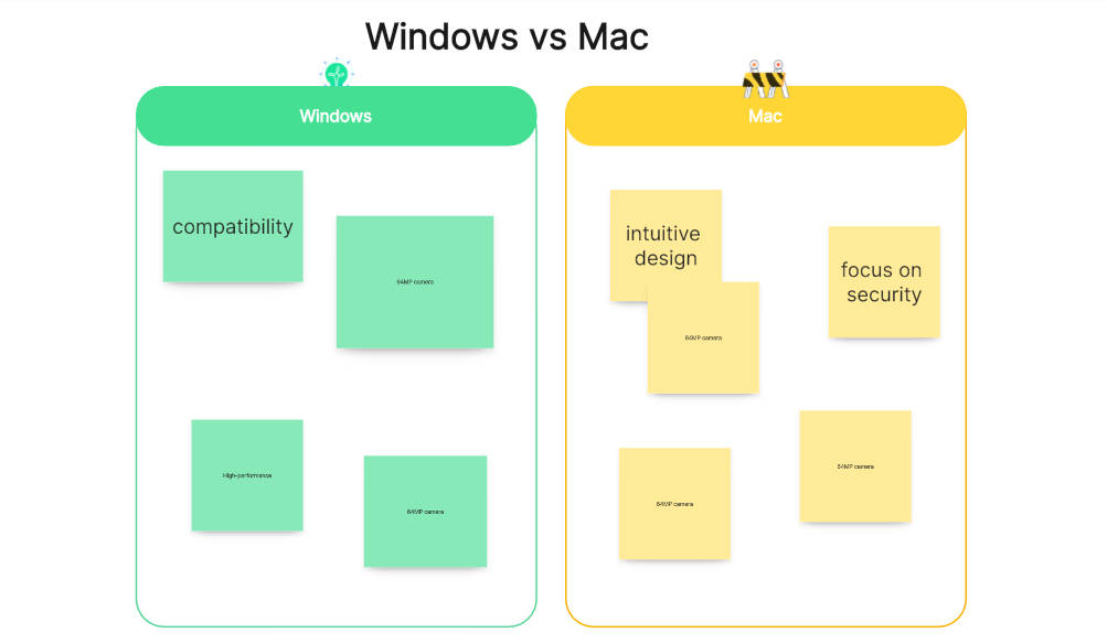
Create a Windows and Mac comparison chart on Boardmix
- iPhone vs Android Comparison Chart
In this comparison chart, we could highlight the key differences between these two popular operating systems. For example, the iPhone, with its iOS operating system, is known for its intuitive and unified user interface, as well as its tight control over the apps available in its store. Android, on the other hand, is famous for its customization and flexibility, allowing users greater freedom to tailor their devices to their individual needs.
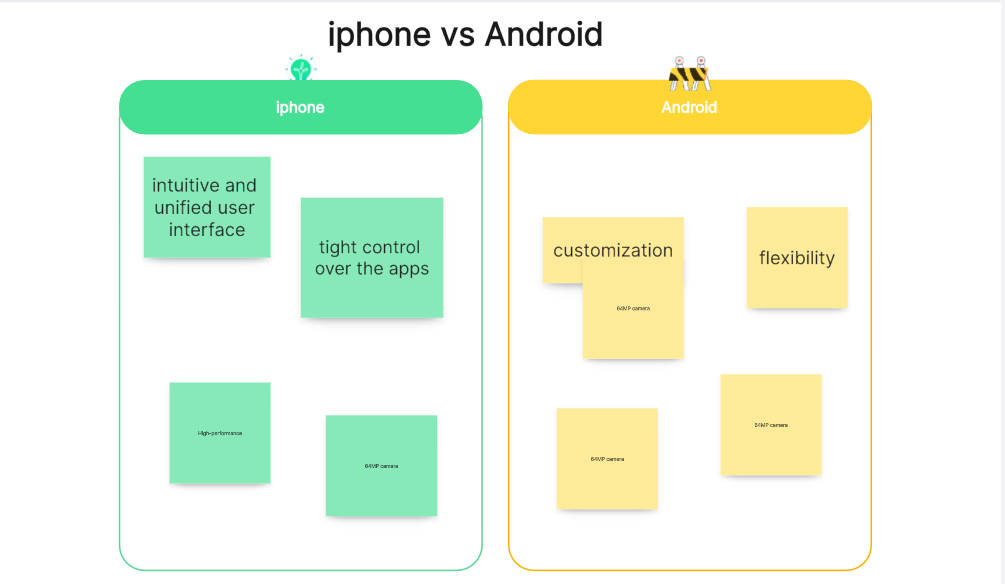
Create an iPhone and Android comparison chart on Boardmix
- Democracy vs Dictatorship Comparison Chart
Such a chart could illustrate the fundamental differences between these two political systems. Democracy is characterized by citizen participation in political decision-making, the existence of multiple political parties, and respect for human rights. In contrast, a dictatorship is characterized by absolute control of power by one person or small group, suppression of political dissent, and frequent violations of human rights.
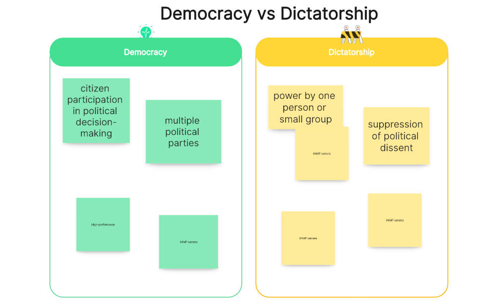
Create a Democracy and Dictatorship comparison chart on Boardmix
10. Short-Term, Medium-Term, and Long-Term Comparison Chart
This comparison chart explains in detail the time, objectives, and key points in different time frames. In the short term, it focuses on immediate goals and the tactics to achieve them. In the medium term, it focuses on mid-term objectives and the strategies to achieve them. And in the long term, it details the long-range vision and the plans to achieve it.
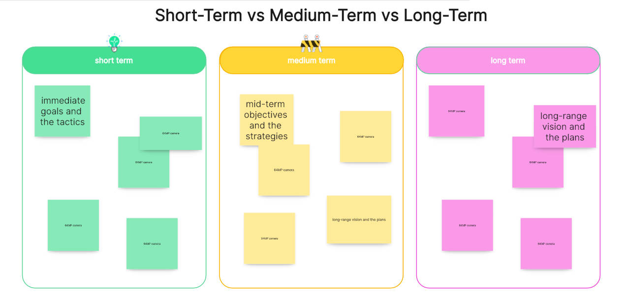
Create a short-term, medium-term and long-term comparison chart on Boardmix
How to Create a Comparison Chart on Boardmix?
Boardmix is a very useful tool that allows the creation of comparison charts in a simple and effective way thanks to its various creation and diagramming functions. This tool provides a clear and concise view of the variables you are comparing, which can be beneficial in various situations. Fortunately, the platform is intuitive and easy to use, so the process of creating a comparison chart won't be a huge challenge. Follow the steps below to create your comparison chart on Boardmix.
Step 1. Log in to Boardmix
To create a comparison chart on Boardmix, you must first log in to your account. If you don't have one yet, just need to go to the official Boardmix website and sign up.

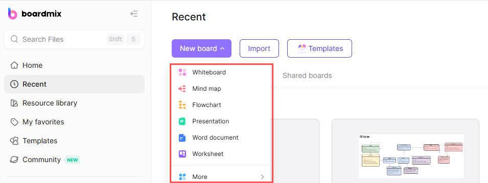
Step 2. Create a new board
Once you're on the home page, you'll find an option on the top menu called "New board." Click on it and a new board will open where you can start creating your comparison chart.
Step 3. Create a table
On the toolbar, you can select the board you want to create.
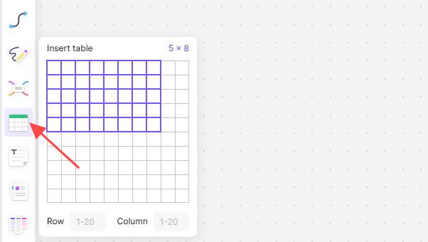
In the sidebar of the canvas, click on “Table” with the number of columns and rows selected and a table will be created where you can enter your information for the comparison chart.
Step 4. Customize
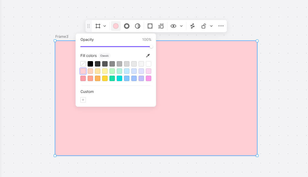
Boardmix offers a variety of tools and features to help you customize your comparison chart. You can add text boxes, images, shapes, and even connectors to link different elements. You can also change the size, color, and font style of the text boxes. It all depends on the type of comparison chart you want to create.
Step 5. Save and share
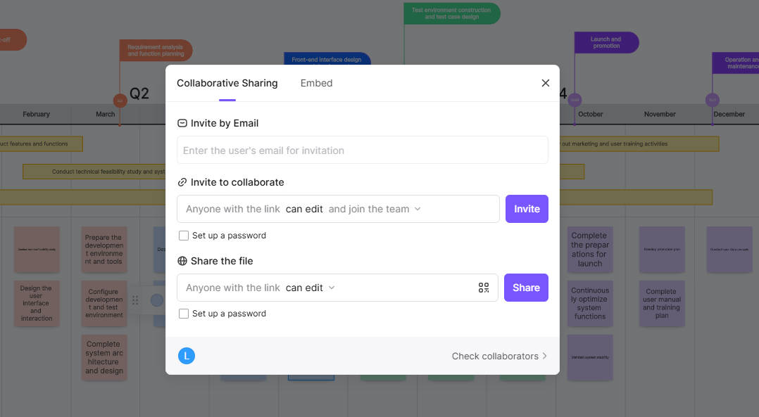
Finally, once you are happy with your comparison chart, you can share it with others through Boardmix. You can do this by simply clicking on the “Share” button in the top menu. Then, choose the option you prefer, whether it is sharing a link or inviting collaborators via email.
All in all, creating a comparison chart in Boardmix is a simple and straightforward process that will allow you to organize and present information effectively. Always remember to review and edit your chart to ensure that the information presented is accurate and relevant.
Conclusion
Comparison charts are a powerful and versatile tool to facilitate learning and decision making. By organizing and simplifying information, they can help you clearly see the similarities and differences between different options or ideas. So whether you are purchasing a new product, choosing a service, studying for an exam, or trying to understand a complex concept, comparison charts can be an invaluable aid and the Boardmix tool helps you create your own comparison charts easily and effectively. Try it now!


