Visual representations of the market are more effective and efficient when it comes to decision-making. Marketers often use visual tools to present the market and determine how best to address the needs of the target consumers. In this article, we’ll explore several brand perceptual map examples and show you how to create one by yourself.
What Is a Brand Perceptual Map
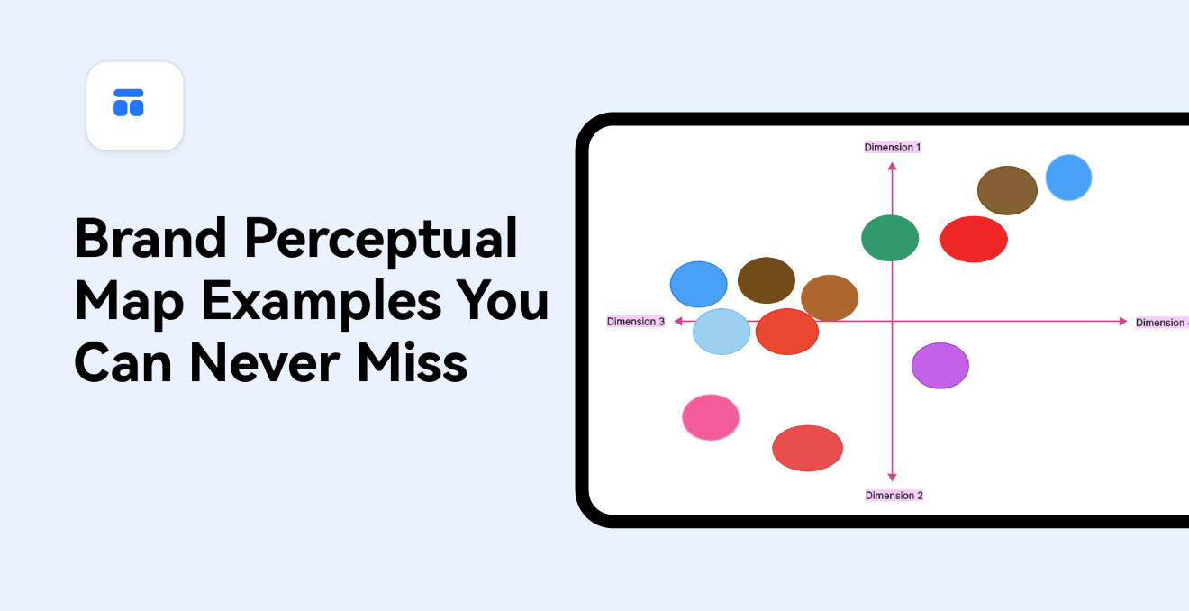
A brand perceptual map is a chart or graphical representation of how the target consumers perceive your product within your industry based on selective attributes. A perceptual map is created by visually plotting specific brands against axes. Each of the axes represents an attribute that has been ascertained to drive brand selection. Since brand perceptual mapping creates a concise summary of the market information available, it is beneficial for marketers in several ways;
- Unlocks insights about your industry and competitors: The brand perceptual map shows the relative position of competing based on the perceptions of the consumers. The visual view of the marketplace allows findings to come to light quicker than when using tables of data.
- Communicates where the brand is headed: The map describes a desired future position for a brand, especially when the industry is undergoing major changes or the brand is seeking to change its positioning.
- Confirms alignment of your brand strategy with business: Brand perceptual branding can help determine whether the position of the brand is the right position for your business, given the organization's overarching business strategy.
Brand Perceptual Map Examples
Let’s now have a look at several brand perceptual map examples, and how they explain the position of a brand among competitors.
Brand Perceptual Map Example – 01
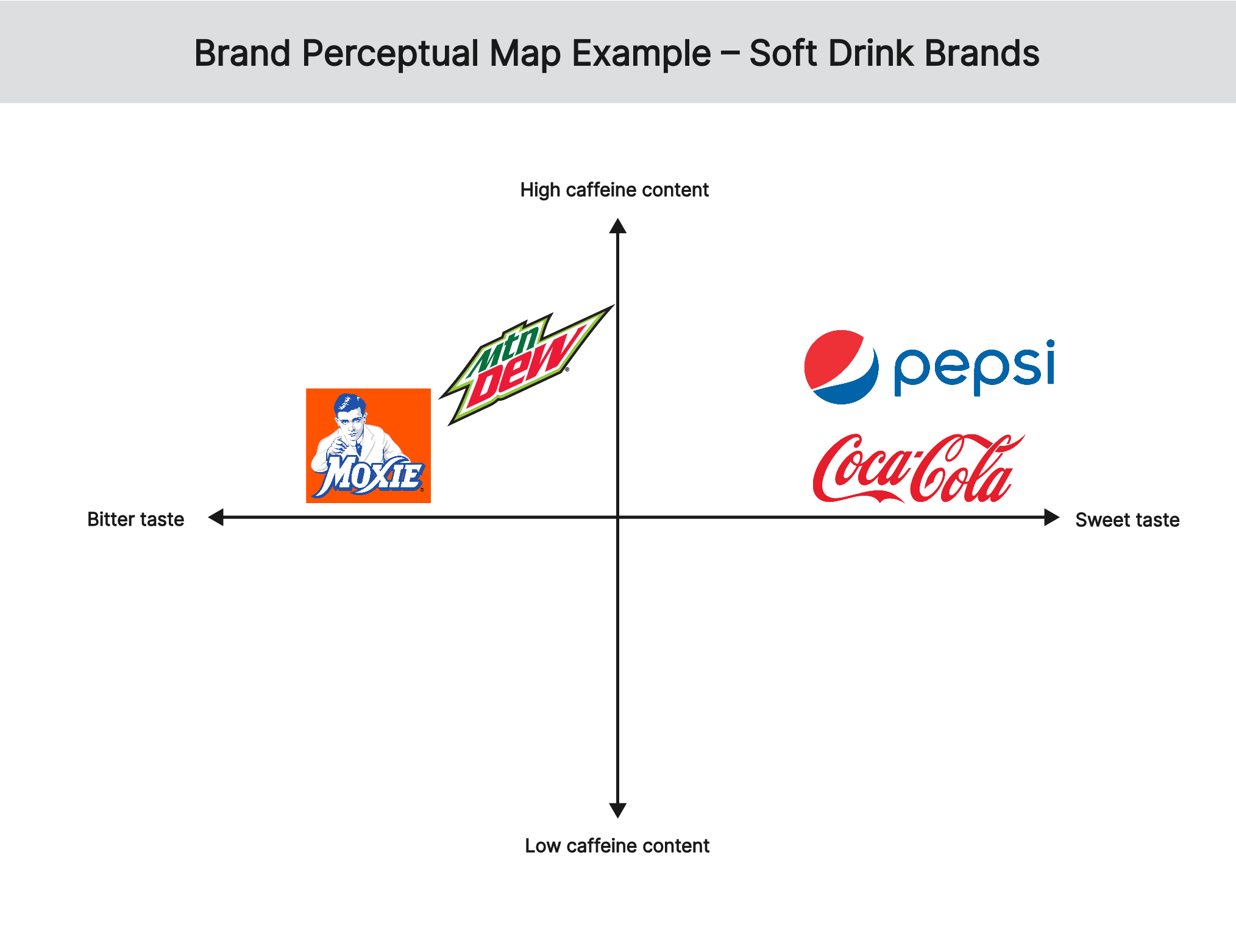
In this brand perceptual map example, 4 soft drink brands are compared based on their taste and caffeine content. Coca-Cola and Pepsi are positioned close to each other because of customer perceptions that they have a sweet taste and a moderate caffeine content. However, customers perceive Coca-Cola to have a stronger taste and a lower caffeine content than Pepsi. On the other hand, Mountain Dew and Moxie are positioned close to each other because of customer perception that they have a bitter taste and a high caffeine content. However, customers perceive Mountain Dew to have a stronger taste and a higher caffeine content than Moxie.
Brand Perceptual Map Example – 02
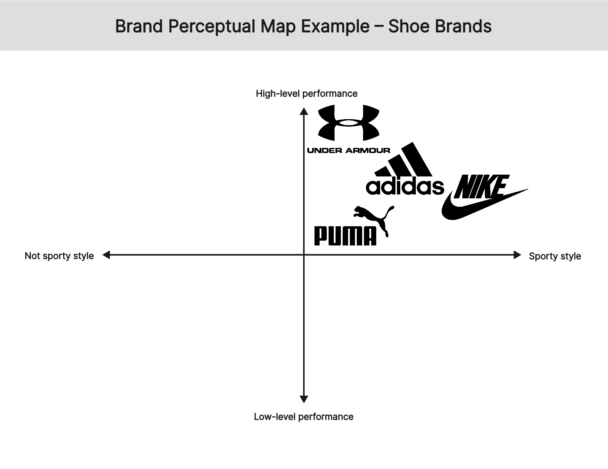
The second brand perceptual map example compares the positioning of 4 shoe brands based on style and performance. Nike and Adidas are positioned close to each other because of the customer's perceptions of a sporty style and high-level performance. However, customers perceive Nike to be more style than Adidas while Adidas is perceived to be more performance-oriented than Nike. On the other hand, Puma and Under Armour are positioned close to each other because of customers’ perception of more sports style and high-level performance. In particular, customers perceive Puma as having the best sporty style and high quality while Under Armour is designed for the best performance of athletes.
Brand Perceptual Map Example – 03
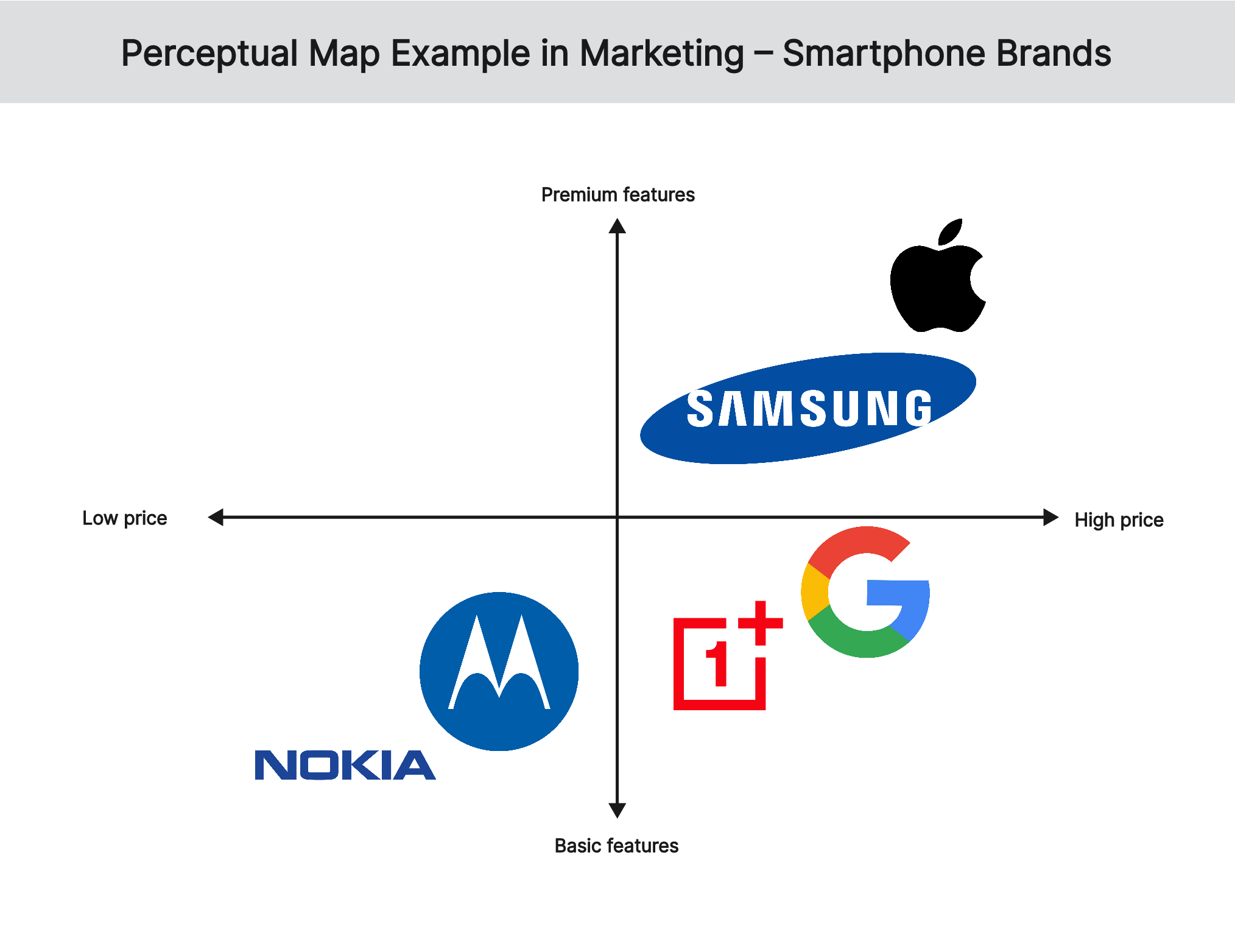
The third brand perceptual map example compares the positioning of computer brands based on price and performance. Apple and Dell are positioned close to each other because customers perceive them as high-end and with innovative designs. However, customers perceive Apple to be more expensive than Dell, while the latter is more innovative in design. On the other hand, Acer and HP are positioned close to each other because of customer’s perception of budget-friendly and range of options. In particular, customers perceive Acer as being more budget-friendly than HP, but HP offers a broader range of computers to choose from.
Brand Perceptual Map Example – 04
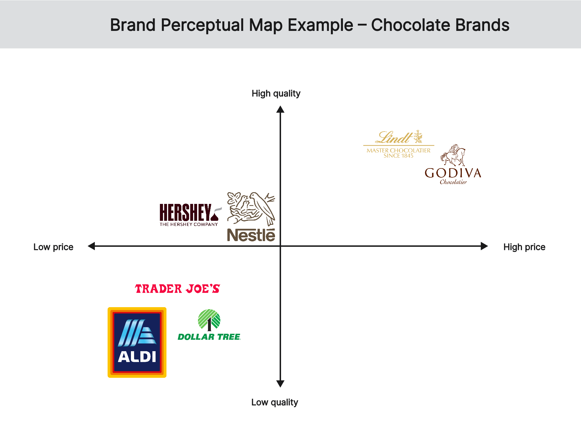
The brand perceptual map example shows the positioning of chocolate brands based on price and quality. Positioned at the top of the map are premium chocolate brands, such as Lindt and Godiva because of their high prices and high quality. At the bottom are budget chocolate brands like Dollar Tree, Trader Joe's, and Aldi that have low prices and low quality while mid-range chocolate brands, such as Nestle and Hershey’s are positioned in the middle of the map to reflect their moderate prices and moderate quality.
Brand Perceptual Map Example – 05
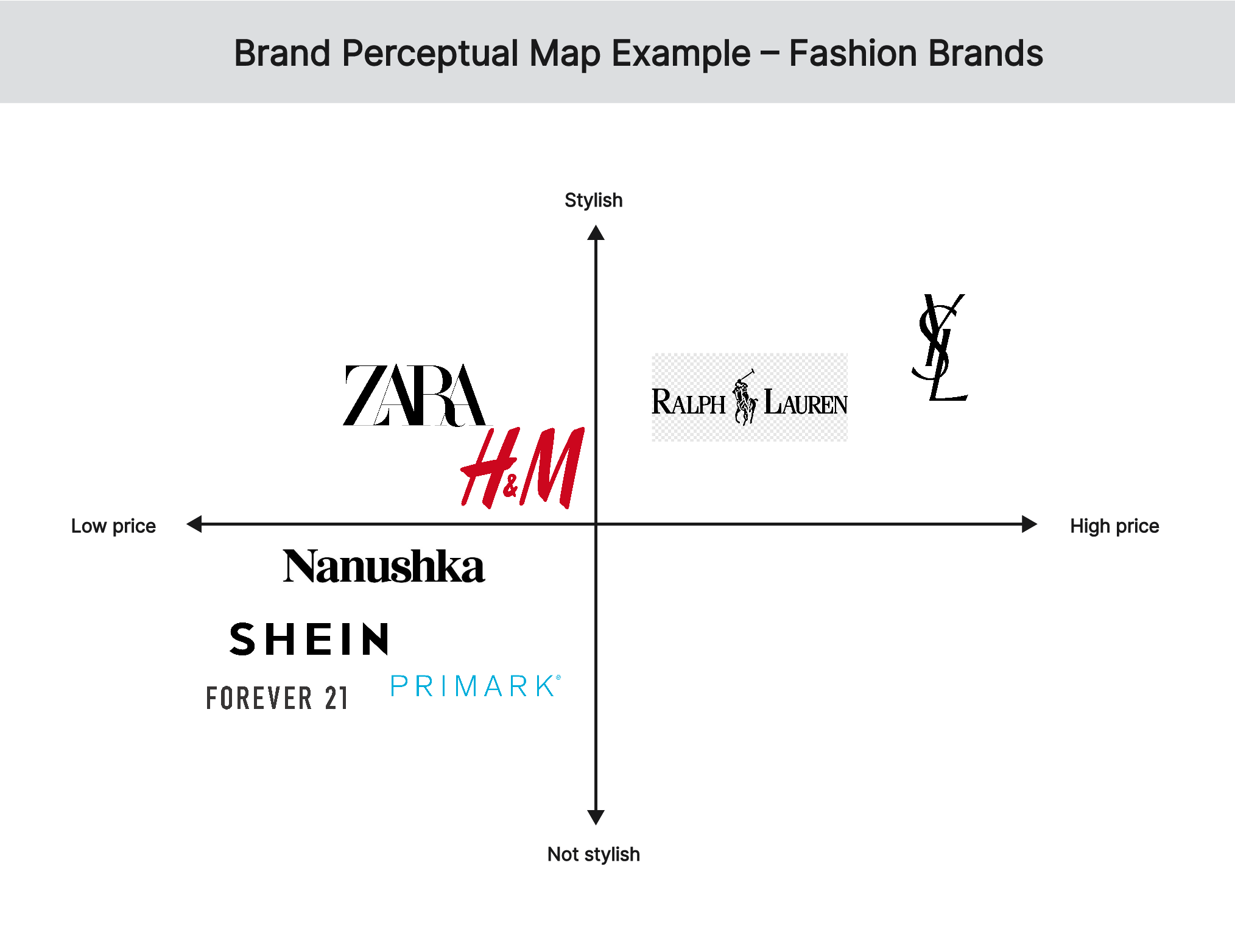
The brand perceptual map example shows the positioning of fashion brands based on style and affordability. High-end fashion brands, such as Ralph Lauren and Yves Saint Laurent are positioned at the top of the map because customers perceive these to be stylish and with an expensive image. Mid-range fashion brands, such as H&M, Nanushka, and Zara are positioned in the middle of the map because customers perceive them to have moderate style and moderate price. Budget fashion brands, such as Primark, Shein, and Forever 21 are at the bottom of the map because customers perceive them to have a casual style and a low price.
How Do You Create a Brand Perceptual Map Using Boardmix
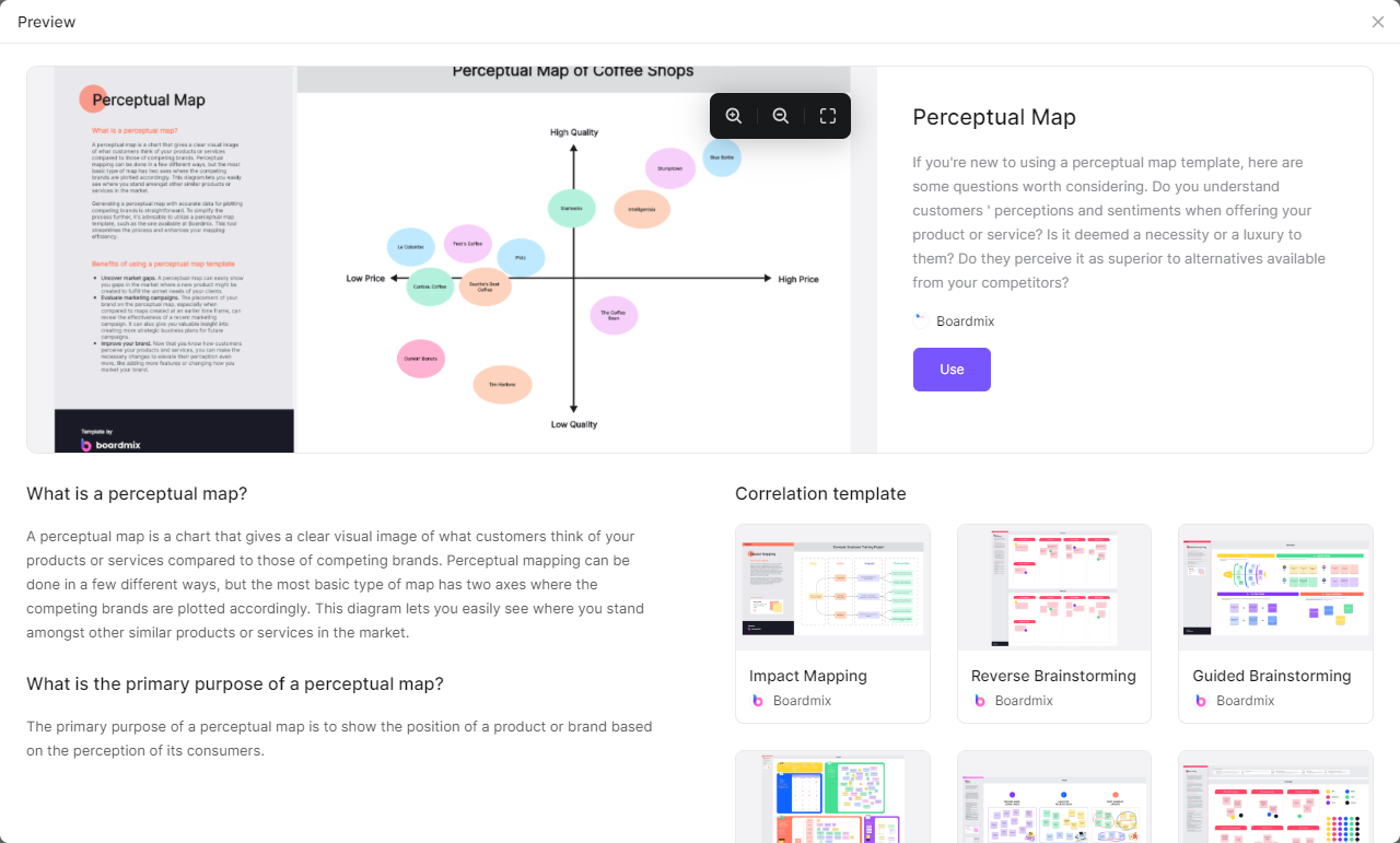
Boardmix provides a ready-made perceptual map template to help you conveniently create a brand perceptual map. Simply click the perceptual map template and build your map using your brand. With the Boardmix’s template, you can create a 2-dimensional or multi-dimensional brand perceptual map to have a clear visual of your respective industry. If you are part of a team, you can use the template to get their initial thoughts and feedback about your brand’s positioning. Besides, Boardmix also offers various useful tools like sticky notes, connection lines, voting features, real-time collaboration features, online meeting features, link-sharing features, and more. You can finish anything you want at its infinite canvas!
