Bar diagrams help in handling data in statistics, and presenting them in a more visually appealing way. They also summarize complex data for easier understanding or better decision-making. Different types of bar graphs are used for specific purposes. In this article, we focus on percentage bar diagrams, providing a few examples, and a tool that will help you draw it quickly and easily. Keep reading.
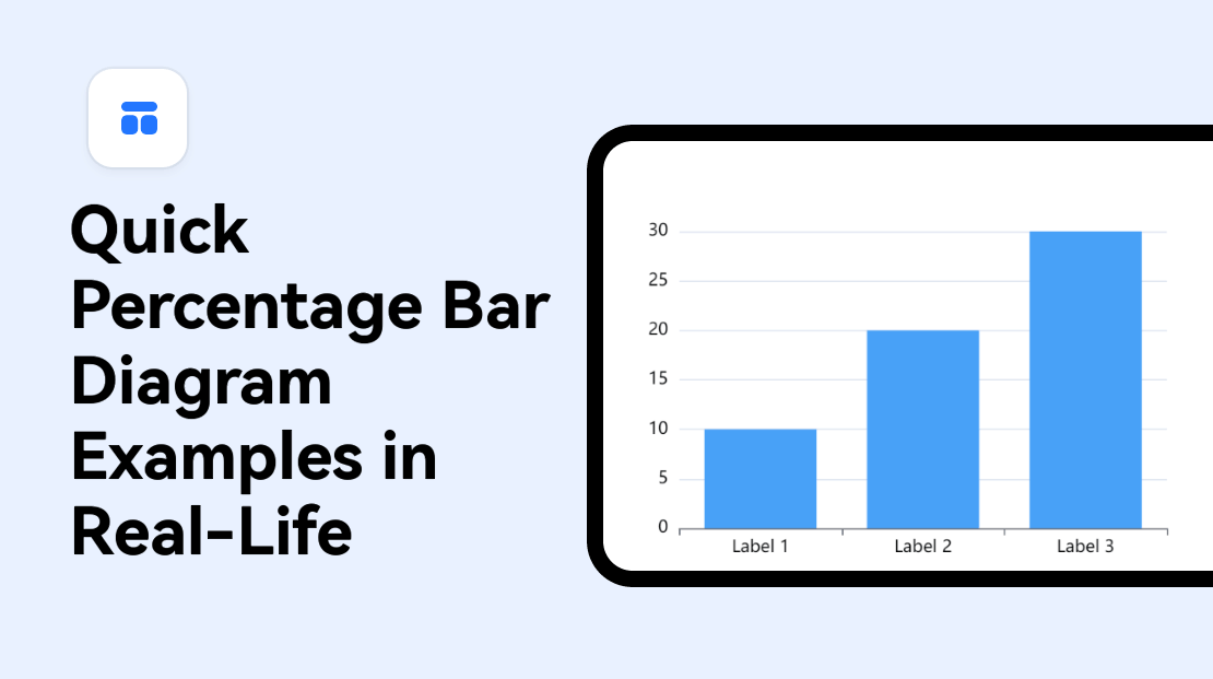
What Is a Percentage Bar Diagram
A percentage bar diagram is a type of graph that is often used to compare multiple sets of data. It represents statistical data of various observations when they are expressed in the form of percentages.
Essentially, the bar diagram shows the percent value of each category in the dataset compared with the total of all categories. The percentage bar graph is also known as a divided bar graph and is based on the proportion of each category in the dataset.
How Do Percentage Bars Work
Percentage bar diagrams represent the relative proportion of categories within a dataset as a percentage. Using a percentage bar graph maker allows you to demonstrate how each category in a dataset is related to the rest. Each bar has a varying length that is proportional to the percentage of that category in the dataset. Ultimately, you can compare the proportion of different categories or data sets.
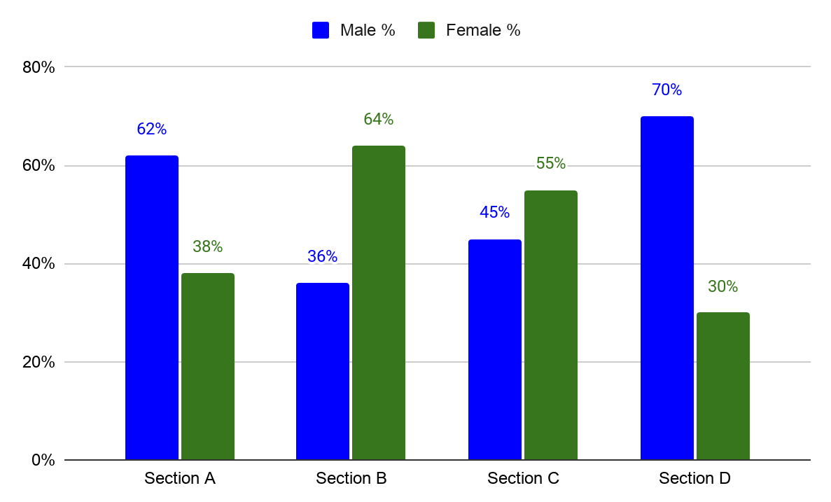
Percentage bar diagrams are important because they express the data in the form of percentages for every observation. They can be presented in a horizontal or vertical format, with each bar having a varying height that represents the percentage proportion of that component. They can also be drawn in double, stacked, or multiple formats depending on the purpose of the chart.
However, drawing a percentage bar graph can be tricky. The data used must strictly be in the form of percentages. If not, you have to convert the data first into respective percentages before using a percentage bar graph maker.
Pros and Cons of a Percentage Bar Graph
Percentage bar graphs are associated with several benefits and drawbacks.
Pros
- Quick and easy to create and interpret.
- Summarize a large data set in visual form for easier comprehension.
- Effective when comparing different categories within a data set or differences between data sets.
- Clearly shows the overall distribution and relative proportion of multiple categories.
- Allows a visual check of the reasonableness and accuracy of calculations.
Cons
- Cannot show trends over time and some values may be disproportionately represented based on the chosen range of the axis.
- Can be difficult to read from a large number of categories or complex data set.
- Does not represent negative values and can create a misleading visualization when the scale is not properly adjusted.
- Can be misleading when the data is not presented clearly or the data presented has been manipulated in some way.
3 Classic Percentage Bar Diagram Examples
The best way to understand different types of diagrams is to explore how they have been used in real life. Let’s have a look at a few classic percentage bar diagram examples.
Percentage Bar Diagram Example – 01
The following table shows the percentage of students who passed each subject in a class:
|
Subject |
Percentage Passed |
|
Math |
70% |
|
English |
90% |
|
Science |
75% |
|
Social Studies |
80% |
|
History |
65% |
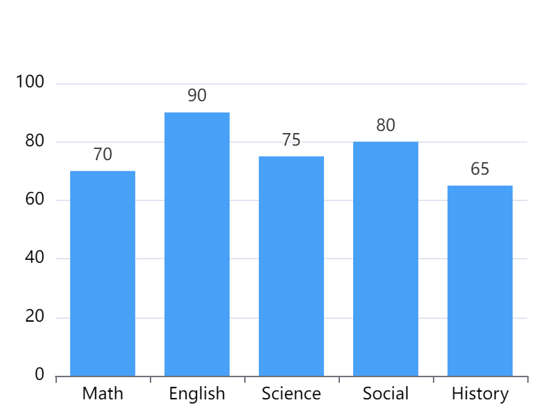
From the data, a percentage bar diagram portrays the visual performance of the students in the class. The highest percentage of the students passed English (90%) while the lowest passed History (65%). This information shows that most of the students struggle with History, and they would benefit more from studies focused on the subject. The teacher can use this information to plan the classes in a way that will empower the students to overcome their weak areas.
Percentage Bar Diagram Example – 02
The following table represents the percentage of sales for each product category in a store:
|
Product Category |
Percentage of Sales |
|
Food |
40% |
|
Electronics |
20% |
|
Clothing |
25% |
|
Other |
15% |
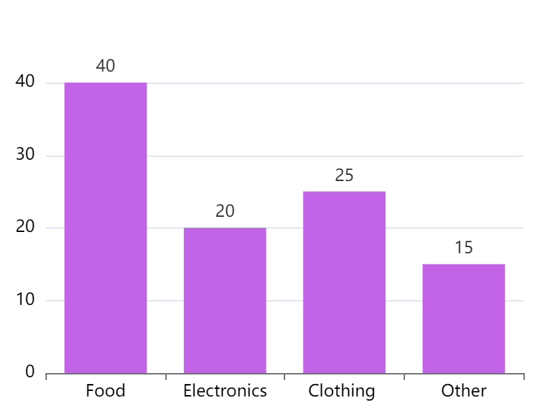
This data set shows that the Food Category had the highest percentage of sales (40%) while other non-classified products had the lowest percentage (15%). The owner of the store can use the information to identify the product categories that are most popular with the customers. This would be a good decision-making point for determining the product categories the store should focus on to generate more revenue. In particular, selling more food and clothing products has the potential to generate more revenue than other categories.
Percentage Bar Diagram Example – 03
The following shows the percentage of votes for each candidate in an election:
|
Candidate |
Percentage of Votes |
|
Candidate A |
55% |
|
Candidate B |
30% |
|
Candidate C |
15% |
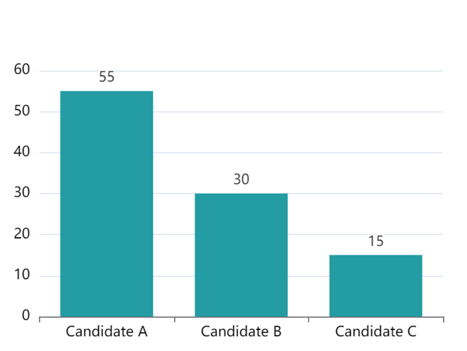
The percentage bar graph from the data represents the performance of each candidate in the elections. It shows that Candidate A won the election with 55% of the votes, Candidate B came second with 30% and Candidate C last with 15%. The graph also shows how the votes were distributed amongst the three candidates. The graph can be used by election analysts and future candidates to understand the voting patterns of the citizens.
A One-stop Percentage Bar Graph Maker - Boardmix
Making a percentage bar graph is not always complicated. With the right tools, you can bring your figures to life and visually explain a complex concept. Boardmix offers some of the easiest tools and features to help you create percentage bar graphs in minutes.
Introduction to Boardmix
Boardmix is an online collaborative whiteboard that offers a variety of data visualizations. The tool integrates various tools to boost teams’ imaginations, including percentage bar graphs related to ones. The platform is easy to use, making it attractive to beginners and experienced diagram experts. It also offers a variety of features to enhance the appearance and effectiveness of professional data visualizations.

How to Make a Percentage Bar Graph in Boardmix
Boardmix offers one of the easiest ways to make a percentage bar chart from scratch. The percentage bar graph maker allows you to input your data and quickly generate a chart for it. You can also choose the font, colors, or theme of your graph to match the purpose. Follow these simple steps to make a percentage bar chart with Boardmix.
- Go to the Boardmix website. Create a new account or log in to your existing one.

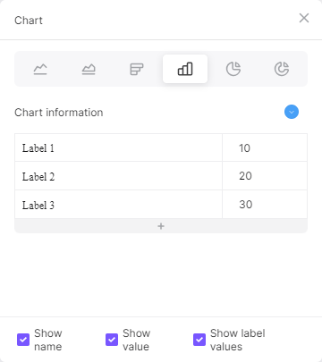
- Create a new board and enter the editor. From the left sidebar, click the 3-dot menu and choose the Chart option.
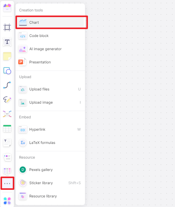
- Enter your data and add other elements to create or edit your percentage bar chart. You customize the colors, directions other formatting options to make the chart livelier.
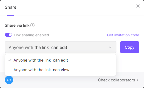
- Click on the Share button to share the chart with other users, including your team members. You can also export the chart in various formats and print it for other purposes.
There you go! It's such a simple and direct process to make a percentage bar graph in Boardmix. No matter what's your purpose, Boardmix is always a top-notch bar graph maker that you can never miss.
FAQ. What is the difference between a subdivided bar graph and a percentage bar graph
A subdivided bar graph is different from a percentage bar graph in that the bar corresponding to each phenomenon/category is divided into several components. Each component or part occupies a proportional part of the bar to its share in the total. For instance, each bar that corresponds to the number of students who passed different subjects can further be subdivided into girls and boys.
A percentage bar graph shows the total percentage of each component instead of the magnitude. In this case, the absolute magnitude of the components is presented using a subdivided diagram, which can further be converted into relative values. In other words, each data component in the graph is expressed as a percentage of the corresponding total.