In the world of data visualization, the bubble chart stands out as an informative and visually engaging way to display data. This unique tool allows for the representation of multiple dimensions of data in a simple, aesthetically pleasing format. In this guide, we will take you through how to make a bubble plot in Excel, and discuss the pros and cons of using Excel for creating bubble charts. You can also learn a versatile diagramming tool that can make the creation more smooth. Let’s get started.
What Is a Bubble Chart
A bubble chart is a variation of the scatter plot. Like scatter plots, bubble charts use a Cartesian coordinate system to plot points along a grid where the X and Y axes are numerical. However, the defining feature of a bubble chart is its third data dimension: the size of the bubbles.
In a bubble chart, each data point is represented by a bubble. The position of the bubble on the X and Y axes indicates two dimensions of data, while the size of the bubble represents a third dimension. In some cases, a fourth dimension can also be introduced through the color of the bubbles.
How to Make a Bubble Chart in Excel
Creating a bubble chart in Excel is a straightforward process. Here's how:
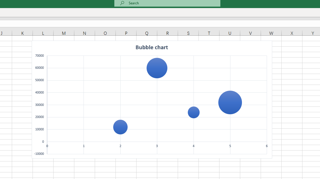
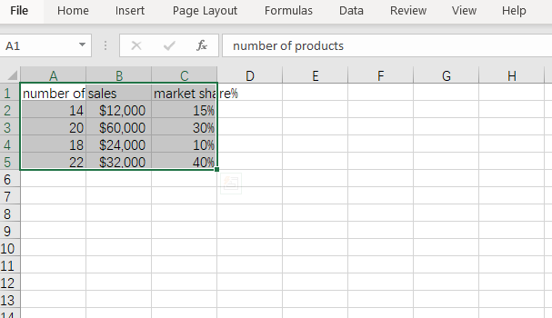
Input your Data: Start by entering your data into the Excel spreadsheet. Ensure that you have three sets of values for each data point - one for the X-axis, one for the Y-axis, and one for the bubble size.
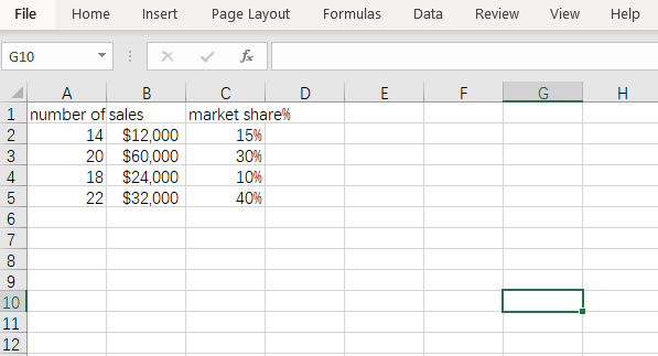
Select your Data: Select all the cells that contain your data.
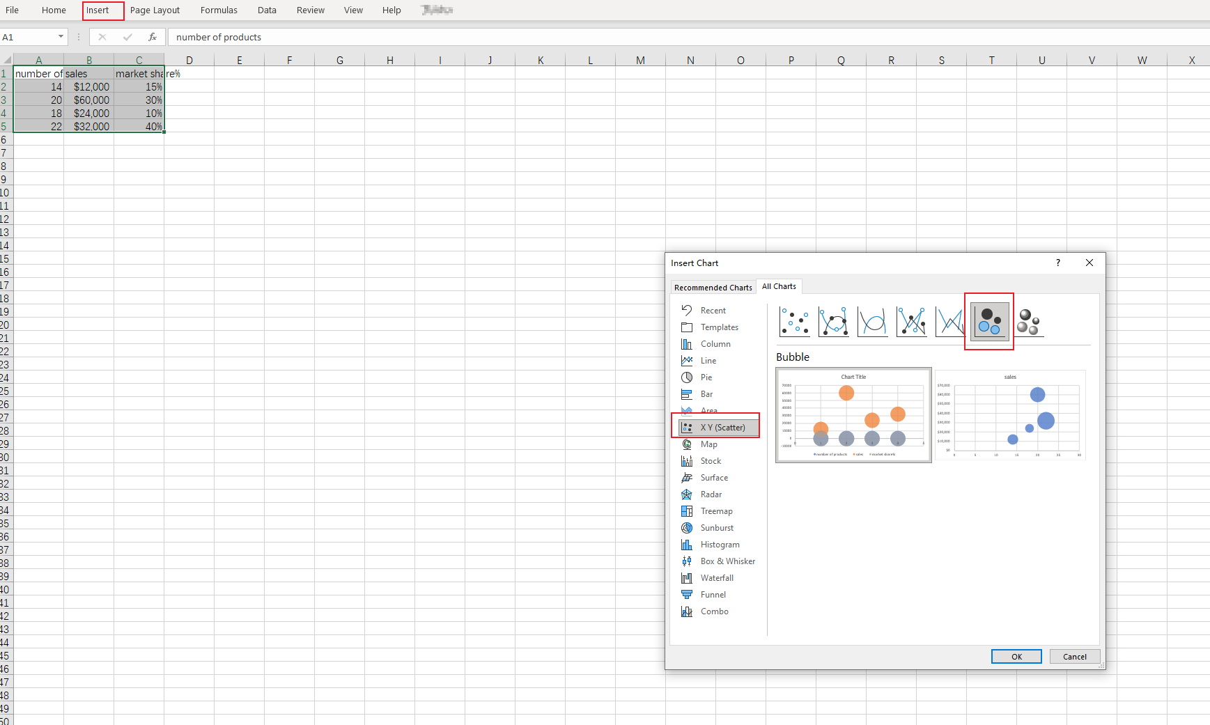
Choose Chart Type: Navigate to the 'Insert' tab in Excel's main menu, click on 'Chart', and then select 'bubble chart' from the list of options.
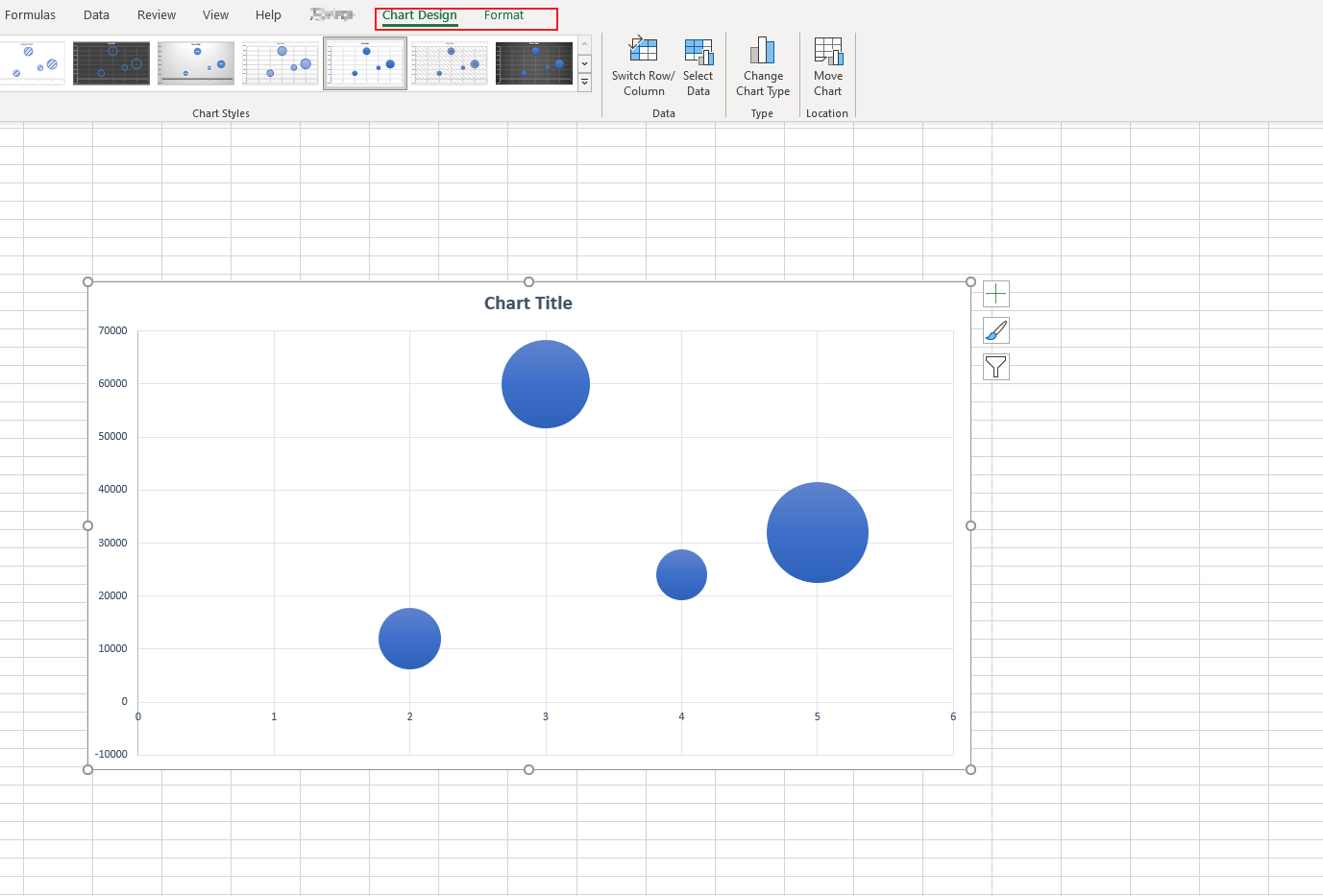
Customize Your Chart: Excel will generate a bubble chart from your selected data. You can customize this chart by adding chart labels, changing color schemes, adjusting bubble sizes, and more.
Pros and Cons of Making a Bubble Chart in Excel
While Excel offers an easy and convenient way to create bubble charts, it also comes with its own set of pros and cons.
Pros
- Accessibility: Excel is a widely used software, making it accessible to most users.
- Ease of Use: The process of creating a bubble chart in Excel is simple and intuitive.
- Customizability: Excel offers several options to customize your chart according to your preference.
Cons
- Limited Scalability: If you're working with large datasets, Excel may become slow and less responsive.
- Limited Design Options: Although Excel offers basic customization options, it doesn't match the advanced design features provided by some specialized data visualization tools.
- Complexity: For beginners, understanding how to interpret and create a bubble chart can be complex.
Bubble charts are a powerful tool in data visualization that can provide meaningful insights when used correctly. Excel serves as a versatile platform for creating these charts but does have some limitations that users should be aware of.
A Versatile Bubble Plot Maker - Boardmix
In today's data-driven world, making sense of large datasets can be challenging. Visualizing data with tools like bubble plots can simplify this task, making it easier to identify patterns and gain insights. This is where Boardmix comes into play. As an online collaboration tool, Boardmix doesn’t just offer project management features, but also excels as a versatile bubble plot maker. Here are some of its key features.

1. Easy to Use Interface
Boardmix has an intuitive interface that even first-time users can navigate easily. The steps for creating a bubble plot are logically laid out and easy to follow. From importing data to choosing the plot type and customizing the plot, each step is straightforward and efficient.
2. Versatility in Data Input
Boardmix offers flexibility when it comes to data input. Users have the option to manually input their data or import it from other sources. Boardmix supports several file types for import, allowing users to work with the data in the format they're most comfortable with.
3. Advanced Customization Options
With Boardmix, you can customize your bubble chart to fit your specific needs. You can adjust bubble sizes, choose different color schemes, add labels, and more. The customization options are easy to use, allowing users to create visually pleasing and informative Bubble Plots.
4. Collaborative Features
One feature that sets Boardmix apart is its collaborative functionality. Once a bubble chart is created, it can be shared with team members for collaborative editing. This promotes a shared understanding of the data and encourages productive discussions based on the visualized data.
5. Multi-purpose Utility
Bubble charts created on Boardmix are not limited to a single use. They can be included in project reports, presentations, or used as a standalone visual for sharing insights. With its ability to generate shareable links or embed codes, Boardmix extends the utility of its bubble plots beyond the platform itself.
6. Secure Data Handling
When working with sensitive data, security becomes a primary concern. Boardmix addresses this concern by implementing strict security measures. Users can be assured that their data is handled securely throughout the process.
In conclusion, Boardmix offers a comprehensive solution for creating bubble plots. Its ease of use, versatility, advanced customization options, collaborative features, multi-purpose utility, and secure data handling make it a standout choice as a Bubble Plot maker. Whether you're a data visualization expert or a beginner, Boardmix equips you with the tools you need to transform complex datasets into insightful visual narratives.