In the realm of data visualization, pie charts stand as one of the most universally recognized tools. Used across various fields like business, education, media, and science, pie charts help simplify complex data into easily comprehensible visual pieces.
This post will show you how to create a pie chart in Excel and analyze its pros and cons. You can also find a more versatile tool to finish the creation. Let’s dive in.
What Is a Pie Chart
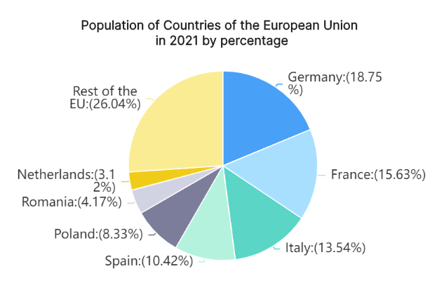
A pie chart is a circular graphic representation used to illustrate numerical proportions in a dataset. Each 'slice' of the pie represents a particular category's proportion in relation to the whole. The size of each section corresponds to the quantity it represents from the total value. This makes it easy to visualize parts-to-whole relationships and compare different categories at a glance.
How to Create a Pie Graph in Excel
Creating a pie graph in Excel is quite straightforward:
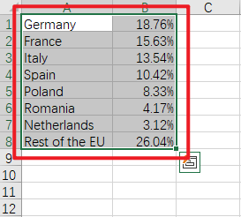
Organize your data: Your data should be placed in columns or rows on the Excel sheet.
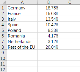
Select your data: Highlight the cells containing the data you want to include in your chart.
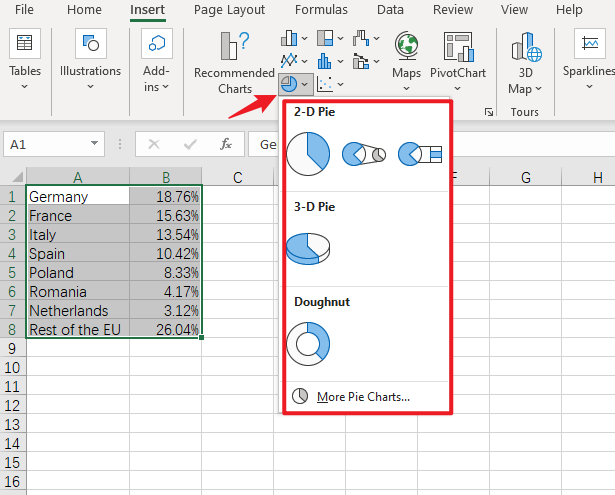
Insert Pie Chart: From the "Insert" menu, select the "Chart" option, then select "Pie Chart."
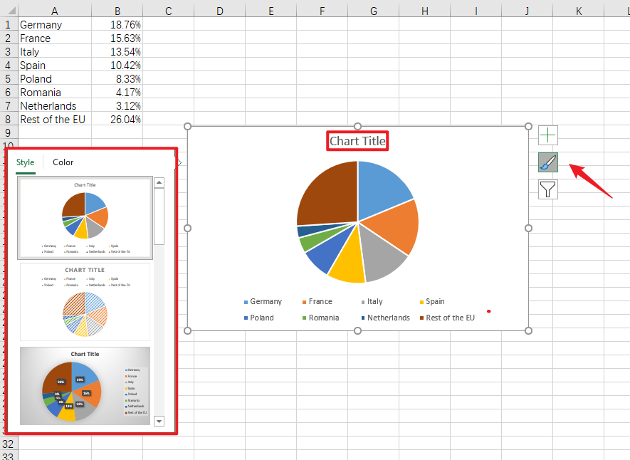
Customize your chart: Customize your pie chart by choosing colors, adding labels, setting a title, etc., by clicking on the "Chart Tools."
Pros and Cons of Building a Pie Chart in Excel
Building pie charts in Excel come with several pros and cons:
Pros
- Easy to Create: Google Excel provides easy steps and tools to create a pie chart.
- Visual Appeal: Pie charts provide an aesthetic visual representation that can be easily understood.
- Show Relative Proportions: They effectively display proportions and percentages amongst categories.
Cons
- Not for Complex Data: They can become confusing if too many categories are present.
- Lack of Precision: It can be hard to spot minor differences between slices.
- Two-Dimensional Limitation: The two-dimensional nature may not accurately represent data when there is a need for a three-dimensional view.
Despite these limitations, pie charts remain an excellent tool for simple data visualization tasks.
Create a Pie Chart in Boardmix
Boardmix is an innovative, intuitive, and powerful online platform that enables users to create professional and visually appealing charts, graphs, diagrams, and more. Its easy-to-use features and extensive selection of chart types make it a go-to choice for individuals and organizations to visualize and present their data.

Creating a pie chart on Boardmix involves several straightforward steps:
Step 1: Open the Boardmix application on your browser. You can either start a new board or choose an existing one where you want to create your pie chart.

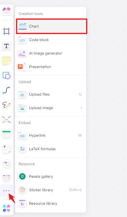
Step 2: Navigate to the menu bar located at the left side of the screen. Here, click the 3-dot menu and choose the “Chart” option.
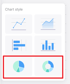
Step 3: Another submenu will show up displaying various types of charts that Boardmix supports. Choose "Pie Chart" from these options.
Step 4: Upon selecting "Pie Chart," a default pie chart will appear on your screen. This chart will also include a data table.
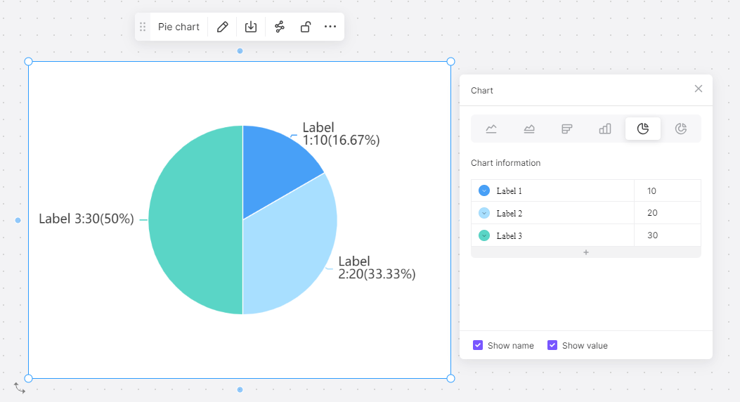
Step 5: Click on this data table to edit its contents. Input your data values in place of the default data. The pie chart will automatically update as you change the data in the table.
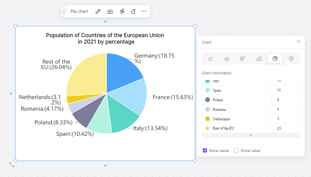
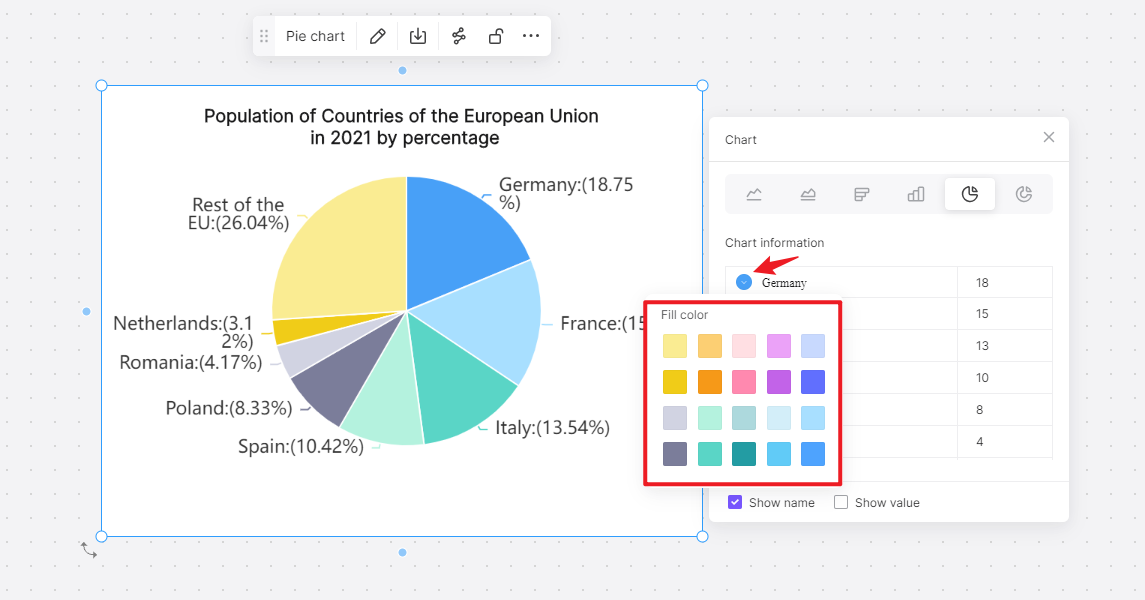
Step 6: After entering all your data, customize the chart to your preference. Boardmix offers a variety of customization options including adjusting the color scheme, adding labels, setting title, and much more.
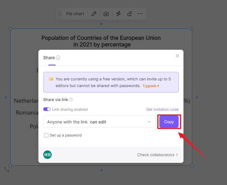
Step 7: Once you have completed your pie chart, name your board. You can then choose to share your project with others or export it in various formats for presentation.
In just a few simple steps, Boardmix allows you to turn complex data into clear, concise, and attractive visuals that facilitate better understanding and decision-making.
How to Choose: Build a Pie Chart in Excel or in Boardmix
Both Excel and Boardmix are effective tools for creating pie charts, each with its strengths. Your choice largely depends on the specific requirements of your project and your personal preferences. Here's a comparison to guide your decision:
Excel
- Ease of Use: Excel is commonly used and known by many. Its chart creation process is straightforward, making it easy for even beginners to make a pie chart.
- Data Analysis Tools: Excel comes packed with a variety of data analysis tools, which can be particularly handy if your pie chart is part of a larger data analysis process.
- Availability: As part of the Microsoft Office suite, Excel is readily available to many users.
Boardmix
- User-Friendly Interface: Boardmix features an intuitive user interface that makes pie chart creation a breeze.
- Real-time Collaboration: One major advantage Boardmix holds is the ability for real-time collaboration. Multiple users can work on the same chart, making it suitable for team projects.
- Variety of Chart Types: Beyond pie charts, Boardmix offers a wide range of other diagram types, all equally easy to create.
- Stylish Presentation: Boardmix charts are known for their sleek, professional appearance. They offer more customization options than Excel, allowing you to design more engaging charts.
In conclusion, if you're seeking simplicity and have data analysis needs, Excel could be your go-to option. However, if you're focusing on collaboration, presentation aesthetics, and have a variety of charts to create, Boardmix would serve you well. Just sign up and try Boardmix right now!