Data visualization is an integral part of today's information-driven world. Whether it is business reports, academic research, or market analysis, effectively representing data can aid in delivering clear insights. One such representation is the Pie Chart, a classic way to show the composition of a whole. With the help of Microsoft PowerPoint, one of the most widely used tools for creating presentations, you can quickly generate these visual aids to enhance your data.
In this article, we will discuss what a pie chart is and guide you through the process of creating one and insert it in PowerPoint. Keep reading.
What Is a Pie Chart
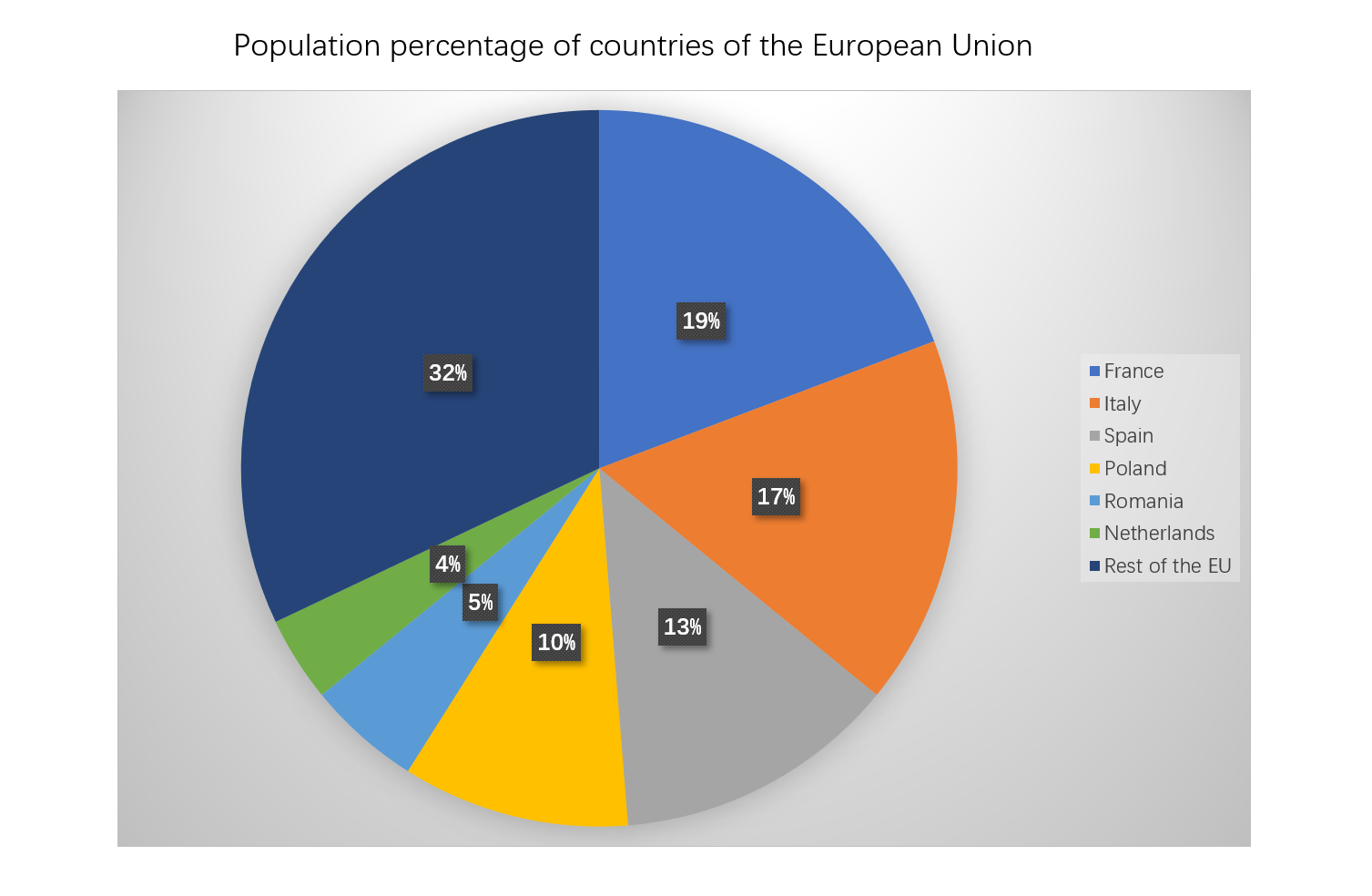
A pie chart is a type of graph that represents data in a circular format, where the entire circle represents the whole or total data set. This whole is divided into 'slices' or sectors, each depicting a particular category. The size or angle of each slice is proportional to the quantity it represents from the total.
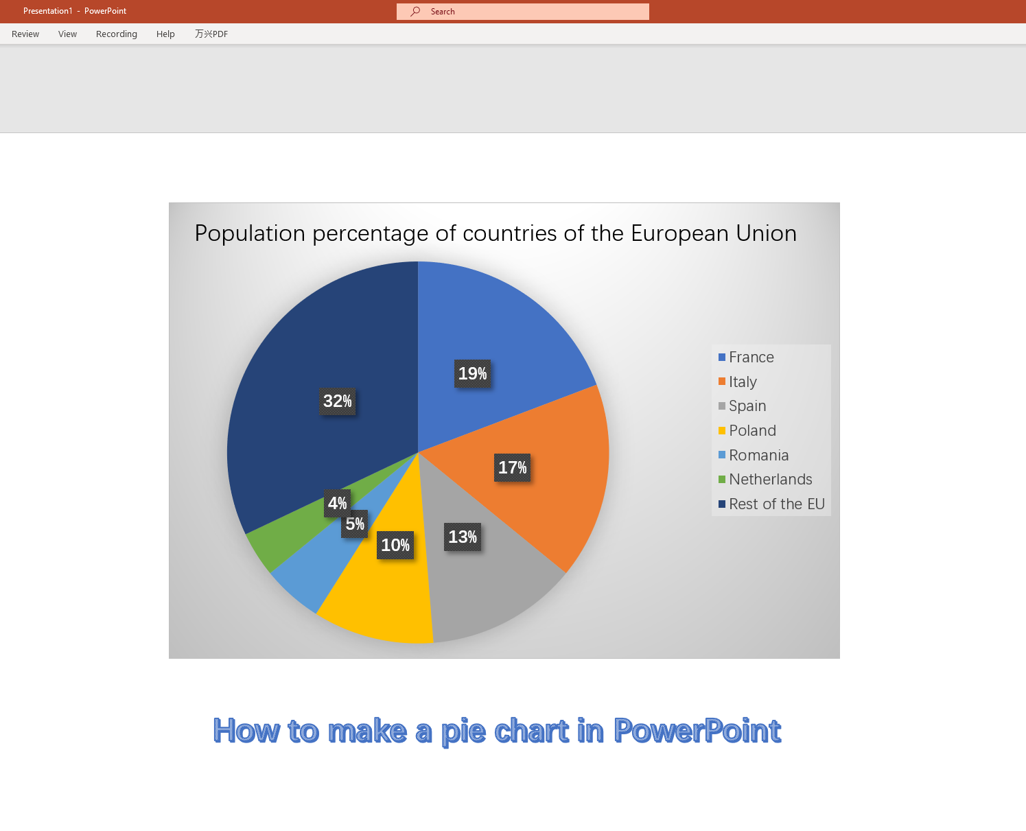
Pie charts are particularly useful when you want to visualize a small categorical data set as they clearly display the relative sizes of the categories. They offer a quick, visual understanding of the proportional distribution of the data and are commonly used in presentations and reports for this reason.
How to Create a Pie Chart in PowerPoint
Creating a pie chart in PowerPoint is a straightforward process that requires only a few steps.
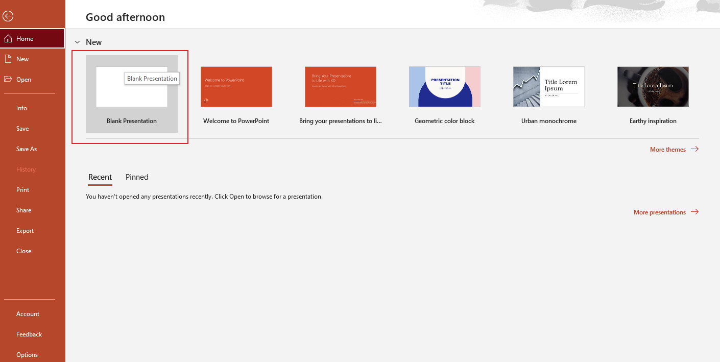
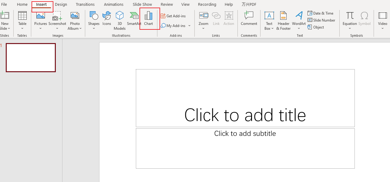
Step 1: Open PowerPoint and Choose Slide
Launch Microsoft PowerPoint and select or create a new slide where you want to add your pie chart.
Step 2: Insert Chart
Click on the "Insert" tab on the ribbon toolbar at the top. Then select the "Chart" option, which opens up a dialog box.
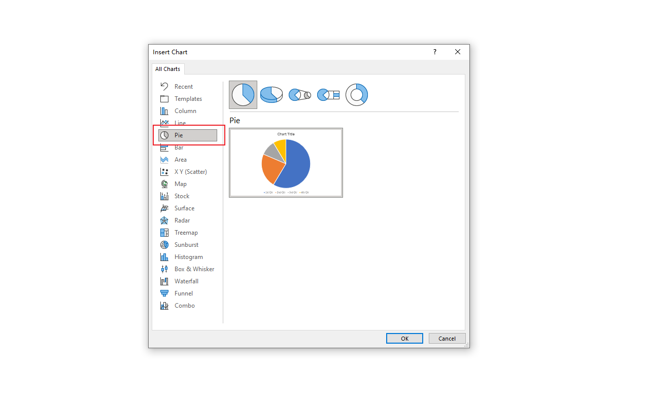
Step 3: Select Pie Chart
In the dialog box, you will see a variety of chart types listed in the left pane. Click on "Pie" and then choose the specific style of pie chart you prefer on the right side. Click "OK" to proceed.
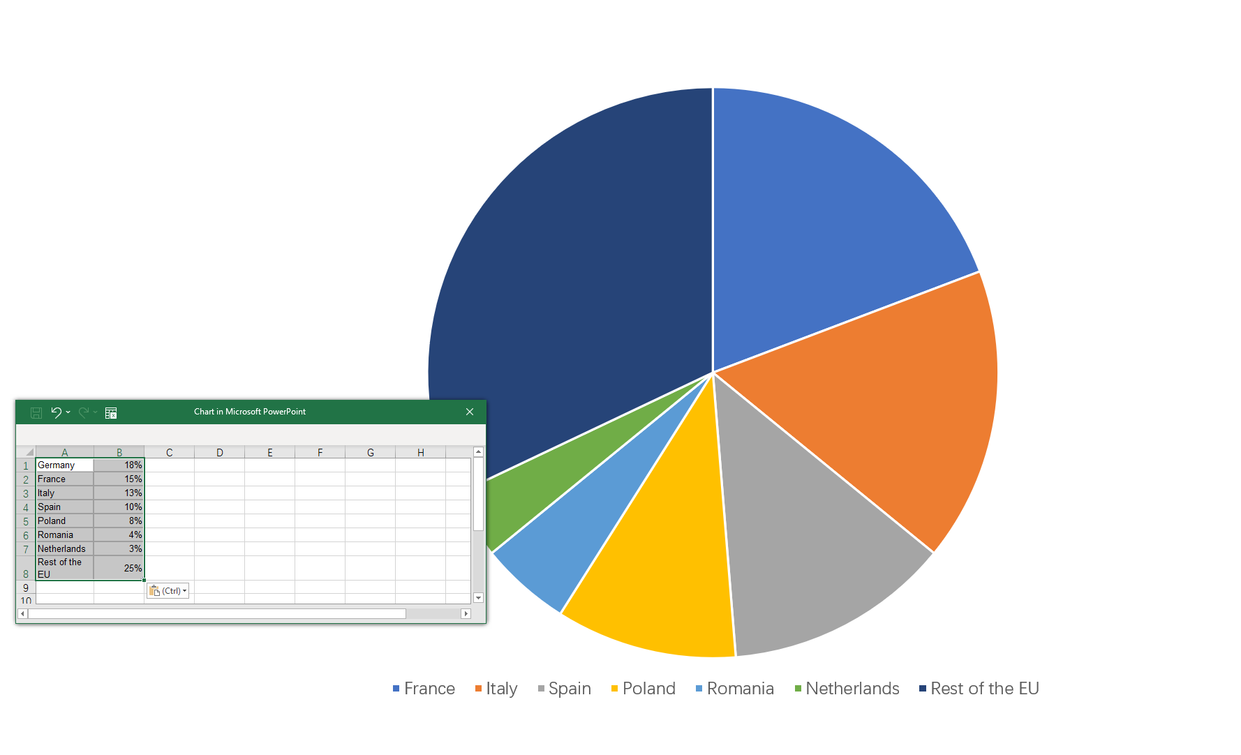
Step 4: Enter Data
Upon clicking "OK", an embedded Excel spreadsheet will open with sample data. Replace this data with your own. The pie chart on your PowerPoint slide will automatically update as you input your data.
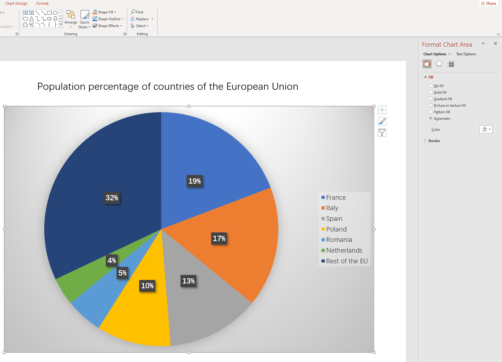
Step 5: Customize Your Chart
After adding your data, you can customize your chart using different colors, adding labels, changing font sizes, and much more. Explore the "Chart Tools" tabs that appear on the toolbar when your chart is selected.
Step 6: Finalize
Once you have customized your pie chart according to your needs, click anywhere outside the chart to finish. Your pie chart is now ready and inserted into your slide.
Creating a pie chart in PowerPoint is an effective way to present your data visually. It helps clarify relationships within the data, making it easier for audiences to digest and understand presented information.
Pros and Cons of Inserting a Pie Chart in PowerPoint
Pie charts are a great way to represent data in presentations, but like any tool, they have their strengths and weaknesses. Here are some of the pros and cons of Inserting a pie chart in PowerPoint:
Pros
- Easy to Understand: Pie charts divide data into neat slices that make it easy to see relative proportions at a glance.
- Customizable: With PowerPoint, you can easily customize your pie chart with different colors, labels, legends, etc., to match your presentation theme.
- Integrates with Excel: You can seamlessly import and update data from an Excel spreadsheet, which makes handling complex data sets easier.
Cons
- Not Ideal for Large Data Sets: Pie charts can become confusing and hard to read if there are too many categories or slices.
- Difficult to Compare: It's often hard to compare slight differences between slices in a pie chart. Bar or line charts may be better suited for comparisons.
- Dependent on Proper Ordering: For clarity, slices should be arranged in a certain order, either ascending or descending; otherwise, it might confuse the audience.
While pie charts are not always the best choice for every situation, when used appropriately and designed carefully, they can be an effective method to present your data in PowerPoint.
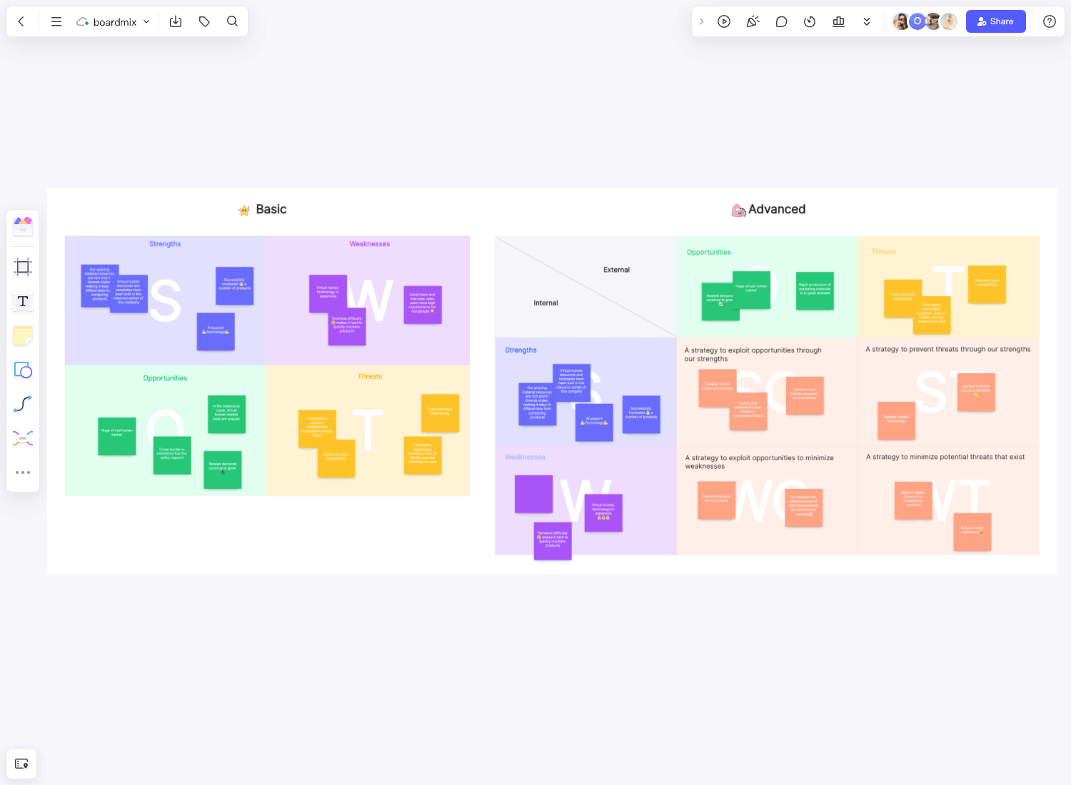
How to Create a Pie Chart in Boardmix
In the era of data-driven decision making, an easy-to-use and intuitive data visualization tool is vital. Boardmix is one such powerful tool that enables users to transform complex data into simple, comprehensive, and interactive visualizations. Among the range of visuals available, one of the most universally understood and used is the Pie Chart.

In Boardmix, creating a pie chart is straightforward. This circular statistical graphic divided into slices represents the proportions of different categories, thereby simplifying the understanding of part-to-whole relationships. Here, we provide a detailed guide on how to create a pie chart in Boardmix.
Creating a pie chart in Boardmix involves several steps:
Step 1: Launch Boardmix
Start by launching Boardmix on your device. You can access it through a web browser or as an application if installed.

Step 2: Create a New Board
Once Boardmix opens, create a new board in which you wish to create the pie chart.

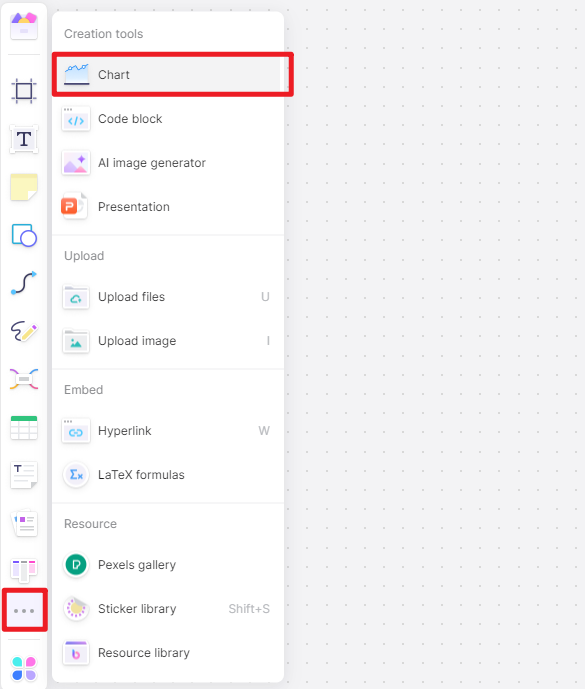
Step 3: Insert a Pie Chart
Click on the 3-dot menu in the left corner. This will open a submenu displaying various tools. Among all the options available, click on "Chart" and then choose “Pie chart.”
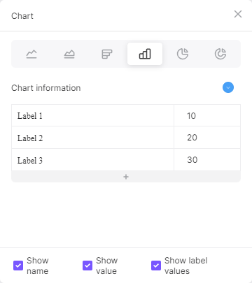
Step 4: Input Data
After selecting the Pie chart, Boardmix will display a new blank chart on the canvas. You can click the pen icon to input your data.
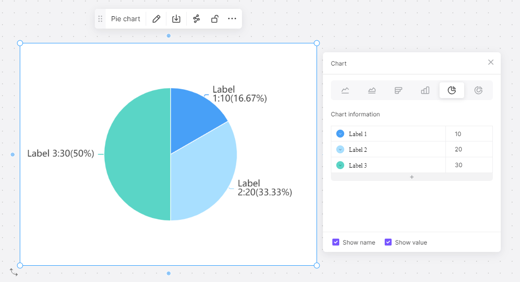
Step 5: Customize Your Chart
Once your data has been inputted, you can customize your pie chart as needed. You can change colors, adjust labels, modify size and alignment of slices, and much more. Boardmix offers a plethora of customization options.
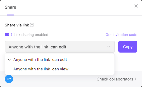
Step 6: Share Your Chart
After customization, you can then share your pie chart with others via link or email. You can also embed it into presentations or reports.
While the steps might vary slightly based on different versions or updates of Boardmix, this guide should provide you with the fundamental knowledge needed to create an impressive pie chart in Boardmix.
Creating engaging visuals like pie charts isn't just about data representation; it's about telling a story with your data that's simple to understand yet impactful. By using tools like Boardmix to their full potential, you can help your audience better understand the narratives behind your numbers.
How to Choose: Create a Pie Chart in PowerPoint or in Boardmix
When choosing between PowerPoint and Boardmix, there are several factors to consider: ease of use, design options, interactivity, collaboration possibilities, and accessibility.
Ease of Use
If you are familiar with Microsoft's interface and already use it for various purposes, then you might find it easier to use PowerPoint for creating pie charts. On the other hand, although Boardmix may have a slight learning curve, it can be highly intuitive once you get the hang of it.
Design Options
When it comes to design options, Boardmix has an edge. It offers numerous customization options, allowing users to change colors, fonts, sizes, and layout. In contrast, PowerPoint's options can be somewhat limited in comparison.
Interactivity
Interactive pie charts can make your data more engaging for your audience. Boardmix shines in this aspect as it lets you create dynamic charts that viewers can manipulate. Conversely, PowerPoint does not inherently offer interactivity with its pie charts.
Collaboration
If your work involves team collaboration, then this factor is vital. PowerPoint has collaborative features through its online version. However, Boardmix, designed as a web-based tool from the outset, offers more seamless collaboration.
Accessibility
PowerPoint, being part of Microsoft Office Suite, has a widespread presence in corporate environments and is available on various devices. In contrast, as a web-based tool, Boardmix can be accessed anywhere with an internet connection but requires a subscription.
Your choice between PowerPoint and Boardmix depends on what you value more in a tool. If you need an accessible tool with a familiar interface and sufficient capabilities for creating simple pie charts, PowerPoint might be the better option.
However, if you value advanced customization options, interactivity, enhanced collaboration features, and don't mind the subscription cost or learning curve, then Boardmix is likely the superior choice for creating pie charts. Just try it out now!