In the realm of data visualization, the use of graphs, charts, and diagrams plays an invaluable role in communicating intricate information effectively. It's about transforming raw data into something meaningful, insightful, and easy to understand. In this context, one of the simplest yet most potent tools is the humble Pie Chart. It is an elegantly simple visualization that presents categorical data in a circle.
This article will show you every detail about how to make a pie chart in Google sheets. You can also learn a different but more convenient way to finish the creation. Let’s get started.
What Is a Pie Chart
A pie chart is a circular statistical graphic divided into slices to illustrate numerical proportions. Each 'slice' corresponds to a percentage in a category, and the total of all slices adds up to 100%, forming a circular whole like a pie. The beauty of a pie chart lies in its ability to depict information in a digestible, visual format quickly.
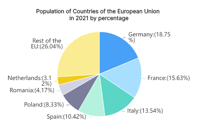
This graphical tool has found wide-ranging applications across various fields, such as business for market segmentation, research for survey results analysis, media for demographic distribution, education for teaching data visualization and more. In all these areas, pie charts help visualize complex data sets into easily comprehensible slices.
How to Make a Pie Chart in Google Sheets
The simplicity and utility of pie charts have made them prevalent in data manipulation platforms like Google Sheets. This free web-based tool allows users to create dynamic pie charts swiftly with just a few clicks.
Here's how you can make your own pie chart using Google Sheets:
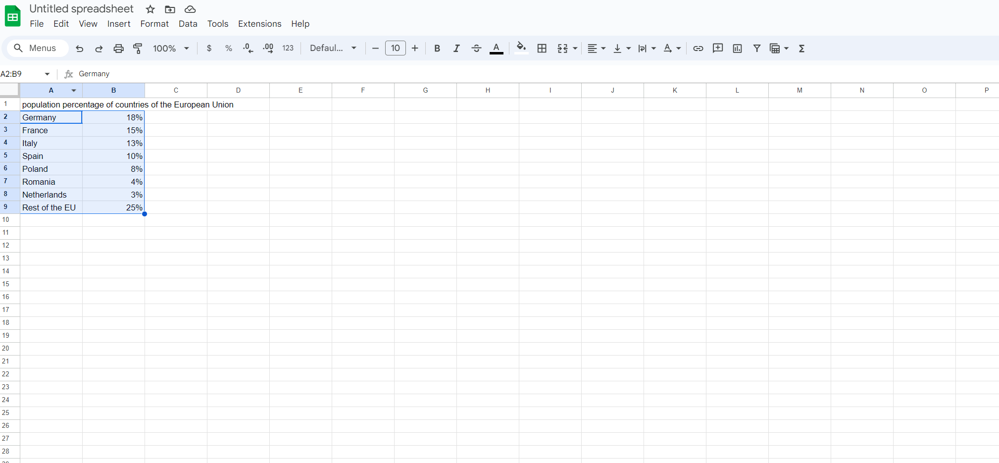
Create or Import Data: Firstly, start by either creating your data set within Google Sheets or importing an existing one.
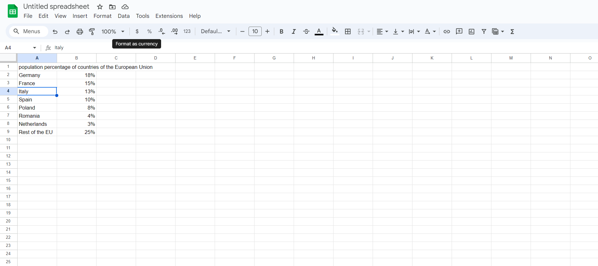
Highlight Data: Once your data is ready, highlight the cells that contain the information you wish to represent graphically.
Choose Chart Type: Navigate to the 'Insert' menu and select 'Chart'. A new window will open on the right-hand side of your screen where you can choose the chart type.
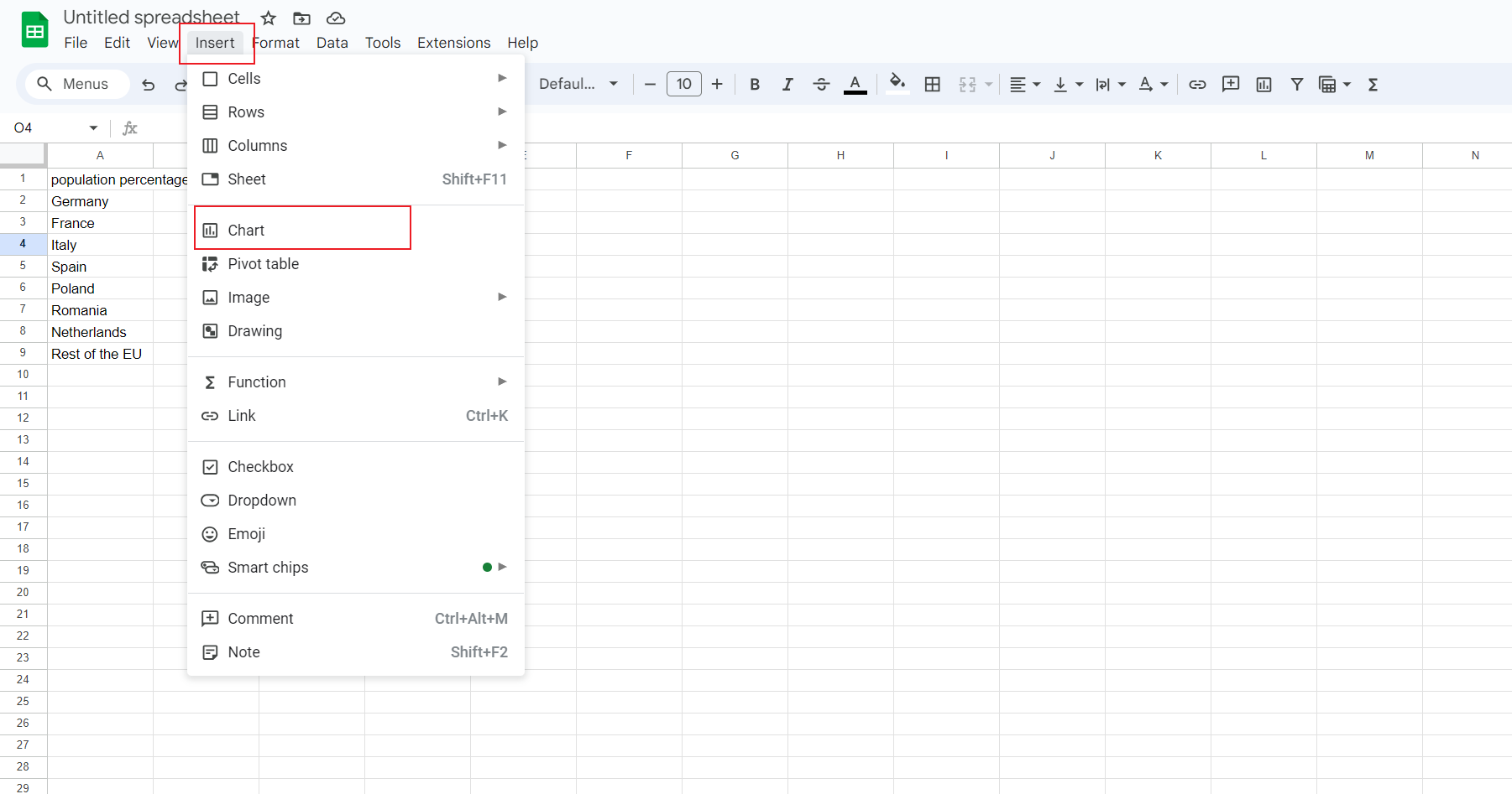
Select Pie Chart: Under the chart type drop-down menu, select 'Pie chart'. Google Sheets will immediately create a basic pie chart based on your data.
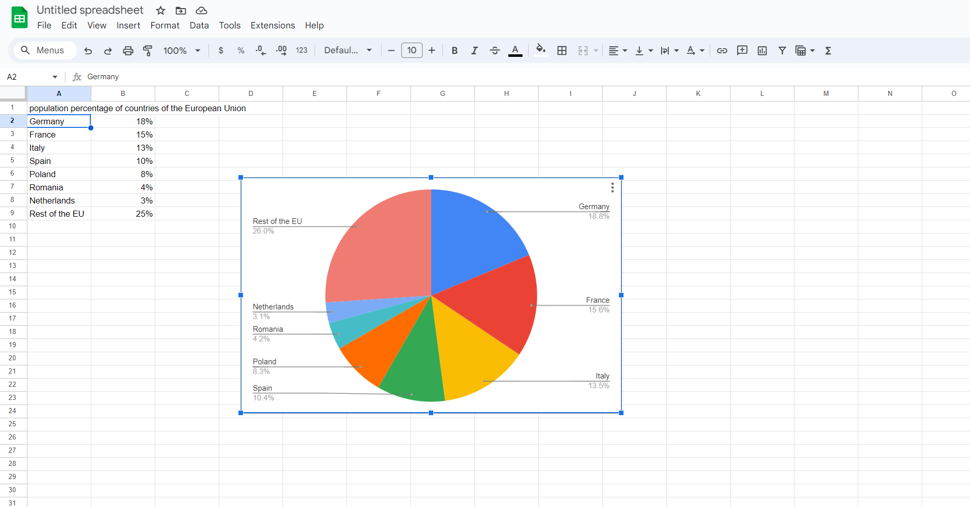
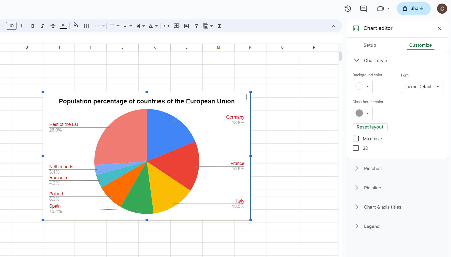
Customize Your Pie Chart: Lastly, make your pie chart more informative by adding labels, adjusting colors or sizes of slices, changing the title, and more.
It's easy to see why Google Sheets is so popular for creating pie charts - its accessibility, intuitive design, and customization options make it an excellent choice for data visualization.
Pros and Cons of Making a Pie Chart in Google Sheets
While creating pie charts in Google Sheets offers many advantages, like any tool, it comes with its set of drawbacks. Understanding both can help us utilize this tool optimally.
Pros
- Easy to Use: Google Sheets provides an intuitive user interface that makes it easy even for beginners to create professional-looking pie charts.
- Free and Accessible: As part of Google's free suite of productivity tools, it's accessible anywhere with internet access and doesn't require any special software installation.
- Collaborative: Multiple people can work on the same sheet simultaneously, making it perfect for team projects.
- Customizable: Google Sheets offers numerous options for customizing your pie chart, from colors and labels to titles and legends.
Cons
- Oversimplification of Data: Pie charts can sometimes oversimplify data, leading to loss of detail and context.
- Difficult to Compare: It can be challenging to compare data across multiple pie charts.
- Not Suitable for Large Datasets: Pie charts can become cluttered and hard to read when dealing with many categories or large data sets.
Ultimately, the efficacy of a pie chart depends on the nature and complexity of the data at hand. As with any form of data visualization, understanding your data and your audience's needs are key to choosing the most effective tool for communication.
How to Create a Pie Chart in Boardmix
Boardmix is a powerful tool that has risen in prominence in recent years due to its comprehensive capabilities for data visualization and collaboration. One such visualization that holds high utility in Boardmix is the Pie Chart. In the upcoming sections, we delve into a step-by-step guide on how to create a pie chart using Boardmix.

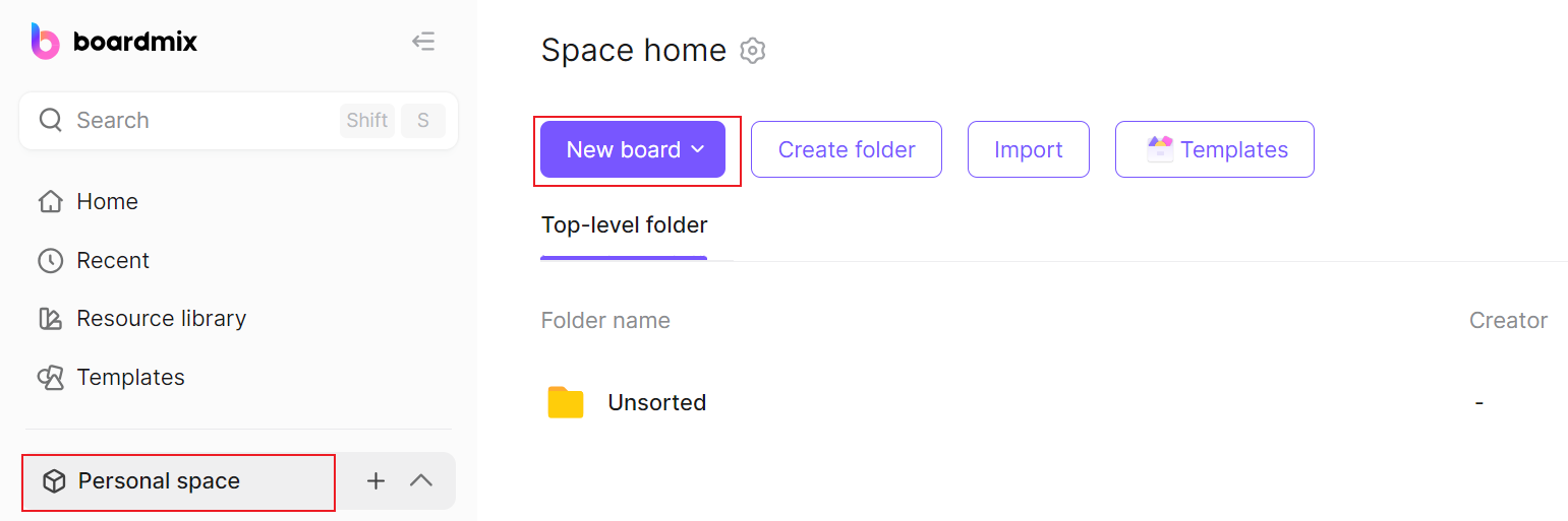
Step 1: Access Boardmix Dashboard
Log into your Boardmix account and navigate to your dashboard. The dashboard is where all your data and projects reside. Create a new board you wish to hold a pie chart.
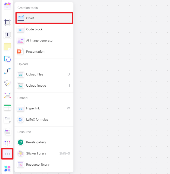
Step 2: Insert a Pie Chart
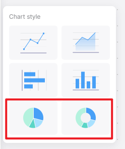
Head over to the 3-dot menu on the left side and select 'Chart' from the dropdown menu. This will open a chart menu where you need to select 'Pie Chart' among the options.
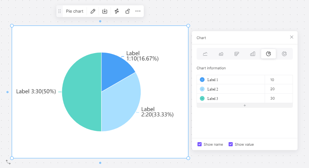
Step 3: Assign Data to the Pie Chart
Once you have your empty pie chart on the board, it's time to assign data to it. Click on the chart and go to the 'Chart Editor' on the panel. Here, select your preferred data range by specifying the rows and columns of your dataset.
Step 4: Customize Your Pie Chart
After feeding in your data, you can now customize your chart as per your requirements. You can add labels, change color schemes, adjust slice sizes, and modify the title and legend to provide a comprehensive picture of your data.
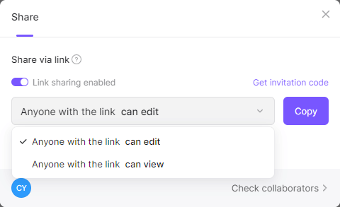
Step 5: Sharing Your Work
Finally, share your work with team members or stakeholders. Boardmix provides options for sharing via email, link sharing, or even embedding the chart on external platforms.
Pie charts created in Boardmix offer an excellent way to showcase percentage or proportional data visually. They can communicate a lot of information at a glance, making it easier for viewers to digest complex data sets quickly. They also add aesthetic appeal to reports and presentations, making them more engaging and interesting.
That being said, like any other tool, creating pie charts in Boardmix should be done with proper understanding and discretion. Use them where they make sense and are effective - mainly when dealing with categorical data that forms parts of a whole. Avoid using them for comparing individual categories or when the data set is too large or complex.
Boardmix, with its superior features and functionalities, stands as an essential tool for data visualization. Harnessing its full potential can enable individuals and businesses to communicate information more effectively, leading to better decision-making and greater success.
When faced with the choice between Google Sheets and Boardmix for creating pie charts, various factors come into play. Each tool comes with its own set of features, advantages, and limitations. In this article, we delve into these aspects to help you make an informed choice.
How to Choose: Make a Pie Chart in Google Sheets or in Boardmix
Factors to Consider
Data Size
If you are dealing with small to medium-sized datasets, Google Sheets should suffice. However, if your data is more complex or large-scale, Boardmix’s ability to handle significant data quantities could make it the better option.
Collaboration
Google Sheets shines when it comes to real-time collaboration. If you need multiple individuals to simultaneously work on creating or modifying the chart, Google Sheets might be the better choice. While Boardmix also supports collaboration, its functionality is not as seamless as that of Google Sheets.
Data Security
Boardmix might be more suitable if data security is a priority. It provides robust data protection measures, ensuring that your sensitive information is secure.
Customization
While both platforms allow pie chart customization, Boardmix provides more advanced options. You can add interactive elements to your pie charts in Boardmix, making them more engaging for the viewer.
Ease of Use
Google Sheets’ interface is straightforward and user-friendly, even for beginners. Although Boardmix’s dashboard offers more extensive features, it might be slightly overwhelming for first-time users.
Versatility
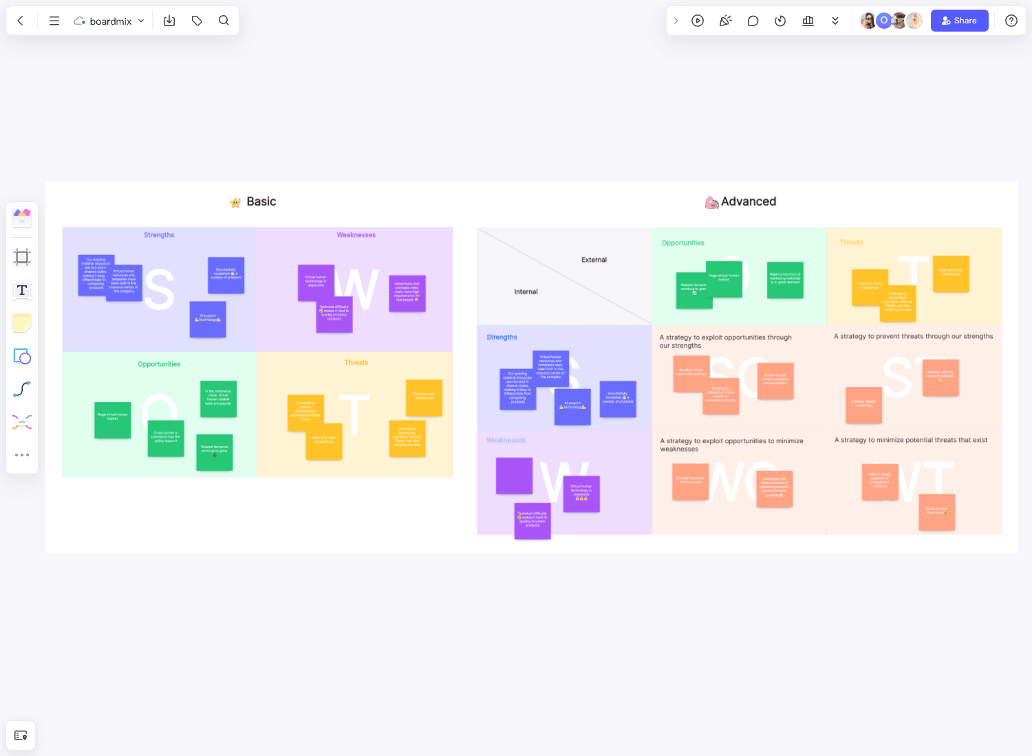
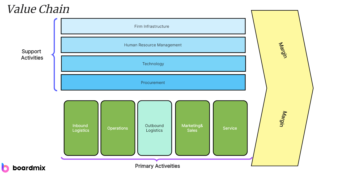
Google sheets is suitable for people who only need the chart making features, while Boardmix comes with more diagramming options like mind map, flowchart, concept map, org chart and more. To make the diagramming process more smooth, it also provides various ready-to-go templates.
Choosing between Google Sheets and Boardmix for creating pie charts essentially boils down to your specific requirements. If real-time collaboration and simplicity are your priorities, and you’re working with smaller datasets, Google Sheets would be a great fit. However, if you’re dealing with larger datasets and need a tool with advanced visualization options and high data security, Boardmix could be the ideal choice.