A bubble chart is a data visualization tool that uses bubbles of different sizes and colors to display multidimensional information. Its value lies in its ability to simultaneously show relationships among multiple variables and the distribution of data points. By using a bubble chart, trends, patterns, and outliers can be easily identified, aiding decision-makers in better understanding the data. This article will provide a detailed explanation of bubble charts, including their concepts, uses, characteristics, and how to create them. Let's dive in!
What is a Bubble Chart?
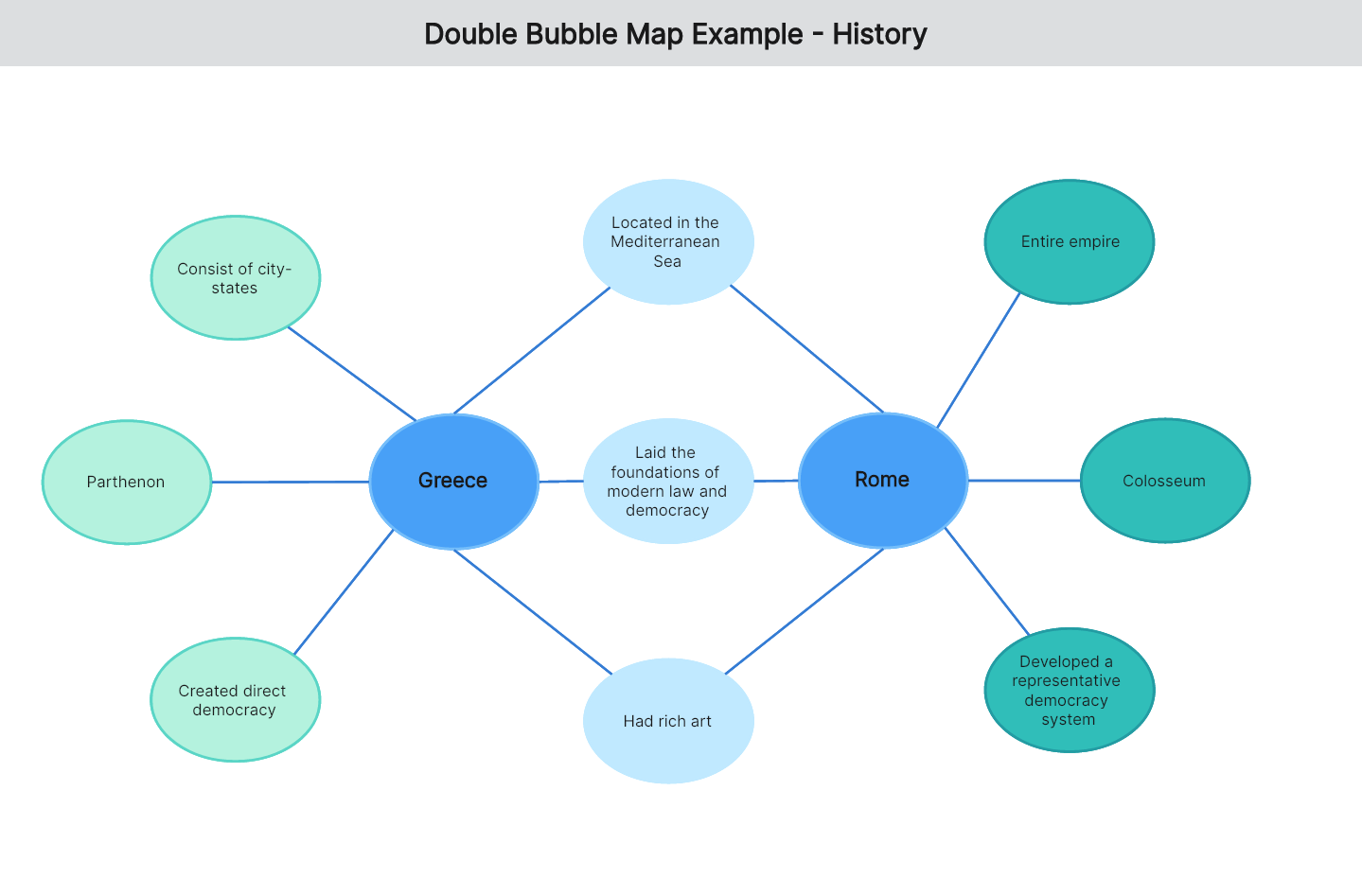
A bubble chart is a type of multivariate chart that can be seen as a variation of a scatter plot, where the points are represented as bubbles of varying sizes. These bubbles use size and color to represent different variables, often color-coded to differentiate data categories, and are commonly used to compare and display relationships between different categories.
As a way of displaying multidimensional data, bubble charts can simultaneously show multiple variables, making data analysis and information communication more intuitive and efficient. For instance, in statistical analysis, a bubble chart can be used to show and compare numerical values, displaying different data situations through the size and color of the bubbles. In data visualization, bubble charts convey information through the size, position, and color of circular bubbles, helping us better process and present data. In information transmission, bubble charts can present complex numerical relationships in a simple, clear manner, allowing us to quickly understand the story behind the data.
How to Interpret a Bubble Chart
A bubble chart is a type of multivariate chart that can display the relationships between three or more variables. When viewing a bubble chart, focus on the following key aspects to better understand the relationships between the variables.
Axes: Bubble charts typically have two axes representing different variables. By understanding the labels and values on these axes, you can interpret the relationships between the variables.
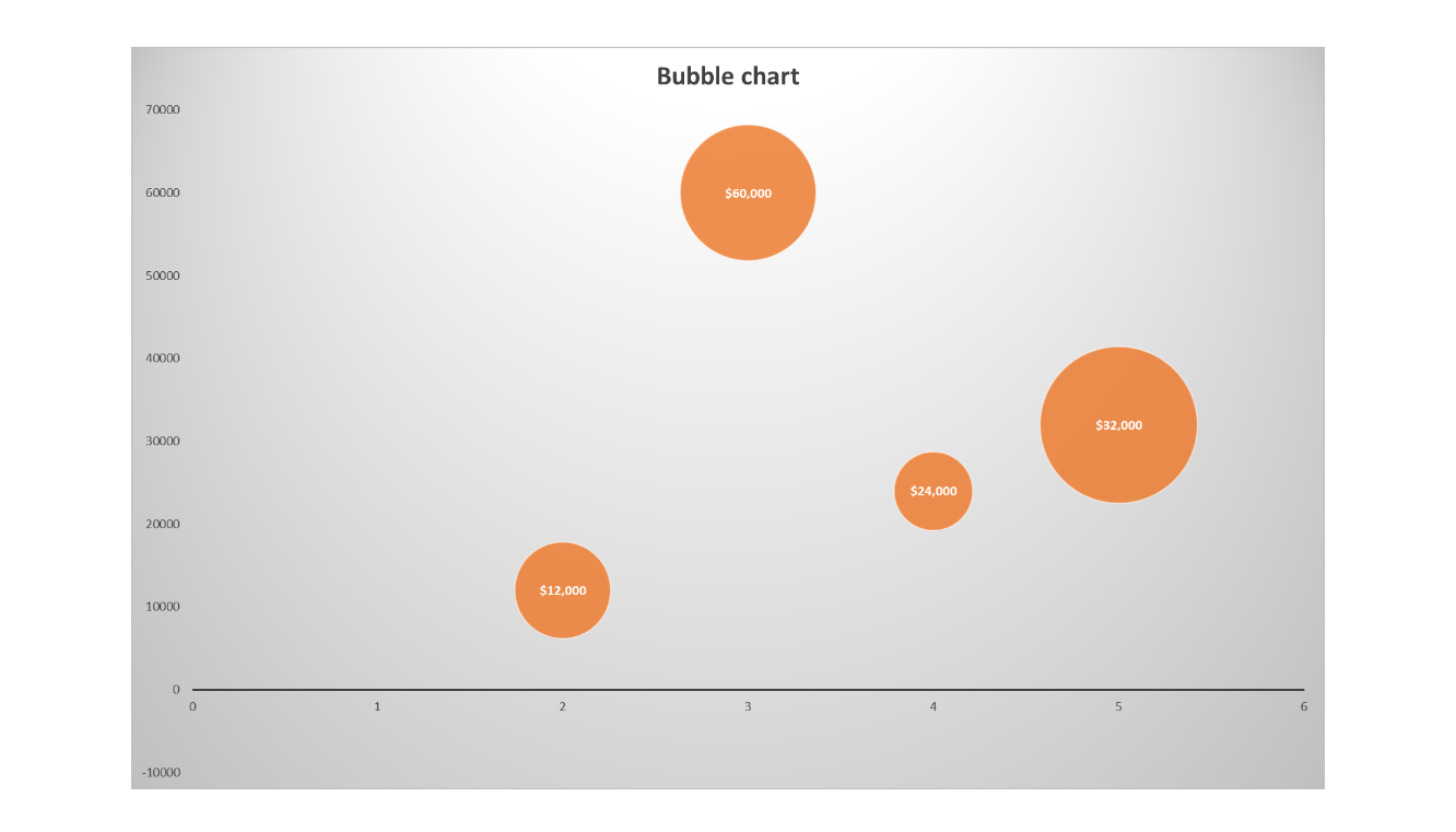
Bubble Size: The size of the bubbles usually represents the third variable. Larger bubbles indicate a higher value of the third variable, while smaller bubbles indicate a lower value.
Bubble Color: Colors often represent different data categories. By observing the colors, you can understand the relationships between different data categories.
Bubble Position: The position of the bubbles provides information about the relationships between the variables. For example, the clustering of bubbles in a particular area might indicate similar values for those data points.
Labels and Legends: Bubble charts typically include labels and legends to explain what each bubble represents. Reviewing these can provide a clearer understanding of the relationships between the variables.
Characteristics and Uses of Bubble Charts
Bubble charts are characterized by their intuitiveness and richness of information, aiding in data analysis, trend identification, and outlier detection.
Multidimensional Data Display: Bubble charts represent multiple dimensions of data simultaneously through bubble size and color, typically including at least three variables: x-axis value, y-axis value, and bubble size. Optionally, bubble color can represent a fourth variable.
Data Comparison and Trend Identification: Bubble charts are ideal for comparing different groups or categories of data. The size of the bubbles visually highlights relative differences in the third variable, making it easier to identify trends and correlations.
Highlighting Outliers: Bubble charts can help identify and highlight outliers within a dataset. A bubble that is distant from others may indicate a significantly different value, prompting further investigation.
Clustering and Pattern Discovery: By observing the distribution of bubbles, you can identify clusters or patterns within the data. Dense clusters in a specific area might suggest similarities or concentrations in the data.
Visualization of Data Volume: Bubble charts can effectively display a large number of data points, as each point is represented by a bubble whose size can be adjusted based on the third variable, making the data distribution more evident.
Ease of Understanding: Bubble charts are generally easy to understand because people intuitively grasp circular shapes and colors. This visualization method helps non-experts better comprehend the data.
Due to these characteristics, bubble charts are widely used in business, science, research, and policy analysis. Common application scenarios include:
Market Analysis: Bubble charts can analyze the relationships between product sales, market share, and price, helping businesses understand the competitive landscape.
Data Analysis: Bubble charts can examine relationships between multiple variables, such as displaying user followers, followings, and activity levels in social network analysis.
Business Intelligence: Bubble charts can visualize company performance, such as showing relationships between revenue, profit, and assets in financial analysis, helping businesses understand their operational and financial status.
How to Create a Bubble Chart
Boardmix is a powerful online collaboration tool with a rich library of professional graphical symbols, suitable for creating various office charts, including bubble charts. Here are the steps to create a bubble chart using Boardmix:
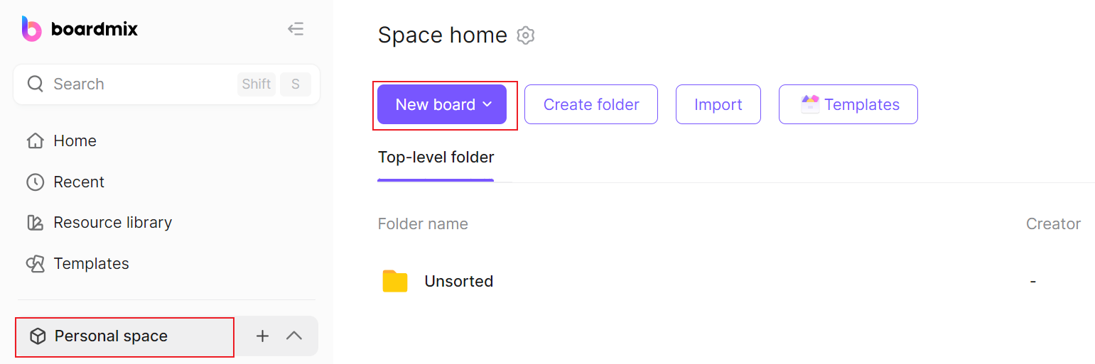
Open Boardmix: Visit the Boardmix website, log in to your account, and click "Create New Board" to create a new blank page.
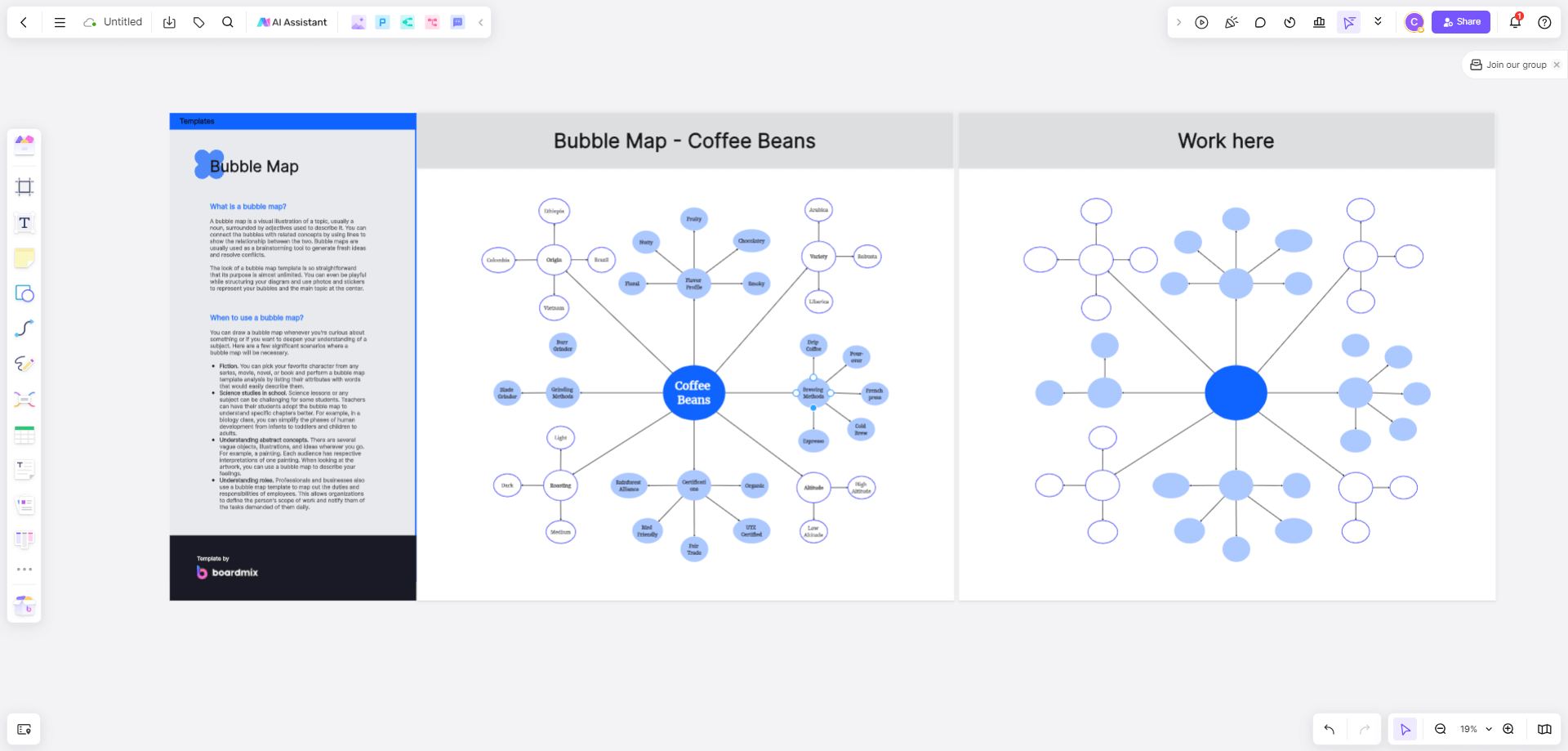
Create a New Bubble Chart: On the blank page, click the "Shapes" tool in the left menu to open the "Shapes Library" panel. Select the "Circle" symbol, or choose a desired bubble chart from the templates, drag it onto the board, and adjust the bubble contents as needed.
Add Data: In the new bubble chart, click on the bubbles to enter the data you need to display, such as names, values, and descriptions.
Add Connectors: Use the "Connector" feature in Boardmix to link bubbles to indicate relationships between them. Click on one bubble, then drag the mouse to another bubble, and an arrow will automatically connect them.
Modify Bubble Styles: When creating a bubble chart with Boardmix, you can freely adjust the size, position, and color of the bubbles to achieve better visualization.
Share and Export: Boardmix supports real-time collaboration, allowing others to edit and share the bubble chart. You can also export the bubble chart as a PDF file or image format by clicking the button in the upper left corner.
In practice, you can flexibly choose and use bubble charts based on the characteristics and needs of the data to achieve the best visualization effect. To efficiently create a logical, visually appealing, and informative bubble chart, it's essential to choose a robust online tool. Boardmix is an excellent tool for creating bubble charts, offering comprehensive features and a rich template library for free use. It supports various business scenarios and visualization charts, with real-time collaboration and discussion sharing. Additionally, Boardmix provides various creative expression tools such as text, sticky notes, documents, brushes, mind maps, and flowcharts, making creation simple and efficient. Try it for free now!