Breathing is a silent miracle—every second, millions of oxygen molecules dart from your lungs into your bloodstream, while carbon dioxide makes the reverse journey. Yet, this life-sustaining dance of gases remains invisible to the naked eye. How can we visualize such an intricate process? Bubble map of respiration, a visual map that transforms abstract physiology into vivid, easy-to-grasp visuals.
Whether you're a teacher aiming to simplify classroom lessons, a student tackling biology homework, or a curious mind exploring human anatomy, this guide will walk you through building a scientifically accurate and visually engaging respiration bubble map.
What is Bubble Map about Respiration?
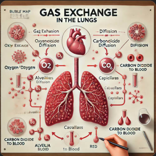
The bubble map about respiration is a diagram that visualizes the gas exchange process, focusing on the diffusion of oxygen (O₂) and carbon dioxide (CO₂) between the alveoli and capillaries. The diagram uses bubbles of different colors (such as red for O₂ and blue for CO₂) and flow arrows to intuitively express the dynamic transfer of gas from high-concentration areas to low-concentration areas.
The bubble map about respiration can be applied in:
Biology teaching: used to explain the working principle of the respiratory system in class;
Medical illustrations: assist in explaining the pathological mechanism of lung diseases (such as pneumonia and emphysema);
Popular science animation: Demonstrate gas exchange in a dynamic form in the video to enhance public understanding.
The advantage of the respiratory bubble diagram is that it converts abstract physiological processes into easy-to-read visual symbols, which is suitable for audiences of multiple ages and knowledge backgrounds.
Steps to Create a Bubble Map about Respiration
Step 1. Drawing the structural framework
(1) Drawing alveolar vesicles
First, make a sketch to position: draw 2-3 adjacent circles or polygons (about 3-5cm in diameter) to simulate the honeycomb structure of the alveoli.
The shape of the real alveoli is slightly irregular. You can overlap slightly to increase the three-dimensionality. Do not draw isolated circles. The integrity of the alveolar group must be reflected.
Then draw the lines to shape: Use a black fine-line pen (or the pen tool in the drawing software) to outline the alveoli. The lines should be smooth and natural.
You can use the ellipse tool to draw and adjust the anchor points to make the shape natural.
Then add alveolar wall details:
Draw a single-layer cell structure at the edge of the alveoli. You can use short dashed lines or fine dotted lines to represent the thin membrane of the alveolar epithelial cells.
Because the alveolar wall is composed of only one layer of flat epithelial cells, it reflects the thin barrier characteristics of gas exchange.
(2) Add capillary network
Draw the direction of the blood vessels: Draw curved parallel double lines (about 0.5cm apart) around the alveoli to simulate the structure of capillaries surrounding the alveoli.
Tips: The direction of blood vessels can be compared to the bifurcation of tree branches, with the main blood vessels extending small branches close to the alveoli.
Enhance the three-dimensional effect: fill the inside of the blood vessels with light red (simulating blood), or keep white but use shadow lines to represent the blood vessel wall.
Tips: You can use the parallel line method to add gray shadows on one side of the blood vessel to highlight the three-dimensional effect.
Connect the alveoli and blood vessels: leave a narrow gap (about 1mm) between the alveoli and the capillaries to represent the respiratory membrane (alveolar-capillary barrier).
Step 2. Dynamic expression of gas exchange
(1) Draw the flow of oxygen (O₂)
O₂ bubbles in the alveoli: Draw small red dots or bubbles (about 0.3cm in diameter) scattered in the alveolar cavity, with a higher density near the alveolar wall. The scientific basis for this is that O₂ diffuses from the high-concentration area of the alveoli to the low-concentration area of the blood.
Add arrow direction: Draw a red solid arrow from the bubble in the alveolar to the capillary (arrow size is about 0.5cm). Tips: The end of the arrow points to the red blood cells in the capillaries to enhance the association.
(2) Draw the flow of carbon dioxide (CO₂)
CO₂bubbles in capillaries: Draw blue or gray dots in the blood vessels, and concentrate them on the side of the blood vessels close to the alveoli.
Reverse arrow annotation: Draw a blue dotted arrow from the blood vessels to the alveolar cavity to contrast with the O₂arrow.
The design logic here is that the dotted line indicates that CO₂ is a metabolic waste, and it is prioritized from the solid arrow of O₂.
Step 3. Annotation and annotation
(1) Naming key structures
You can use text to mark the position:
Alveolar cavity: Use small black letters to mark "alveolar cavity" in the blank space of the alveoli.
Capillaries: Mark "capillaries" next to the blood vessels and use a leader to point to the blood vessel wall.
Red blood cells: Draw a small oval (red without nucleus) in the blood vessels and annotate "red blood cells" next to it (as shown in Figure 5).
Adjust fonts and layout: Use a sans-serif font (such as Arial) for the structure name, and the font size should be smaller than the title to avoid blocking the graphics.
(2) Gas exchange description
Use flow chart annotation: Add a text box next to the diagram and explain the points:
“① Oxygen (O₂) diffuses from the alveoli into the blood.”
“② Carbon dioxide (CO₂) diffuses from the blood into the alveoli.”
Remember to use color matching:
Set the word “oxygen” to red and “carbon dioxide” to blue, which is consistent with the color of the bubbles in the diagram.
Them, you can use layered drawing method (suitable for complex diagrams):
First draw the background structure (alveoli + blood vessels) → then superimpose gas bubbles → finally add arrows and text.
Proportion refer to this:
Alveoli: blood vessels ≈ 3:1, reflecting that the alveoli are the main place for gas exchange.
Why Use Boardmix to Make Bubble Maps?
Boardmix is an online collaboration platform where any team can display a breathing bubble chart in real time on one platform. Let's explore what features of Boardmix are conducive to making bubble charts.
Various well-designed diagram templates
Boardmix has designed bubble chart templates, which can be directly drawn using the bubble chart framework to save time.
Multi-people real-time collaboration
Boardmix supports simultaneous editing and annotation by teams or teachers and students, facilitating interactive modifications in teaching scenarios and improving the efficiency of co-creation of popular science content.
Rich and free design elements
You can add arrows and gradient color effects to intuitively display the flow direction and concentration gradient changes of gases (O₂/CO₂) to enhance understanding.
Comment and interaction
Quickly add text annotations, add tags, comment online, or use demonstration mode to display bubble chart knowledge, so that teaching interaction is seamless.
Cross-platform compatibility
All information can be saved in the cloud, and multiple PC/tablet/mobile phones can be seamlessly connected, and can be modified or displayed anytime, anywhere, suitable for classrooms, lectures, online popular science and other scenarios.
Visual multi-format file embedding
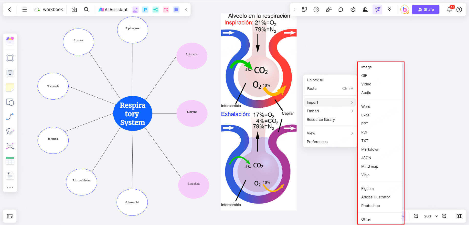
Supports inserting concentration numerical charts, respiratory rate dynamic curves, pictures, documents, videos, web pages and other formats of information into the same whiteboard, and no longer needs to switch platforms to display multiple data at the same time.
Multi-format export and sharing
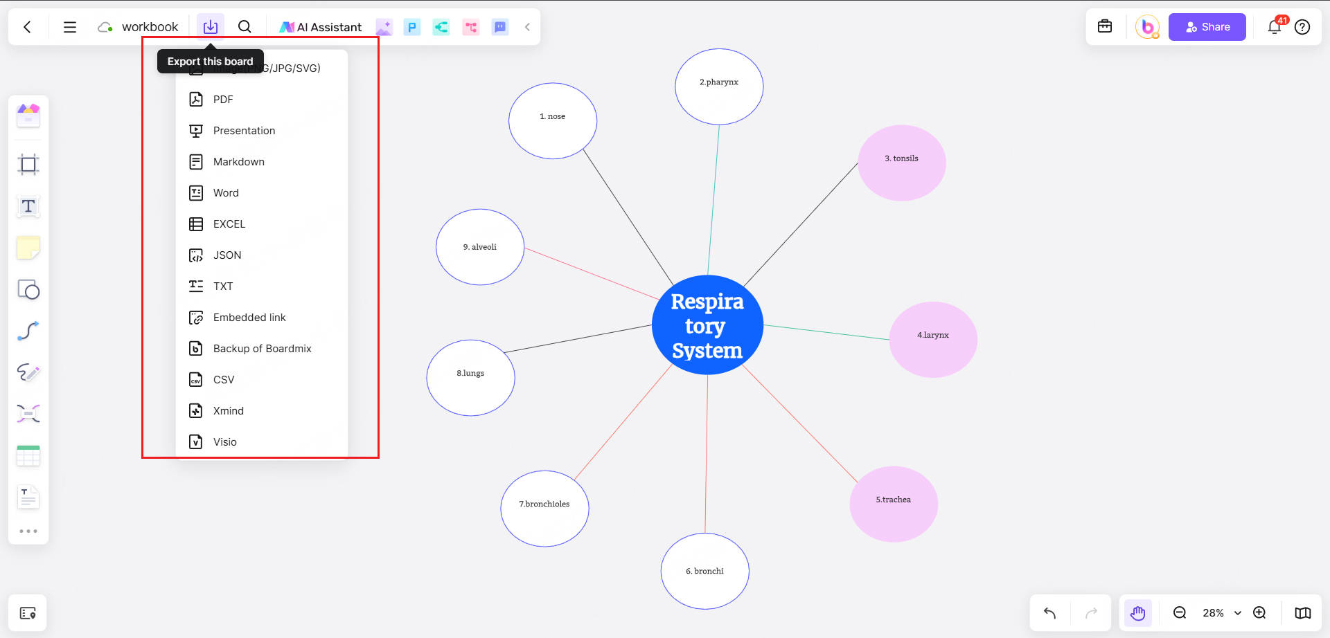
Bubble charts can be exported as high-definition pictures, PNG/SVG or PDF, or even slide formats, and they are well compatible with multi-scenario communication needs such as courseware, papers, and self-media.
By exploring these features, I believe you have discovered that Boardmix's real-time online collaboration and ease of use will help you efficiently draw respiratory bubble charts, which are especially suitable for visual expression in education and medicine.
Conclusion
From sketching alveoli to animating gas exchange, creating a respiration bubble map bridges the gap between complex biology and intuitive understanding. By following these steps, you’ve not only crafted a diagram but also unlocked a universal language for explaining how life’s essential gases flow.
Don’t hesitate to experiment with colors, labels, and images in Boardmix to elevate your bubble design. Let's make a bubble map and share it in classrooms, presentations, or the Boardmix community!