T charts stand out as a simple yet powerful tool for comparing and contrasting information, whether you're a teacher looking to enhance classroom engagement, a business professional seeking to streamline workflow, or someone in need of organizing thoughts efficiently, T charts can make a significant impact. This article delves into the various applications of T charts, providing free examples and a comprehensive step-by-step guide to creating your own. By the end, you'll be equipped with the knowledge to utilize T charts effectively in different scenarios, enhancing clarity and decision-making processes.
Why should Use a T Chart Example for Workflow?
By using T chart examples, you can effectively visualize different elements of a workflow, making it easier to identify areas for improvement, streamline processes, and enhance productivity. Here are several reasons why T chart examples are beneficial for workflow management:
Simplifies Complex Information
Workflow processes often involve multiple steps, decisions, and variables. T chart examples help break down this complexity by organizing information into two distinct categories. For instance, you can use a T chart to compare current workflow steps on one side with proposed improvements on the other. This visual separation simplifies understanding and highlights differences and potential enhancements.
Identifies Areas for Improvement
T charts are instrumental in identifying inefficiencies and areas for improvement within a workflow. By comparing the current state with a desired or optimized state, it becomes easier to pinpoint specific steps that need adjustment.
Facilitates Training and Onboarding
T chart examples can be a valuable resource for training new employees or onboarding team members to a new workflow. The clear and organized format of a T chart makes it easier for newcomers to understand the workflow and the rationale behind certain processes.
Customizable for Various Scenarios
T charts are highly versatile and can be customized to fit different workflow scenarios. Whether you’re comparing different project management methods, evaluating customer service processes, or analyzing sales strategies, T chart examples can be tailored to meet specific needs.
T chart Examples in Different Scenarios
1. Examples of T charts in Education📙📙
T charts are a valuable resource in education, aiding in the organization and comparison of information across various subjects. Here are some examples of how T charts can be effectively used in different academic disciplines:
T Chart Example for Math
In mathematics, T charts can simplify the understanding of complex concepts by visually breaking them down. For example:
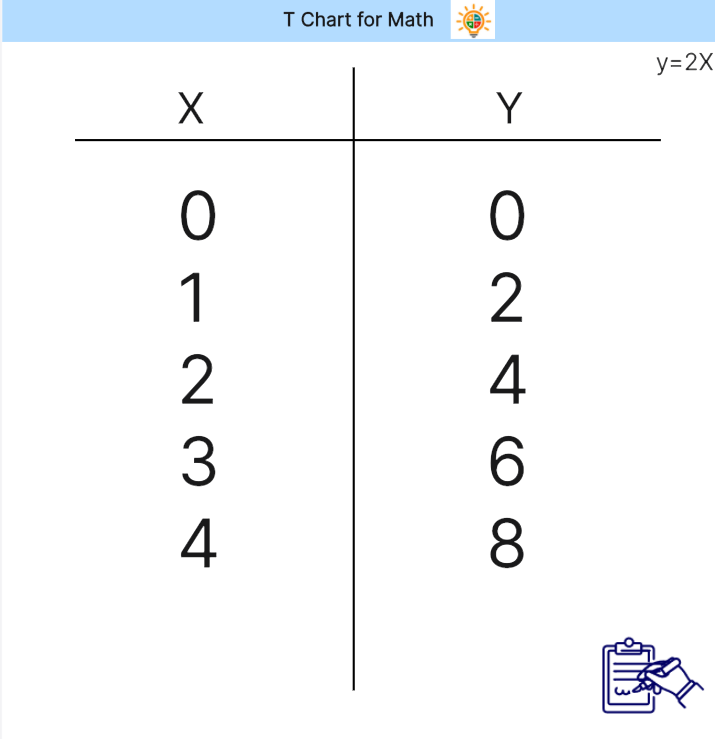
Comparing Fractions: One side of the T chart can list fractions (e.g., 1/2, 2/4, 3/6), while the other side shows their equivalent decimal or percentage forms. This helps students see the relationship between different representations of fractions.
Problem-Solving Strategies: When tackling word problems, students can use a T chart to separate the problem into 'Given Information' and 'Steps to Solve.' This method organizes their thoughts and guides them through the problem-solving process.
The detailed content in a T chart for math might include numerical examples, visual aids like pie charts or number lines, and step-by-step explanations of mathematical procedures.
T Chart Example for Language📜📜
In language arts, T charts can assist students in comparing and contrasting elements of texts, grammar rules, or vocabulary. For example:
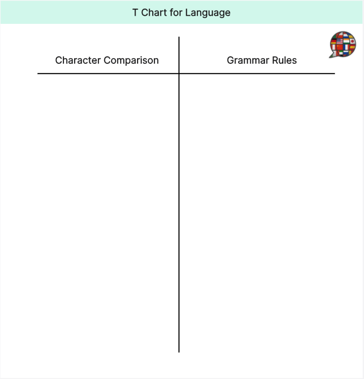
Character Comparison: Students can use T charts to compare two characters from a story. One side might list Character A's traits, actions, and motivations, while the other side lists Character B's. This comparison helps in understanding character development and relationships.
Grammar Rules: A T chart can help differentiate between similar grammar rules. For instance, one side could explain the use of “there,” “their,” and “they're,” while the other side provides examples and contexts for each usage.
The detailed content in a language T chart might include direct quotes from texts, descriptive adjectives, specific examples of grammar rules, and illustrations to support understanding.
2. Examples of T charts in Business💷💷
In the business environment, T charts are essential for strategic planning and management. Here are some examples of how T charts can be utilized effectively in business management:
T Chart for Business Management
SWOT Analysis: A T chart can be used to perform a SWOT analysis (Strengths, Weaknesses, Opportunities, Threats). One side of the T chart lists internal strengths and weaknesses, while the other side lists external opportunities and threats. This format helps businesses visualize and strategize around their current position and potential future moves.
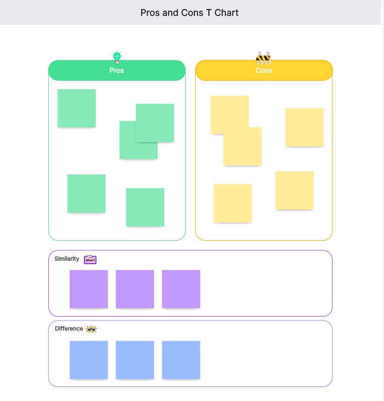
Decision Making: When faced with a major decision, businesses can use a T chart to compare the pros and cons of each option. For example, deciding whether to launch a new product line:
Pros: Potential for increased revenue, market expansion, and brand diversification.
Cons: High initial investment, market uncertainty, resource allocation.
How to Create a T Chart: Step-by-Step Guide
Creating a T chart is a straightforward process that can be easily accomplished with the right approach. Here’s a step-by-step guide:
Step 1: Identify the Purpose
Determine the specific purpose of your T chart. Are you comparing pros and cons, analyzing strengths and weaknesses, or evaluating two different processes? Clearly defining the purpose will guide the rest of your T chart creation.
Step 2: Draw the Chart
On a blank sheet of paper or using a digital tool, draw a large "T" shape. Label the top of the left column with the first category (e.g., Pros) and the top of the right column with the second category (e.g., Pros) Cons).
Step 3: List Items
Begin listing items under each category. Be specific and concise, ensuring that each item aligns accurately with its respective category.
Example:
-Pros: Increased productivity, cost savings, improved employee morale
-Cons: Initial setup cost, learning curve, potential resistance to change
Step 4: Analyze the Information
Once your T chart is complete, review the information. Look for patterns, insights, and areas that require further exploration. This will help in making informed decisions based on the visual comparison.
Step 5: Add Details and Visuals
For a more comprehensive T chart, add details or examples to each item. If using an online tool like Boardmix, you can enhance your chart with visual aids such as icons, images, or color coding to make the information more engaging and easier to understand.
Step 5: Share and Discuss
Share your T chart with relevant stakeholders and discuss the findings. This collaborative approach ensures that everyone’s perspectives are considered, leading to more comprehensive conclusions.
Using these steps, you can create effective T charts that facilitate better understanding and decision-making in various scenarios.
What are the Best Practices for Using T Chart Examples?
To maximize the effectiveness of T charts, it's essential to follow best practices that ensure clarity, relevance, and collaboration. One significant best practice is using online tools to visualize T charts, which brings numerous advantages in terms of accessibility, ease of use, and collaborative potential. Among these tools, Boardmix stands out as a particularly effective option for creating and managing T charts. Here’s how you can best use T chart examples with online tools and the specific advantages of using Boardmix:
Using Online Tools to Visualize the T Chart
Online tools offer several benefits for visualizing T charts:
Accessibility: Online tools allow you to access your T charts from anywhere with an internet connection, making it easy to work remotely or on the go.
Ease of Use: Many online platforms provide intuitive interfaces with drag-and-drop features, templates, and customization options that simplify the process of creating T charts.
Collaboration: Online tools often include features that enable real-time collaboration, allowing multiple users to contribute to and edit the T chart simultaneously. This is particularly useful for team projects and group decision-making.
Advantages of Using Boardmix for Creating T Charts
Boardmix is an exceptional online tool for creating T charts, offering several specific advantages:
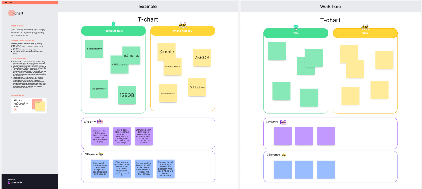
Versatile Templates: Boardmix offers a variety of templates specifically designed for different use cases, such as SWOT analysis, decision-making, and project management. These templates provide a solid starting point and can be customized to fit your particular scenario.
Visual Enhancements: Boardmix allows you to incorporate visual aids, such as icons, images, and diagrams, into your T charts. These enhancements can make your charts more engaging and easier to understand, helping to convey your message more effectively.
Customization Options: With Boardmix, you can customize your T charts to suit your specific needs. You can adjust colors, fonts, and layouts to make the charts visually appealing and aligned with your branding or presentation style.
Real-Time Collaboration: Boardmix supports real-time collaboration, allowing multiple users to work on a T chart simultaneously. This feature is perfect for team meetings, brainstorming sessions, and collaborative projects, ensuring that all team members can contribute their insights and feedback.
Tips for Creating Effective T Charts
Be Clear and Concise: Ensure that the information in each column of your T chart is clear and to the point. Avoid overloading the chart with too much text. Instead, use bullet points or short phrases that capture the key points.
Use Visual Aids: Incorporate colors, icons, or images to highlight key points. This can make the T chart more engaging and easier to understand. Such as you can use the aids in Boardmix to edit the T chart example.
Update Regularly: As new information becomes available, update your T chart to reflect the latest data. This keeps the chart relevant and useful.
Keep It Simple: While it might be tempting to include a lot of information, simplicity is key. A cluttered T chart can be overwhelming and counterproductive.
By following these best practices, you can create T charts that are not only informative but also easy to interpret and use.
T charts are a versatile and powerful tool for comparing and contrasting information in various scenarios. From educational settings to business environments, they facilitate clarity and informed decision-making. By understanding how to create and utilize T charts effectively, you can enhance your ability to organize thoughts, analyze data, and communicate insights. Remember to follow best practices to keep your T charts clear, concise, and collaborative. With these tools at your disposal, you’re well-equipped to tackle any challenge that comes your way with enhanced clarity and efficiency.