In today's data-driven environment, translating complex data into a simple visual format is of utmost importance. Comparison charts are an effective tool in this endeavor, providing an easy way to compare and analyze different data points. In this article, we will look at what a comparison chart is and the six types of comparative charts that can effectively present your data. You can also learn how to make one based on your needs. Let’s get started.
What Is a Comparison Chart
A comparison chart is a graphical representation of different data sets intended to make comparisons easier. These charts present numerical data and qualitative information side by side to draw similarities or disparities between two or more items or concepts.
Comparison charts are versatile, visually appealing, and can be used in a variety of fields, from business and marketing to education and research. By illustrating information in a simplified and easy-to-understand manner, they enable quick decision-making based on insights derived from data analysis.
6 Types of Comparative Charts
There are several types of comparison charts, each with unique characteristics suitable for different data sets and purposes. Let's take a look at six of the most commonly used comparative charts:
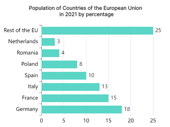
Comparison Bar Charts
Comparison bar charts are useful for comparing quantities across different categories. In this type of chart, each bar represents a category, and the height or length of the bar corresponds to its value. This straightforward visualization makes it easy to identify patterns, trends, and differences at a glance.
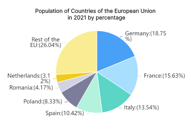
Pie Chart
Pie charts are a circular statistical graphic divided into slices to illustrate numerical proportion. Each slice of the pie represents a category and its size shows the category's proportion of the whole. They're excellent for comparing parts of a whole, but are generally used when you have less than seven categories to avoid confusion.
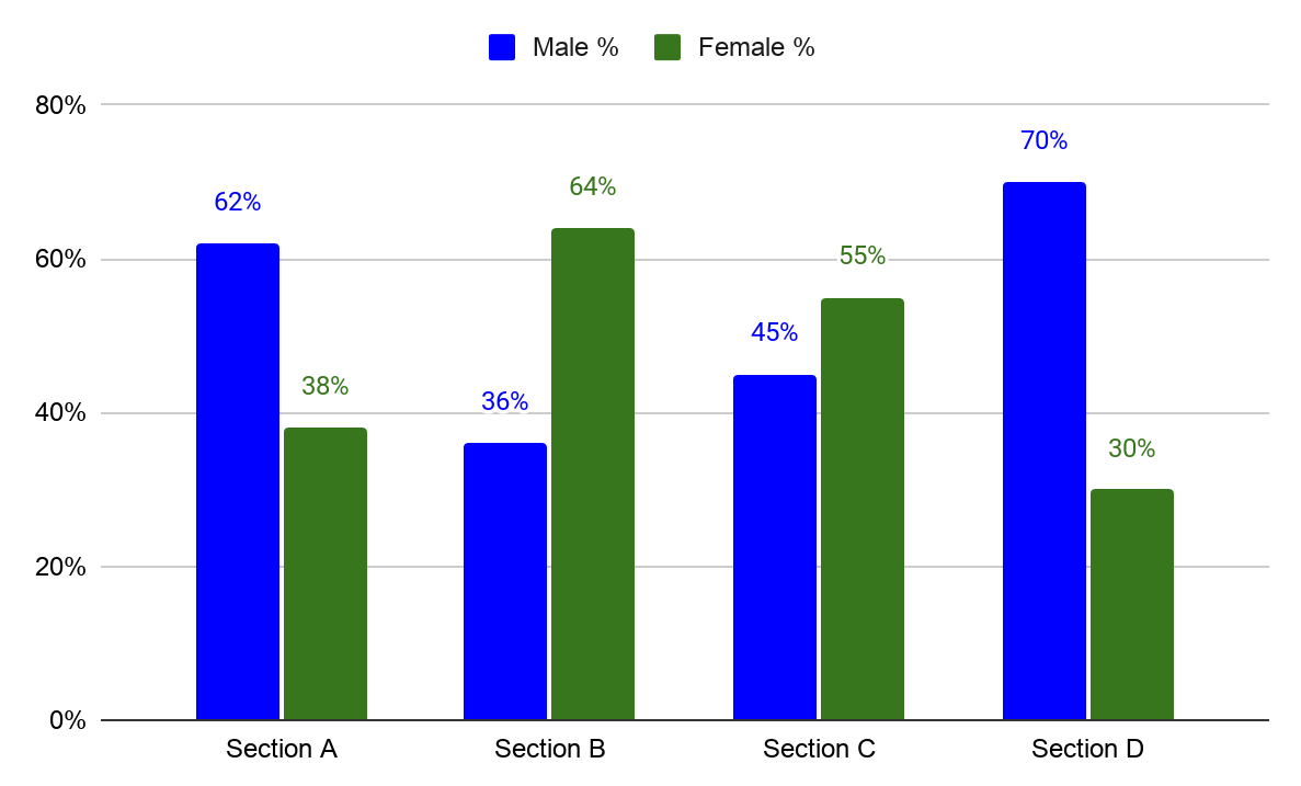
Double Bar Graph
Double bar graphs, also known as grouped or clustered bar charts, are great for comparing two categories of data side by side. Each group has two bars that represent different data points, which is useful for presenting comparative information across different categories.
Stacked Bar Chart
Stacked bar charts are used to compare the total and one part of the categories with other categories. The total length of the bar shows the total size of the category, while segments of different colors show its components.
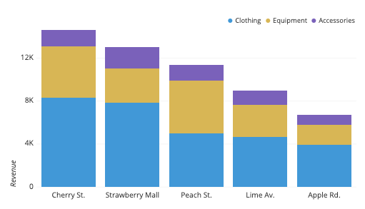
Image from CHARTIO
Donut Chart
A donut chart is similar to a pie chart but with a hole in the middle. Like pie charts, donut charts show the relationship of parts to a whole, but they can contain more than one data series. Each ring of the donut chart represents a data series.
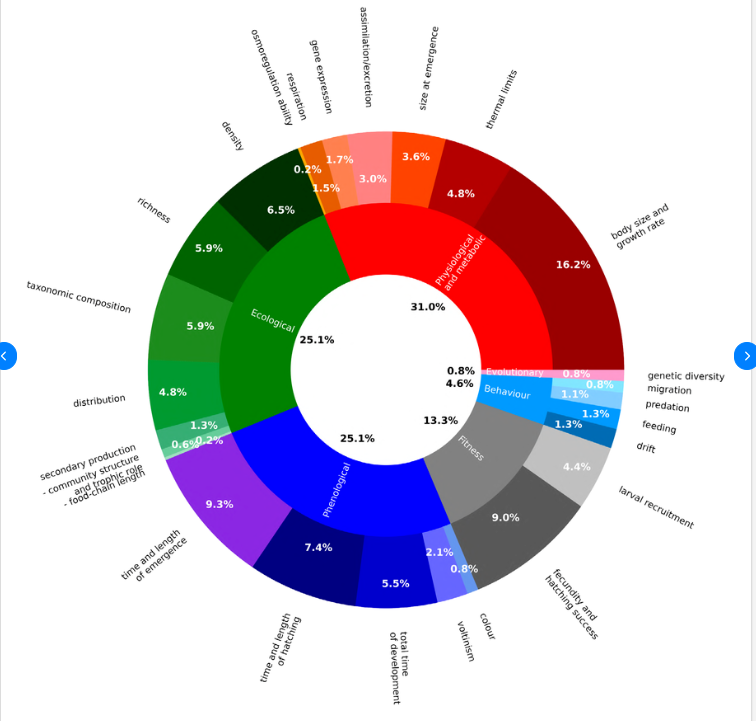
Image from ResearchGate
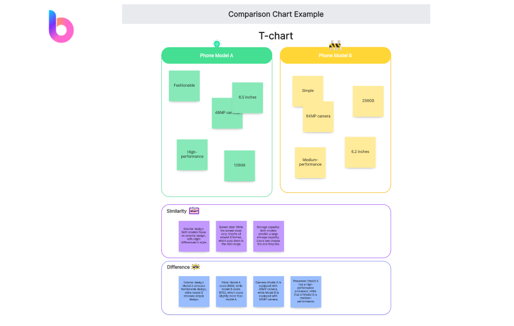
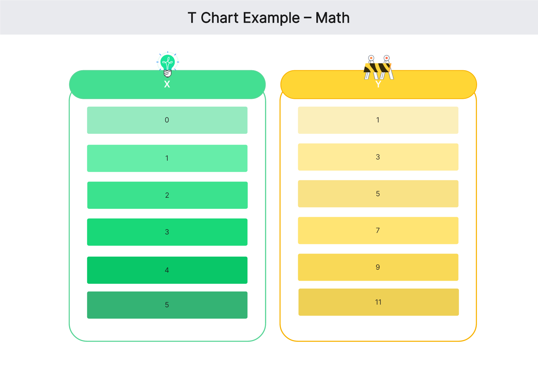
T Chart
T chart is a concise and effective comparison chart format, presenting data in a clear and organized manner. It consists of a vertical line intersected by horizontal bars, creating a visual representation of two sets of information. This simple yet powerful format allows for easy comparison between two variables, making it an ideal choice for displaying contrasts or differences in a straightforward and visually impactful way.
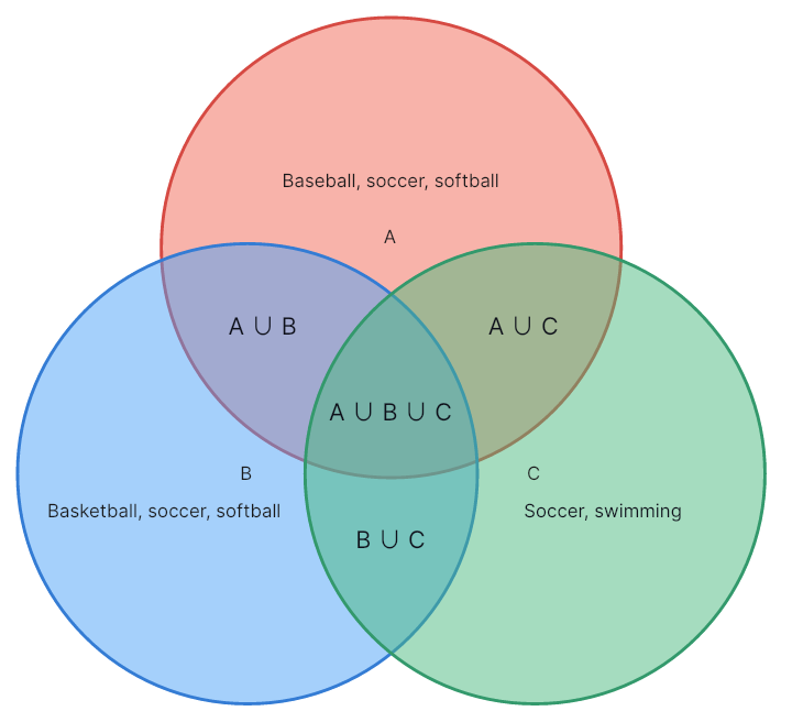
Venn Diagram
Venn Diagrams, a powerful type of comparison chart, visually represent relationships between different sets of data. Using overlapping circles, they illustrate commonalities and distinctions, making complex information easily comprehensible. Venn Diagrams are widely utilized in diverse fields, aiding in analysis, decision-making, and presentation of overlapping concepts or entities.
Each of these comparative charts has its own strengths, and selecting the right one depends on your specific objectives and data types. Understanding how to use them effectively can greatly enhance your ability to present data clearly and accurately.
Pros and Cons of Comparison Charts
Comparison charts offer significant benefits when it comes to visualizing data; however, they also have some limitations.
Pros
- Enhanced Clarity: Comparison charts simplify complex datasets, making them easier to interpret and understand.
- Effective Visualization: They provide a visual representation that can show trends, patterns, or discrepancies that might be missed in a text-based presentation.
- Facilitate Decision-making: By illustrating comparisons clearly, these charts support informed decision-making.
Cons
- Over-simplify: While their simplicity can be a strength, it can also lead to oversimplification of complex data.
- Not Suitable for Large Datasets: If too many categories or data points are included, comparison charts can become confusing.
- Lead to Misinterpretations: Different types of charts can present the same data differently, leading to potential misinterpretations.
How to Make a Comparison Chart Using Boardmix
Boardmix is a versatile comparison chart maker designed to streamline the process of creating visually appealing and informative comparison charts. Whether you're comparing products, services, features, or any other data points, Boardmix offers a user-friendly interface for designing charts that effectively communicate the differences and similarities between various elements. Here's a simple step-by-step process for making each type of chart mentioned:

Make a Bar Chart, Pie Chart & Donut Chart in Boardmix:
- Data Preparation: Start by organizing your data in a spreadsheet or a similar format. For bar graphs, you should have your categories and corresponding values.
- Chart Selection: In Boardmix, choose the Bar Chart option.
- Data Import: Import your data directly into Boardmix.
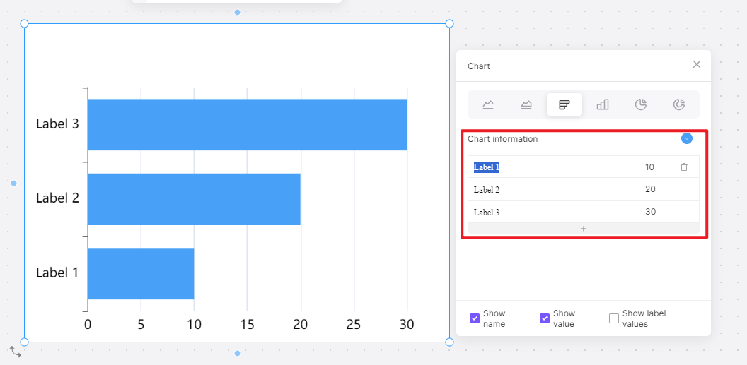
- Customization: Adjust colors, labels, and sizes as desired. For a double bar graph or stacked bar chart, simply add an extra data series.
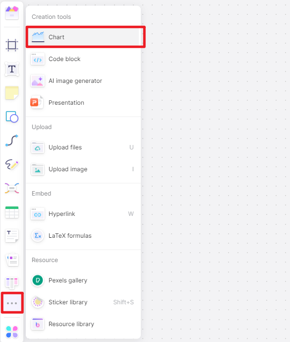
Make a T Chart & Venn Diagram in Boardmix:
- Data Preparation: Prepare a grid of information with two or more criteria for comparison.
- Choose a Template: Choose the T chart or Venn Diagram template that suits your needs in Boardmix.

- Data Input: Input all your items or data into the ready-made framework.
- Customization: Adjust colors and labels as required.

Boardmix provides the tools needed to create all these types of comparison charts, enhancing the data visualization experience with its intuitive interface and collaboration features.
Best Practices of Comparison Charts
Comparison charts, when used correctly, can be an influential tool in data visualization. They allow for the swift assimilation of information and facilitate comparisons across various categories. But to fully leverage the power of comparison charts, it's important to adhere to some best practices.
Keep It Simple
While you may be dealing with complex data, remember that one of the major benefits of a comparison chart is its ability to simplify information. Too much clutter or unnecessary information can lead to confusion. Limit the number of data points and categories to those that are absolutely essential.
Use Consistent Scale
To maintain the integrity of your comparisons, always use a consistent scale. Altering scales between charts or within the same chart can distort data perception and lead to incorrect interpretations.
Choose the Right Chart Type
Not all comparison charts are created equal. Certain types lend themselves better to specific data sets or situations. For instance, bar charts are perfect for comparing quantities, while pie charts effectively show parts of a whole. Select a chart type that most effectively conveys your data.
Employ Clear Labels
Your chart should be self-explanatory, and clear labels play a crucial role in this. Make sure every bar, pie slice, or data series is clearly labeled. Additionally, don't forget to label your axes in a bar or column chart.
Use Color Wisely
Colors can greatly enhance the readability of your chart, but they need to be used judiciously. Stick to a consistent color scheme, and try to limit your use of colors to avoid confusion.
Prioritize Data Integrity
Always ensure that your chart accurately represents your data. Avoid techniques that might exaggerate or minimize differences, such as truncating the y-axis on a bar chart.
By adhering to these best practices, you can ensure that your comparison charts serve their purpose – to make data easier to understand, comparisons clearer, and insights more accessible.
How to Create Various Comparison Charts in Excel
Excel is a robust tool that provides a multitude of options for creating comparison charts. if you're looking for more comprehensive guidance, Boardmix offers detailed guides to create different kinds of bar charts and pie charts in Excel.
To create bar charts in Excel: A Comprehensive Guide to Creating Bar Charts in Excel
To create pie charts in Excel: How to Create a Pie Chart in Excel: A Step-by-step Guide