Arrow diagrams are a visual way of representing processes. They're used in nearly every field, from software development to business to education. You can draw your design on whiteboards or paper, or you can use diagramming tools like Boardmix to make them even more dynamic.
In this post, we'll talk about what they are, how they work, and why they're so useful in all kinds of situations. We'll also cover some pros and cons of using them compared to other ways of diagramming activities. Finally, we'll give you some tips on how to create your own diagrams using Boardmix! Let’s dive in right now.
![]()
What Is an Arrow Diagram
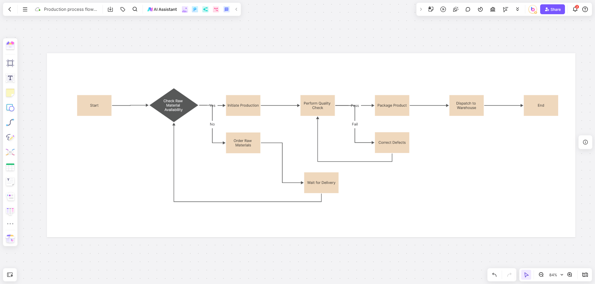
An arrow diagram is a visual representation of processes that flow from one step to another. In an arrow diagram, each step is represented by a box with an arrow pointing out of it, which connects it with another box representing the next step in the process. Each box can also include information about who performs that action and what the end result of this action will be.
![]()
Each box has its own label so that readers know which steps belong together in order—for example: "create proposal," "present proposal," "receive feedback," and so on.
How Do Arrow Diagrams Work
Arrow diagrams are made up of arrows that represent activities, and you can connect them with lines to show the flow of an activity. The starting point is usually at the right side of the page, with arrows going left. Each arrow should point to the next step in the process, and there should always be one arrow pointing back to where it started (to indicate completion).
The diagram is useful for keeping track of all the steps that need to be done for a project to be completed. They can be used as templates directly in Boardmix, which means you can copy and paste a ready-made one into any document so that it's always accessible when you need it.
Pros and Cons of Arrow Diagrams
Activity on Arrow Diagrams vs. Arrow Diagrams
Activity on Arrow diagrams, also known as AOA diagrams, are a type of network diagram used in project management to represent the sequence of activities in a project. In AOA diagrams, activities are represented by arrows and are connected to show the dependencies between them. The arrow points in the direction of the flow of the project and the length of the arrow represent the duration of the activity.
![]()
On the other hand, Arrow diagrams, also known as precedence diagrams, are a type of network diagram used to represent the logical relationships between tasks in a project. In arrow diagrams, tasks are represented by nodes and are connected by arrows. The arrows show the dependencies between tasks, with the arrow pointing from the predecessor task to the successor task. The length of the arrow does not represent the duration of the task.
In summary, AOA diagrams show the sequence of activities and the duration of each activity, while Arrow diagrams mainly show the logical relationships between tasks in a project.
When to Use One
For example: if you want to create a diagram showing how data flows through your company's systems, it would be best suited for this purpose.
Arrow diagrams can be used to explain any kind of process or relationship between two or more things. Examples include:
- How a new product is developed (for example, from idea to prototype)
- The stages of a project
- The steps involved in completing a task (for example, checking out of the library)
- A time-based process such as financial planning over five years
- The flow of materials through a system, such as how raw materials are transformed into finished goods.
- The movement of people or vehicles through spaces, such as an office building or airport terminal.
How to Draw an Arrow Diagram
If you're wondering how to make an arrow diagram, the process is pretty simple. To start, you'll need some kind of software that will aid you to create them. There are many applications available to accomplish this. But some, like Boardmix, are better than others.
Boardmix is a collaborative whiteboard tool useful for creating flowcharts, process diagrams, and other visual representations of information. It's also useful in brainstorming sessions where you need to work with others in real time.

It's ideal for teams that:
- Need to create visual representations of information.
- Need to brainstorm together in real-time on the same page.
- Want to collaborate on projects from anywhere.
You can use Boardmix on your desktop or laptop computer. You don't need to download anything; just sign up for an account and start using it right away.
With Boardmix, you can work together with your team to create arrow diagrams, mind maps, and various flowcharts—anything you need to get your ideas down. All members of the team can see each other's work in real-time. You can even add sticky notes and photos!
You’re not required to download anything, it works right in your browser window. To get started with Boardmix, all you need to do is sign in with your Google account or create an account. Try it out for free and upgrade later if you find it helpful.
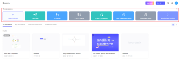
Next, you'll need to create a project. Select a type, in this case, arrow diagram, on the homepage of Boardmix. There are templates for planning, brainstorming, and creating (mind maps, and flowcharts).
You can customize shapes, colors, and the text of your diagram design. These tools are conveniently located on the left sidebar.
![]()
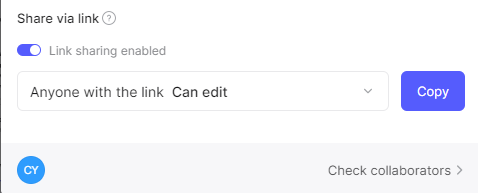
When you have your basic ideas and interactions between the steps or processes, invite team members to collaborate on the design or add data by clicking the "Share" button in the right-hand corner. Copy the link and send it to colleagues, teammates, or whoever you want to work with.
Then, you’ll finish a clear and visualized arrow diagram.
Easy Example of an Arrow Diagram
Here is a practical example of an arrow diagram with basic analysis that will help you get started using them in your own research projects!
![]()
Let's say you have a large group of people who are participating in a study where they will be given one of three types of treatment: A, B, or C. The goal of this study is to see if any differences in outcomes exist between these groups, specifically between happiness levels and stress levels.
You would start by listing your three groups on the x-axis (A, B, C), then list your two outcomes (happiness level and stress level) on the y-axis (from highest value to lowest value).
Next, you would draw lines connecting each subject's data point with their assigned group (each subject gets assigned one group only). These lines indicate whether or not there is a causal relationship between happiness level and stress level for each group (if someone has high-stress levels but low happiness levels, then you can say there is a causal relationship between the two variables).
Finally, you would connect all of the data points by drawing a line from the highest value on one axis (highest happiness level or lowest stress level) to the lowest value on the other axis (lowest happiness level or highest stress level).
It is easy to communicate relationships between different things using arrow diagrams. Creating mind maps, flow charts, or brainstorming ideas with colleagues has never been easier than with Boardmix.