In the dynamic world of data visualization, line charts are a powerful tool for communicating trends and patterns over time. Whether you're a seasoned analyst or a spreadsheet novice, understanding how to harness the potential of line charts can greatly enhance your ability to convey insights. Whether you're a data enthusiast looking to improve your Google Sheets skills or an explorer looking for a more specialized solution to make a line chart online, this guide will help you!
What Is a Line Chart
A line chart is a foundational data visualization tool that effectively communicates trends, patterns, and data fluctuations over a continuous interval or time span. Comprising a series of data points connected by straight lines, this graphical representation facilitates the swift identification of variations. Its simplicity and clarity make it an invaluable asset for analysts and decision-makers.
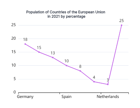
The inherent strength of line charts lies in their ability to transform raw data into a coherent narrative. Each data point signifies a specific value, and the connecting lines emphasize the sequential relationships, enabling a visual journey through numerical evolution. Whether applied in finance for stock market analysis, scientific research to illustrate variable progression, or marketing to display sales trends, line charts prove universally adaptable.
How to Make a Google Sheet Line Chart
Creating a powerful line chart in Google Sheets is a straightforward process with these five step-by-step instructions:
Data Preparation: Ensure a solid foundation by organizing your data. Clearly distinguish between X and Y-axis values, setting the stage for accurate and meaningful chart representation.
Select Data Range: Highlight the specific data range you intend to incorporate into your line chart. This step focuses on pinpointing the dataset that will drive your visual representation.
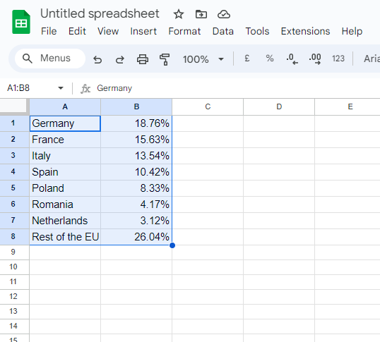
Insert Chart: Navigate to the "Insert" menu in Google Sheets. Within this menu, select the "Chart" option. From the array of chart types available, opt for "Line Chart" to initiate the chart creation process.
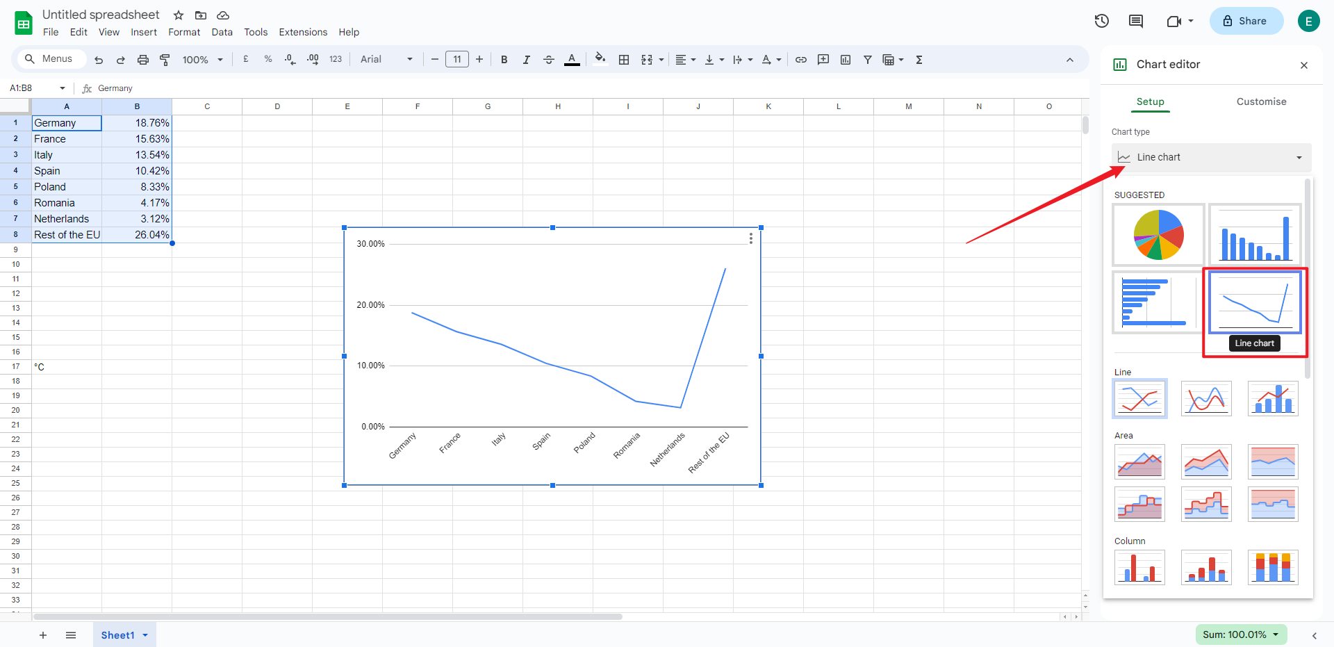
Customize Chart: Take control of the aesthetics and details. Tailor your chart by adjusting titles, axis labels, and other formatting options. This step allows you to personalize the visual presentation according to your specific data and communication requirements.
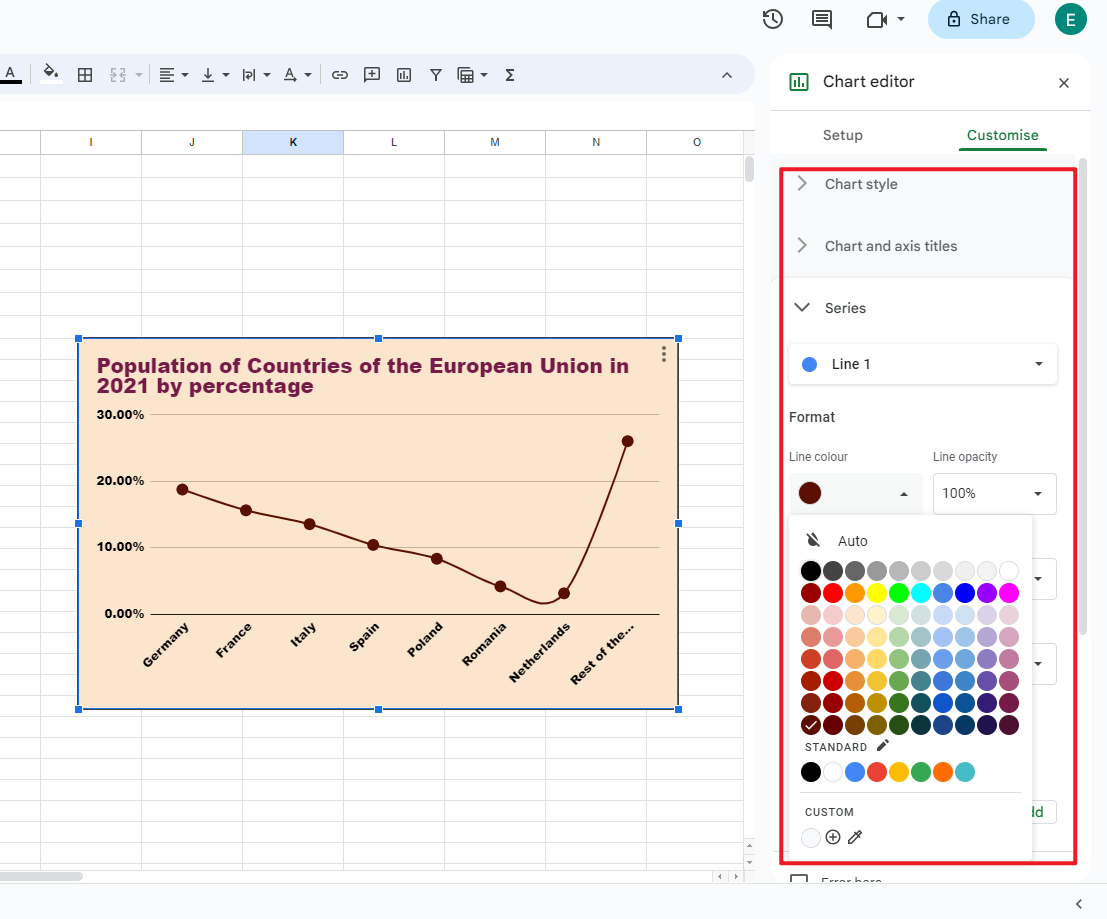
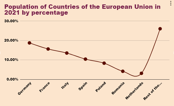
Preview and Embed: Before finalizing, preview your chart to ensure it aligns with your expectations. Once satisfied, seamlessly embed the chart directly into your Google Sheet. This step not only facilitates easy reference but also streamlines collaboration within the Google Sheets environment.
Pros and Cons of Making a Line Chart in Google Sheets
Making line charts in Google Sheets is a flexible and intuitive process, but there are some advantages and disadvantages. Let's dive into the specifics of what we encountered during this process to get a fuller understanding of the advantages and disadvantages of making line charts
Pros:
User-Friendly Interface: Google Sheets provides a user-friendly platform, simplifying the creation of line graphs. The intuitive design makes it easy for users of varying expertise to generate compelling visualizations.
Real-Time Collaboration: A significant advantage is the ability for real-time collaboration. Multiple users can concurrently contribute to and modify line graphs, fostering teamwork and facilitating quick decision-making.
Data Integration and Import: Google Sheets seamlessly integrates with various data sources. This feature simplifies the import of data, ensuring a smooth process of incorporating information into line graphs.
Cons:
Limited Customization Options: While Google Sheets provides essential customization features, it may lack the advanced options available in dedicated data visualization tools. This limitation can be a drawback for users seeking highly tailored visualizations.
Performance Issues with Large Datasets: Google Sheets may face performance challenges when dealing with large datasets. Processing and rendering extensive data can lead to delays and impact the overall efficiency of the chart creation process.
Complex Data Manipulation Challenges: For intricate data manipulation, Google Sheets may be less robust than specialized tools. Converting complex datasets into meaningful line graphs might necessitate additional steps and workarounds.
When facing these pros and cons in Google Sheets line graph creation, users can decide wisely, weighing factors like collaboration needs, customization preferences, and data complexity to meet their specific requirements.
Make a Line Chart in Boardmix
Boardmix, an innovative platform for intuitive data visualization, enables users to effortlessly generate dynamic and visually impactful line charts. Boardmix's user-friendly interface and advanced features converge, offering a robust tool for dynamic and engaging data visualization. Seamlessly import diverse datasets, leverage customization options, and enjoy real-time collaboration features. Boardmix is your indispensable ally for creating immersive visual narratives.Follow these comprehensive steps to unlock Boardmix's full potential in crafting compelling line charts:

Step 1: Log In and Establish a New Board
Initiate your Boardmix journey by logging in and creating a new board, streamlining data organization and enhancing visualization efficiency.
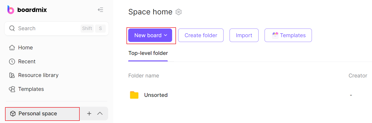
Step 2: Navigate the Interface
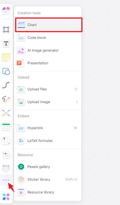
Access the 3-dot menu in the left-side menu bar. Click on it and select the "Chart" option to kickstart the creation process of your line chart.
Step 3: Generate the Chart
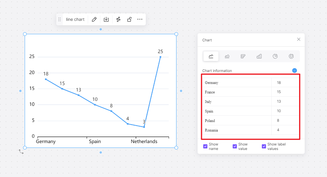
Navigate to the graph creation section. Select the line chart type, input your data variables, and let Boardmix create the initial representation of your line chart.
Step 4: Customize the Chart
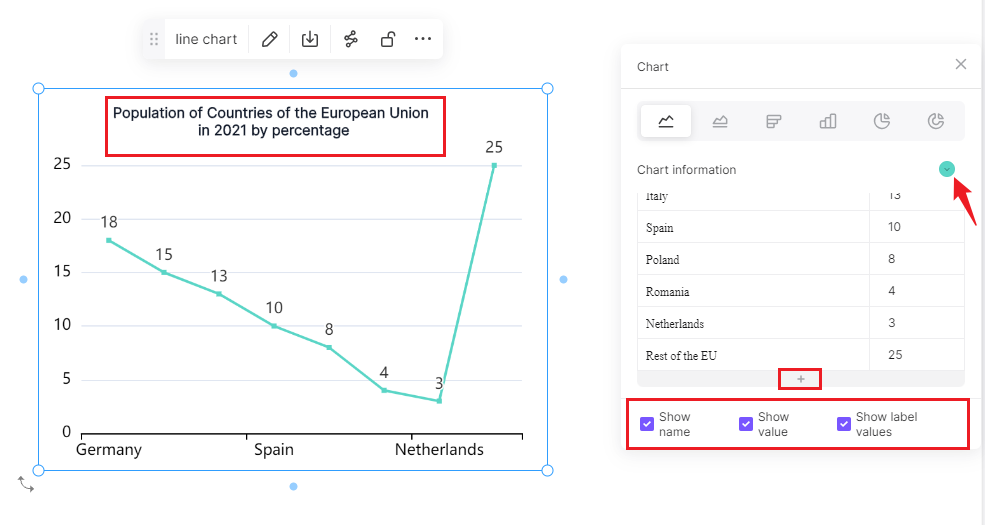
Explore Boardmix's customization options. Tailor your line chart's appearance by adjusting colors, labels, and axis scales to align with your preferences and enhance visual clarity.
Step 5: Finalize and Optimize
Preview your line chart within Boardmix, refining it for optimal visual communication of your data. Ensure that the representation effectively conveys insights before completing the chart.
Navigating through these steps ensures a seamless integration of data and design, guaranteeing an unparalleled experience in transforming raw data into meaningful visual narratives.
How to Choose: Make a Line Chart in Google Sheets or in Boardmix
The decision to opt for Google Sheets or Boardmix hinges on the intricacies of your needs. If simplicity, real-time collaboration, and a modest dataset are your priorities, Google Sheets stands as a fitting choice. Its user-friendly interface and collaborative capabilities make it adept for streamlined tasks.
Contrarily, for those seeking advanced visualizations, handling larger datasets, and incorporating interactive elements, Boardmix emerges as a comprehensive solution. Its versatility extends beyond the conventional capabilities of spreadsheet tools, offering a specialized platform for more intricate data presentations.
To make a judicious decision, carefully assess your project requirements. If your focus is on a straightforward and collaborative environment, Google Sheets is likely sufficient. However, if your project demands heightened customization and interactive features, Boardmix provides the sophistication needed for a more robust data visualization experience. Consider these factors meticulously to align your choice with the unique demands of your project.