Data visualization is a powerful tool that aids in interpreting complex datasets. Among various types of data visuals, line charts hold an essential place due to their versatility and ability to illustrate trends over time. This article introduces line charts, then delves into the reasons behind making line charts online. Most importantly, you can learn how to make a line chart online step by step. Keep reading.
What Is a Line Chart
A line chart, also known as a line graph or line plot, is a type of chart used primarily to visualize the progression of values over a period of time. It consists of a series of data points connected by straight lines, hence the name. The X-axis typically represents time, while the Y-axis shows the quantity you're measuring.
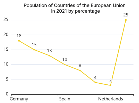
Line charts are especially useful when tracking changes or trends over time, predicting future trends, or demonstrating the relationship between two sets of data. They are commonly used in various fields including finance, economics, statistics, and even in weather forecasting.
Why Make a Line Chart Online
Creating line charts online holds numerous advantages. Here's why you should consider it:
- Accessibility: Online tools like Excel or Google Sheets are accessible from anywhere and at any time, providing flexibility. They also allow for easy sharing and collaboration.
- User-Friendly: Online charting tools often have intuitive interfaces and simplified processes which make creating a line chart a breeze even for beginners.
- Efficiency: Online charting tools automatically plot your data once inputted, saving you the time and effort of drawing it manually.
- Customization Options: These tools provide a variety of options to personalize your charts, including changing colors, adding labels, adjusting axes, and more.
- Integration & Sharing: Online tools often provide options for easy integration with other platforms or applications. Additionally, they offer multiple sharing options including via email, social media or embedding in a website.
- Automatic Updates: If your data changes over time, online tools can update your line chart automatically based on the latest data inputs.
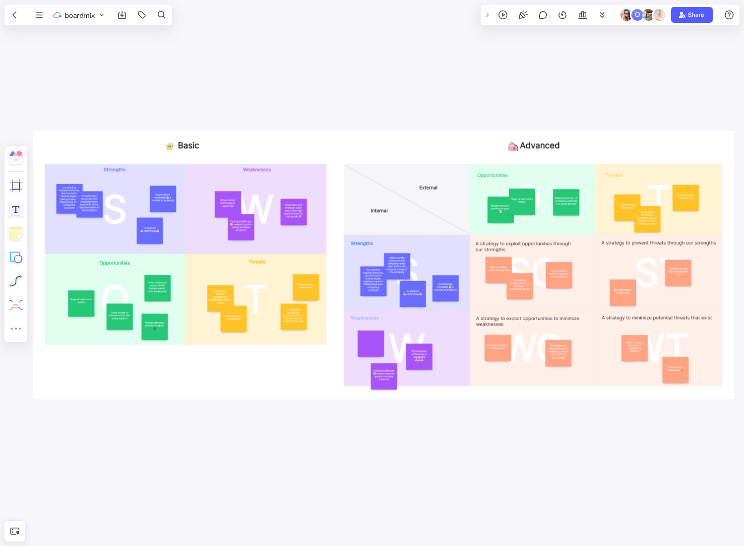
How to Make a Line Chart Online Using Boardmix
Boardmix is an innovative, web-based tool designed for creating stunning and interactive visualizations, including line charts. Known for its user-friendly interface and wide range of customization options, Boardmix is quickly becoming a favorite tool among data analysts and professionals.
With Boardmix, users can craft line charts that truly represent their data's story. The tool allows you to control everything from the line's color to its thickness, ensuring each chart's individuality. With interactive features, you can make your charts more engaging for the audience, letting them interact with data points for detailed insights.
The process of creating a line chart in Boardmix is intuitive. Here's how you can do it:
Step 1: Log into Boardmix
Firstly, access the Boardmix website and log in to your account. If you're a first-time user, you'll need to create an account.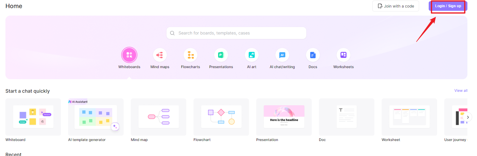
Step 2: Create a New Board
Once you're logged in, create a new board by clicking on the button at the top.
Step 3: Choose Line Chart
After entering the canvas, click the 3-dot menu from the left side and select choose 'Chart > Line chart' from the list of available options.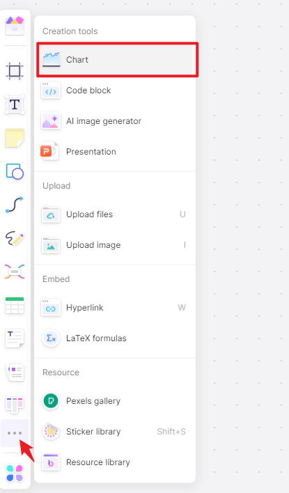
Step 4: Enter Your Data
Now it's time to bring your data into Boardmix. The X-axis usually represents time, while the Y-axis represents the quantity you're measuring.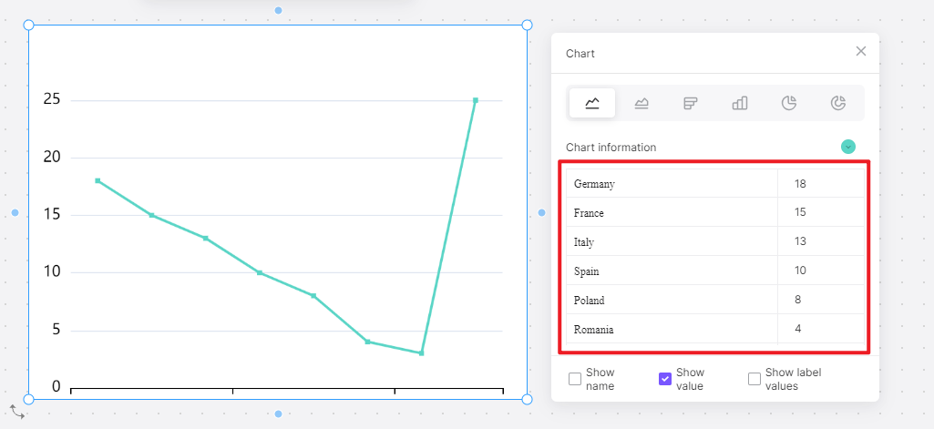
Step 5: Customize Your Line Chart
After importing your data, you'll have full freedom to customize your chart. You can change the colors of the lines, adjust the axes, add labels, and more. Customization options are robust in Boardmix, so make sure your line chart perfectly matches your preferences and needs.
Step 6: Save and Share Your Line Chart
Once your line chart looks exactly as you want it to, save it. Then, you can share your chart via email or social media, embed it into your website, or download it for offline use.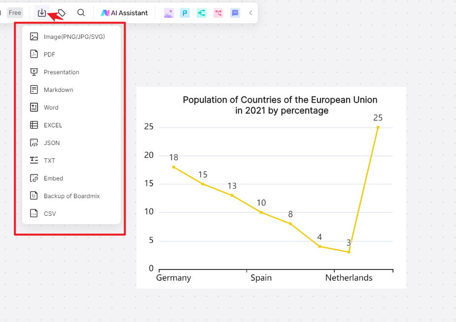
Creating a line chart with Boardmix doesn't just make the process easier but also allows you to present your data more effectively. So dive in and let Boardmix's powerful features help bring your data to life.
Creating a line chart online is not only convenient but also offers numerous possibilities to make your data stand out. However, it requires a blend of know-how and creativity to get the most out of the tools at hand. This guide shares useful tips and tricks to ace the process of online line chart creation.
Tips and Tricks on Making a Line Chart Online
- Understand Your Data
Before diving into creating a line chart, ensure that you have a clear understanding of your data. Familiarize yourself with the variables and trends that you need to showcase. This will allow you to choose the right data points and provide context for your audience.
- Choose the Right Online Tool
Selecting the appropriate online tool for creating your line chart is crucial. Consider factors such as ease of use, customizability, collaboration features, and integration options when making your choice. Platforms like Boardmix offer a great balance of these features.
- Keep It Simple
While it's tempting to use all the bells and whistles provided by the online tool, simplicity often yields better results. Stick to 2-3 colors, keep your axes labels clear and concise, and avoid overcrowding your chart with too many lines.
- Use Gridlines Sparingly
Gridlines can help guide the eye and make it easier to read the line chart. However, too many gridlines can make your chart appear cluttered. Use them sparingly and ensure they are light enough not to distract from the lines representing your data.
- Highlight Key Data Points
Drawing attention to key data points or significant trends can help your audience understand the important parts of your line chart. Most online tools offer options to emphasize certain points by changing their size or color.
- Use Interactive Elements
Interactivity can increase engagement with your chart. Features such as hover effects on data points or interactive legends can make your line chart more informative and engaging for the audience.
- Test Your Chart on Different Devices
Finally, ensure that your line chart looks good on different devices. Since online charts can be viewed on any device with an internet connection, testing them on multiple screens can help maintain visual consistency and readability.
By applying these tips and tricks, you can create compelling and clear line charts that not only look professional but also successfully convey your data's story.