Data is a crucial aspect of organizational and project management, and as such, it can be quite cumbersome to deal with copious amounts and derive meaningful insights from them. Visualization of data and presentation in a specific and understandable format can show how various elements interact and the relationship between them. Matrix diagrams are a powerful organizational tool that analyzes multiple variables and provides a visual representation of the data. It helps managers and relevant stakeholders to identify patterns within several variables.
This article thoroughly reveals all you need to know about matrix diagrams, their types, and the purposes they can serve for organizations. Stay tuned.
What Is a Matrix Diagram
A matrix diagram is a visual depiction of relationships between distinct sets of data. It is utilized for making comparisons of different information and is set out in a rectangular layout, comprising cells in rows and columns which hold the relevant information.
Every box in the matrix diagram serves as a comparison point for an item in one set of data to another in the other set, and the relationship between the two items may be represented by symbols or color codes.
The main target of the matrix diagram is to organize and simplify large amounts of data, thereby rendering it easier to understand and interpret. It is especially useful to identify trends and patterns and can thus be an invaluable tool for predictions, decision-making, and problem-solving.
Purposes of Matrix Diagram
Matrix diagrams can be used for a variety of purposes, including decision-making, problem-solving, evaluating ideas, and analyzing data. The overall purpose and benefits stem from the breakdown and simplification of numerous data gathered and the presentation in a form by which better insights can be obtained.
They can be used to compare different types of information, such as customer reviews, sales figures, and cost estimates. It can also analyze the relationship between different items, such as products, services, or processes. Here are some more specific purposes.
Project Planning
Matrix diagrams are indispensable tools for mapping out projects, as it provides a significantly easy way to represent the tasks, resources, and timelines associated with the project. Project managers can benefit from this to identify dependencies and prioritize tasks. Additionally, it can be employed to track the progress of ongoing projects.
Decision Making
The insight derived from the representation of data relevant to a project is particularly helpful for decision-making. The relationship between the data can be used to predict cause and effect and give a lot of information on the pros and cons of the various choices. This way, heads of organizations and top decision-makers are guided toward making the best decision after weighing the different factors and considerations.
Process Improvement
The wealth of knowledge and insights from matrix diagrams is used to advance management as the diagrams provide an avenue for analyzing the processes and results. Those areas that need improvement can be recognized, and following this, managers can map out different steps and stages of the process, as well as the resources, time, and cost associated with each step.
Solve Problems
Matrix diagrams can also be used for risk management, as they can help to identify and assess risks, as well as prioritize them according to their level of severity. This can help organizations to develop effective risk management strategies to mitigate any potential risks.
Types of Matrix Diagrams
When selecting the type of matrix diagram to use, you should consider the number of items you are comparing and the types of relationships you are looking to identify. If you are comparing two items, an L diagram is the best choice. If you are comparing three it more items, a T, Y, or X diagram can be a common choice.
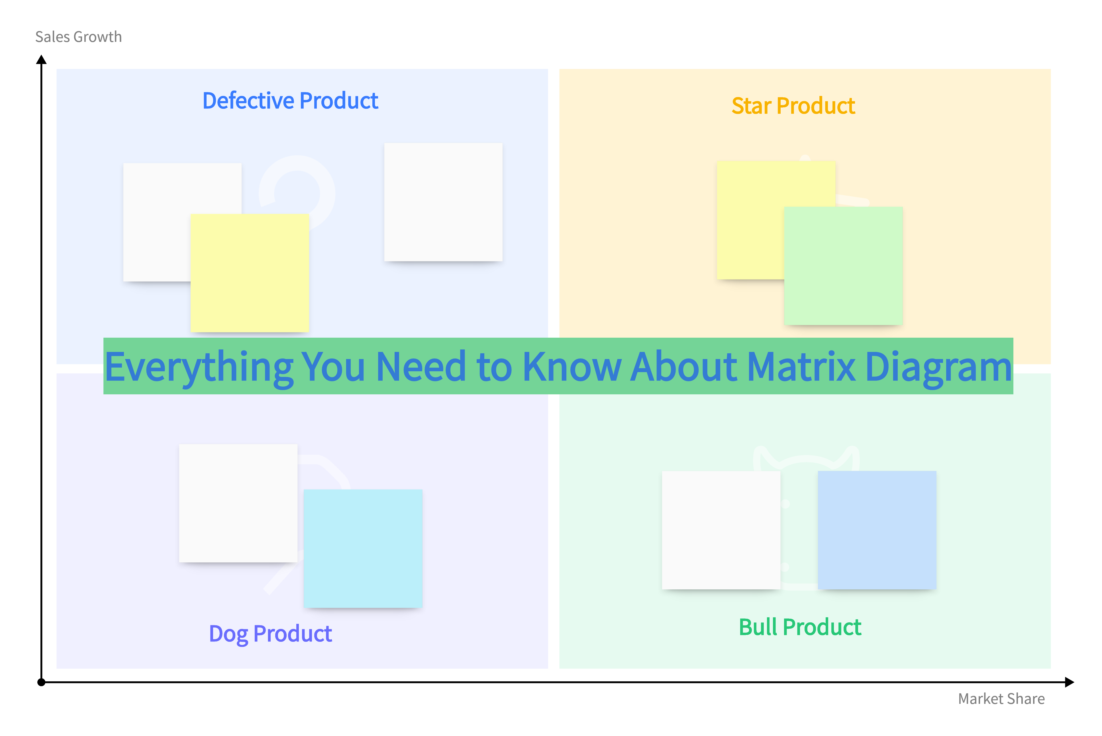
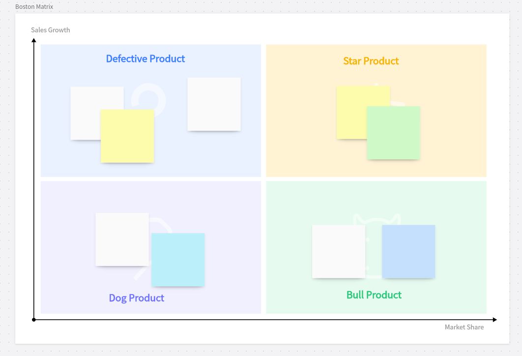
- L Diagram: An L diagram shows the relationships between two closely related data. It represents a row and a column which gives it the L shape. Symbols can be used to highlight the relationships between the intersection of the data sets.
- T Diagram: A T diagram is used to visualize the relationship and intersection between two groups of data. It is practically an intersection between two L diagrams.
- Y Diagram: A Y diagram is used to depict the relationship between three data sets that are in a circular relationship.
- X Diagram: An X diagram is suited to analyze the similarities and differences between two pairs of complementary items. If you intend to establish the relationship between four groups of items, the X diagram is the best.
Pros and Cons of Matrix Diagram
There exist a ton of data visualization solutions, all with their distinct features and the benefits they offer for project management. Here is what you need to know about the perks and drawbacks of a matrix diagram.
How to Create a Matrix Diagram
Creating a matrix diagram is based upon some sequential steps. And the whole process can be simplified with the help of Boardmix, a professional matrix diagram maker. Let's see how to do it.

- Log into Boardmix and create a new file. Establish the purpose and decide the type of the matrix diagram. Boardmix offers a variety of templates across different kinds of matrix diagrams to help with data visualization and analysis.
- Decide the criteria. Based on the knowledge of the functions of the matrix diagram, the next crucial step will be to decide on the criteria which could be used to compare the different elements or the different topics and sections within the matrix diagram.
- Create the matrix. Input the data details where necessary and utilize the interactive and personalization features provided by Boardmix to create and fine-tune the diagram to your taste. Make sure to include all the decided elements or topics.
Finally, you need to review the diagram and ensure that all that must be captured has been addressed. Now you can share your matrix diagram with the desired audience via a sharing link and work with them together on Boardmix.