Feedback is essential in product design. It allows designers to enhance the design and promotes a positive culture where they can flourish. This technically differs from the usual end-user feedback organizations would use to assess the product's effectiveness. Read through this article to discover more about this technique.
What is a design critique?
Build Design Critique for Free
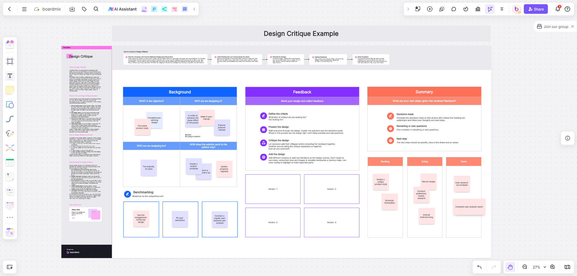
A design critique is a session where professionals and designers present their respective works to colleagues like UC designers, product managers, developers, and visual designers to get constructive feedback. Using a design critique template allows teams to improve their designs, iterate their projects, and assess whether the initially presented solution meets the needed goals and objectives. In some cases, designers use this technique to identify their possible bottlenecks when developing solutions.
When to use a design critique template?
One can maximize a design critique template throughout the design process. This is to ensure that the design meets the objectives and requirements thoroughly. Here are some scenarios where the design critique will come in handy.
- Early stages of conceptualization. The team can already get feedback from your peers even if all you have are design concepts and ideas. This allows you to identify effective ways to fulfill your main goals for your design.
- Mid-design phase. While your team is in the middle of the design process, it pays to invite some colleagues and update the design critique template. This is to assess the existing design elements, receive suggestions, and address the possible loopholes.
- Pre-delivery phase. Before the final presentation, design teams can utilize another design critique template to ensure the output is polished and ready for delivery.
- After-project phase. This phase is like an evaluation of the overall design process and identifies the possible areas for improvements for the succeeding projects.
How to conduct an effective design critique session?
Conducting a design critique can be tricky. The session is generally similar to brainstorming, so the presenters and participants must stay focused. Also, the discussion must be constructive and ensure actionable outcomes.
It pays to use an editable design critique template to start with your critique. This way, team members can easily edit the document when necessary. Here are some steps you can follow to begin the design critique session.
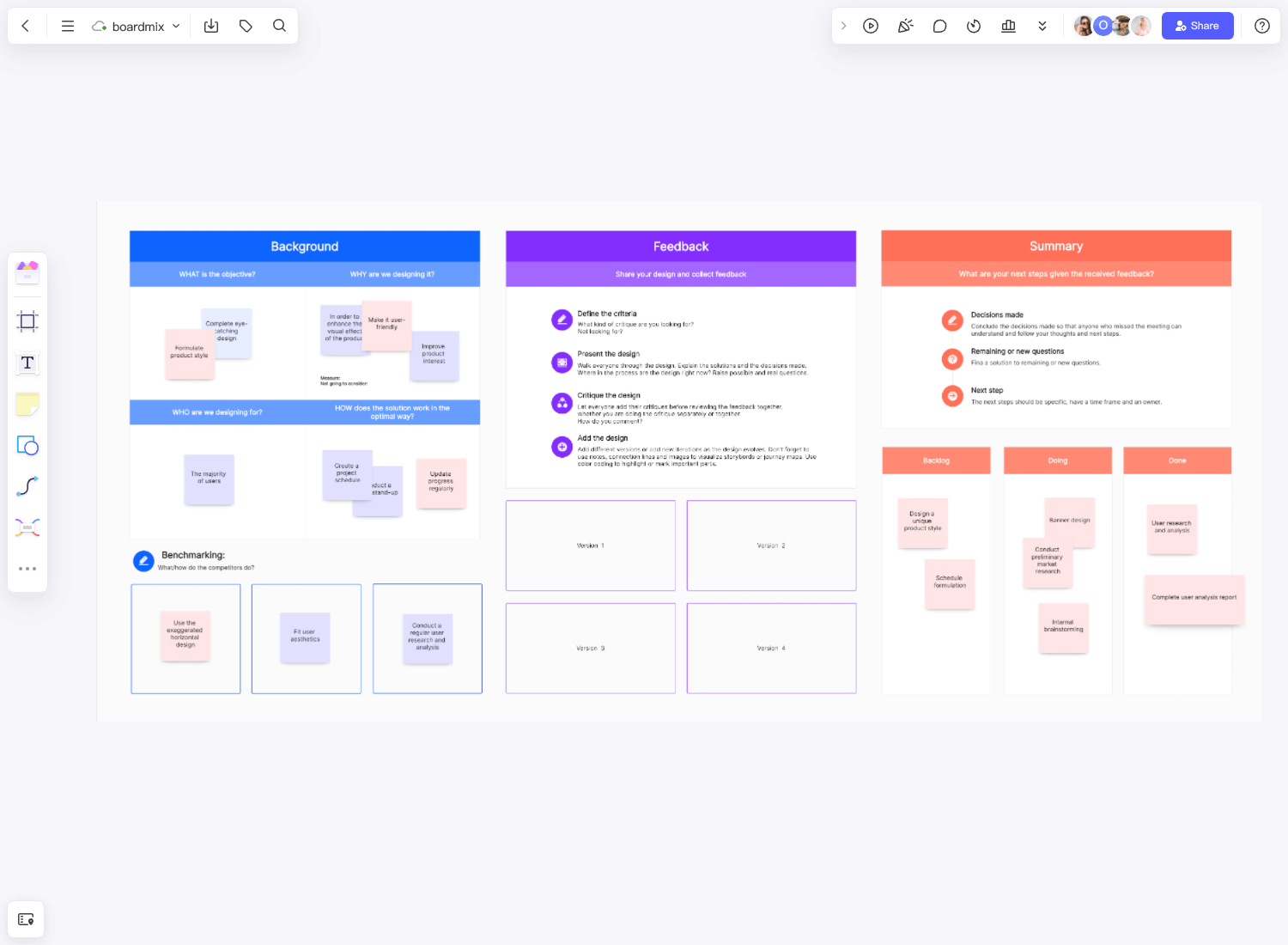
- Choose a template and place the essential background information. You can choose an editable design critique template where you can input your design or idea, feedback, and final decisions.
- Invite your peers and set the rules. You never know what will happen during the session, so ensure to communicate how your colleagues should provide feedback. Some designers might feel attacked or insecure when receiving feedback. The best way to do it is to remind each one to be constructive and focus on the idea or design, not the designer who's presenting. Professionalism is key.
- Present the ideas or projects. Besides listing the background information, it pays to discuss the design with your peers, who will provide feedback. Ensure to include the inputs provided from the previous sessions.
- Collect feedback. This is where you'll receive input from your participants. There might also be questions during the session, so remember to list the essential points.
- Create decisions. All the feedback and inputs from the session must be considered for the team's final decision. You can share the action plan with the participants, team members, and other stakeholders.
Example of a design critique session
In most cases, you'll have three essential sections: Background, Feedback, and Summary. Each designer has their way of constructing a design critique template.
1. Design Critique for User Experience (UX) Teams
Build Design Critique for Free
Project Overview:
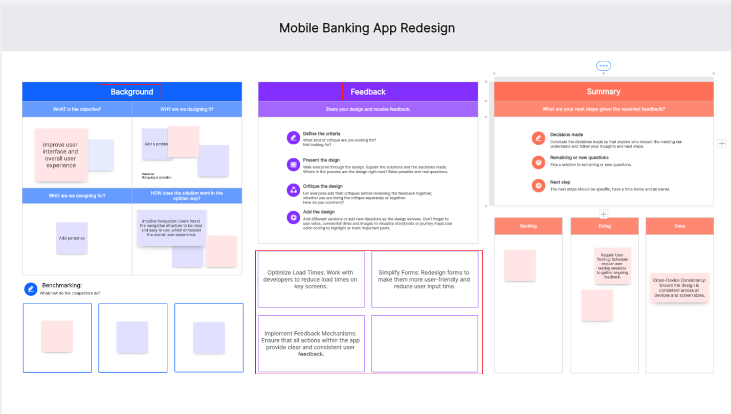
- Project Name: Mobile Banking App Redesign
- Objective: Improve user interface and overall user experience
- Stakeholders: UX designers, product managers, developers, and customers
Positive Feedback:
- Intuitive Navigation: Users found the navigation structure to be clear and easy to use, which enhanced the overall user experience.
- Visual Appeal: The new design aesthetics were well-received for their modern and clean look.
- Accessibility Improvements: Notable enhancements were made for accessibility, making the app usable for a wider range of users.
Constructive Criticism:
- Load Time: Some screens had longer load times which negatively impacted the user experience.
- Form Complexity: Certain forms were found to be overly complex and could be simplified.
- Consistent Feedback: Users suggested adding more consistent feedback mechanisms (e.g., loading indicators, and success messages).
Action Items:
- Optimize Load Times: Work with developers to reduce load times on key screens.
- Simplify Forms: Redesign forms to make them more user-friendly and reduce user input time.
- Implement Feedback Mechanisms: Ensure that all actions within the app provide clear and consistent user feedback.
Future Considerations:
- Regular User Testing: Schedule regular user testing sessions to gather ongoing feedback.
- Feature Expansion: Explore adding new features such as budget tracking and personalized financial advice.
- Cross-Device Consistency: Ensure the design is consistent across all devices and screen sizes.
2. Design Critique for Product Development Teams
Project Overview:
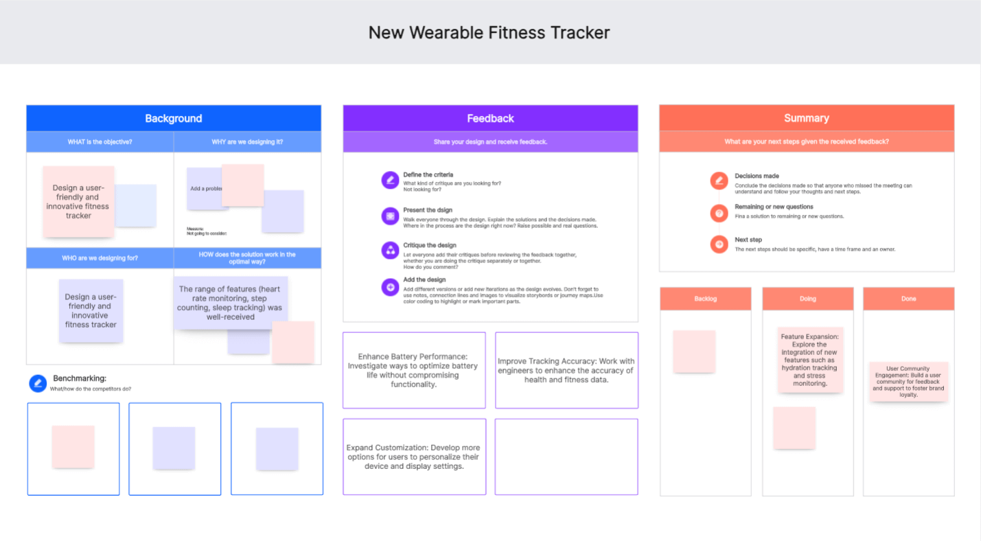
- Project Name: New Wearable Fitness Tracker
- Objective: Design a user-friendly and innovative fitness tracker
- Stakeholders: Product designers, engineers, marketing team, and end-users
Positive Feedback:
- Ergonomic Design: The fitness tracker’s design was praised for its comfort and ease of wear.
- Functionality: The range of features (heart rate monitoring, step counting, sleep tracking) was well-received.
- User Interface: The interface on the tracker and the accompanying app was intuitive and easy to navigate.
Constructive Criticism:
- Battery Life: Users reported that the battery life was shorter than expected.
- Data Accuracy: There were concerns about the accuracy of certain tracking features.
- Customization Options: Limited options for personalizing the device and its display settings.
Action Items:
- Enhance Battery Performance: Investigate ways to optimize battery life without compromising functionality.
- Improve Tracking Accuracy: Work with engineers to enhance the accuracy of health and fitness data.
- Expand Customization: Develop more options for users to personalize their device and display settings.
Future Considerations:
- Feature Expansion: Explore the integration of new features such as hydration tracking and stress monitoring.
- Regular Firmware Updates: Provide regular updates to improve functionality and user experience.
- User Community Engagement: Build a user community for feedback and support to foster brand loyalty.
3. Design Critique for Marketing Teams
Build Design Critique for Free
Project Overview:
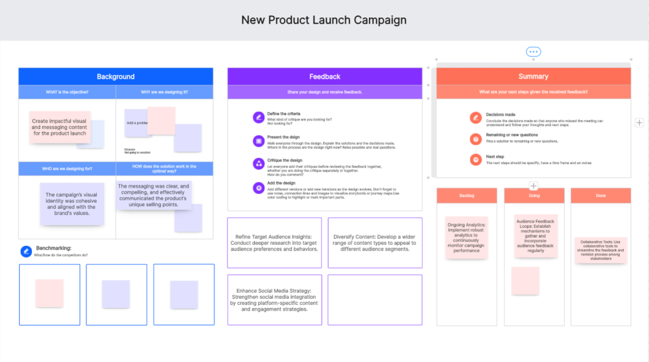
- Project Name: New Product Launch Campaign
- Objective: Create impactful visual and messaging content for the product launch
- Stakeholders: Marketing team, creative team, product managers, and external partners
Positive Feedback:
- Strong Visual Identity: The campaign’s visual identity was cohesive and aligned with the brand's values.
- Engaging Content: Content pieces were engaging and successfully captured the audience’s attention.
- Effective Messaging: The messaging was clear, and compelling, and effectively communicated the product’s unique selling points.
Constructive Criticism:
- Target Audience Focus: Some elements did not fully address the needs and preferences of the target audience.
- Content Variety: Limited variety in content types (e.g., videos, infographics) which could enhance engagement.
- Social Media Integration: Integration with social media platforms could be improved for better reach and interaction.
Action Items:
- Refine Target Audience Insights: Conduct deeper research into target audience preferences and behaviors.
- Diversify Content: Develop a wider range of content types to appeal to different audience segments.
- Enhance Social Media Strategy: Strengthen social media integration by creating platform-specific content and engagement strategies.
Future Considerations:
- Ongoing Analytics: Implement robust analytics to continuously monitor campaign performance.
- Audience Feedback Loops: Establish mechanisms to gather and incorporate audience feedback regularly.
- Collaborative Tools: Use collaborative tools to streamline the feedback and revision process among stakeholders.
How to use a design critique template in Boardmix?
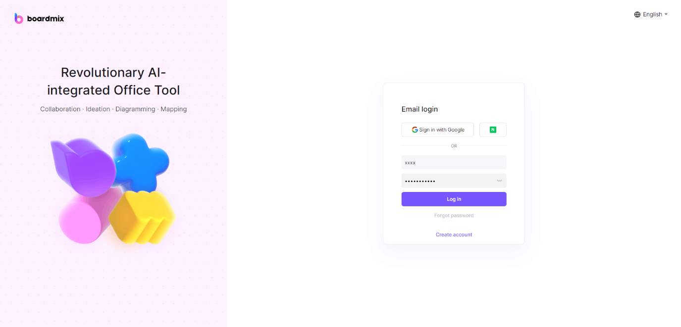
1. Open Boardmix and log in to your account.
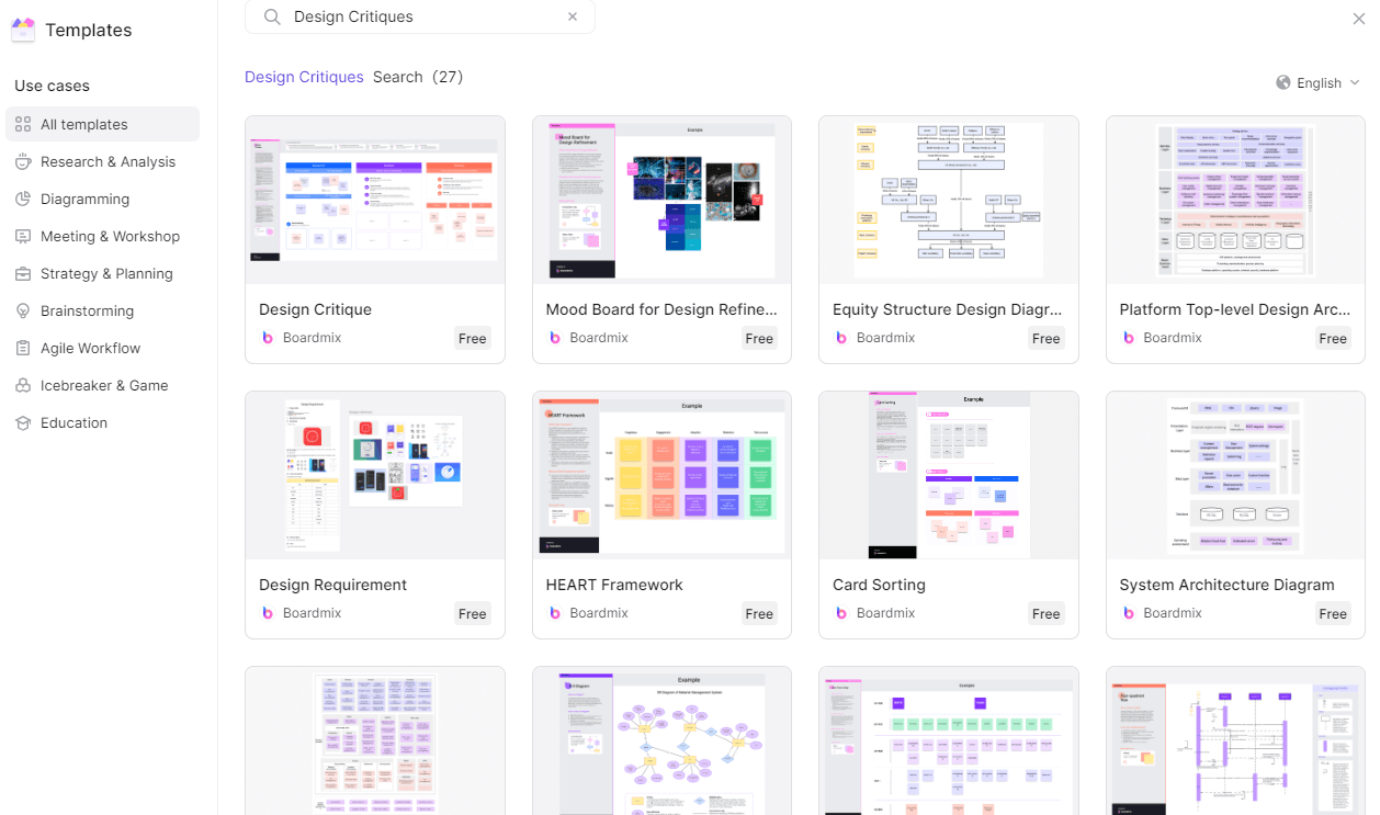
2. Create a new board or search for design critique in the Template library.
3. On the board, click on the "Shapes" icon located on the left-hand side toolbar.
4. Select the desired shape from the shapes menu.
5. Draw the shape on the board to represent the design critique example template.
6. Next, click on the "Text" icon located on the left-hand side toolbar.
7. Click inside the shape and add labels for each section of the design critique example template, such as "Design Elements," "Usability," "Visual Appeal," "Functionality," etc.
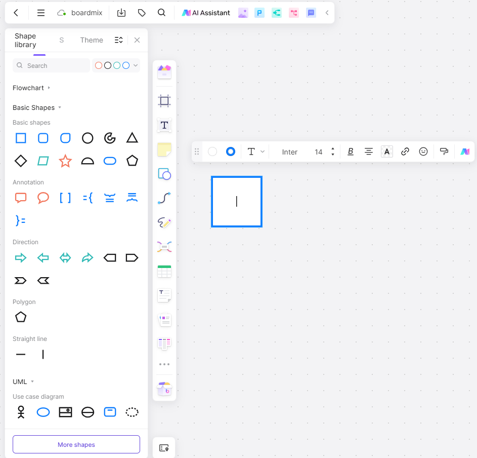
8. Now, you can start adding sticky notes or text boxes to each section of the template. Click on the "Sticky Note" or "Text Box" icon located on the left-hand side toolbar.
9. Click inside each section of the template and add relevant information, comments, or suggestions for design improvements.
10. Repeat this process for each section of the design critique example template until you have captured all the necessary details.
11. You can also customize the colors and styles of the sticky notes or text boxes to make your design critique example template visually appealing and easy to navigate. To do this, click on a sticky note or text box and select the desired options from the toolbar that appears.
12. Once you have completed your design critique example template, you can save it by clicking on the "Save" button located at the top right corner of the board.
That's it! You have successfully created a design critique example template in Boardmix. Now you can use it to provide feedback and suggestions on design projects, collaborate with team members, and improve the overall design process.
Design Critique FAQs
What is the difference between a design review and a design critique?
A design critique involves meetings and discussions to collect feedback and input about an idea or design. This usually involves specific aspects of the design. Meanwhile, a design review focuses on the overall evaluation of a concept and tends to dive deeper into the creative process, usability, and project goals.
What is the purpose of design critiques?
Designers and companies use design critique to collect essential feedback from professionals and improve their final design. One must create the best solutions for their target markets in competitive industries. Along the way, designers will also learn from their peers about the best practices in design so they can apply them in their future projects.


