



Every polished Figma prototype started somewhere messier — a rough sketch, a handful of boxes and arrows, an idea nobody was sure would work yet. That messy middle stage is where online whiteboards have quietly become essential to the UX process. Not as a replacement for high-fidelity design tools, but as the fast, low-pressure space where ideas get tested before they're worth the time investment of pixel-perfect design.
This guide walks through how UX designers actually use online whiteboards across the early stages of the design process — from structuring user flows to running quick usability checks — and how to know when it's time to move from the whiteboard into a dedicated prototyping tool.
Why Whiteboards Matter Before You Open a Design Tool
There's a reason experienced designers resist jumping straight into Figma when a project starts. High-fidelity tools are built for precision — pixel alignment, component libraries, design systems — which is exactly the wrong mindset for the earliest stage of a design problem, when the goal is to explore many directions quickly and stay open to throwing most of them away.
An online whiteboard solves a different problem: it gives designers (and the teammates they're collaborating with) a low-fidelity, low-commitment space to think visually. A few concrete advantages this stage benefits from:
- Speed over polish. Boxes and arrows can be rearranged in seconds, without worrying about spacing, alignment, or component consistency.
- Lower barrier to collaboration. Product managers, engineers, and stakeholders who don't use Figma daily can still meaningfully contribute on a whiteboard.
- Structural focus. Low-fidelity wireframes keep conversations centered on flow and hierarchy, rather than getting derailed by color or font debates too early.
- Cheap to test and discard. A rough flow that doesn't work costs a few minutes to redo — a high-fidelity prototype that doesn't work costs a lot more.
In short: whiteboards are where UX designers explore; dedicated prototyping tools are where they refine. Understanding that division is the key to using both efficiently rather than treating them as competing tools.
Stage 1: Mapping User Flows Before Any Screens Exist
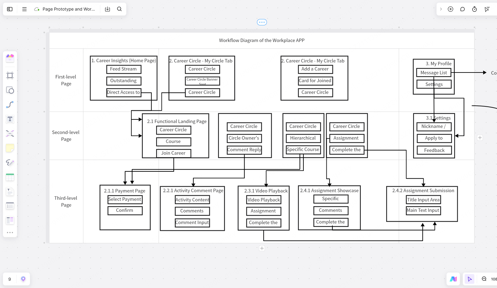
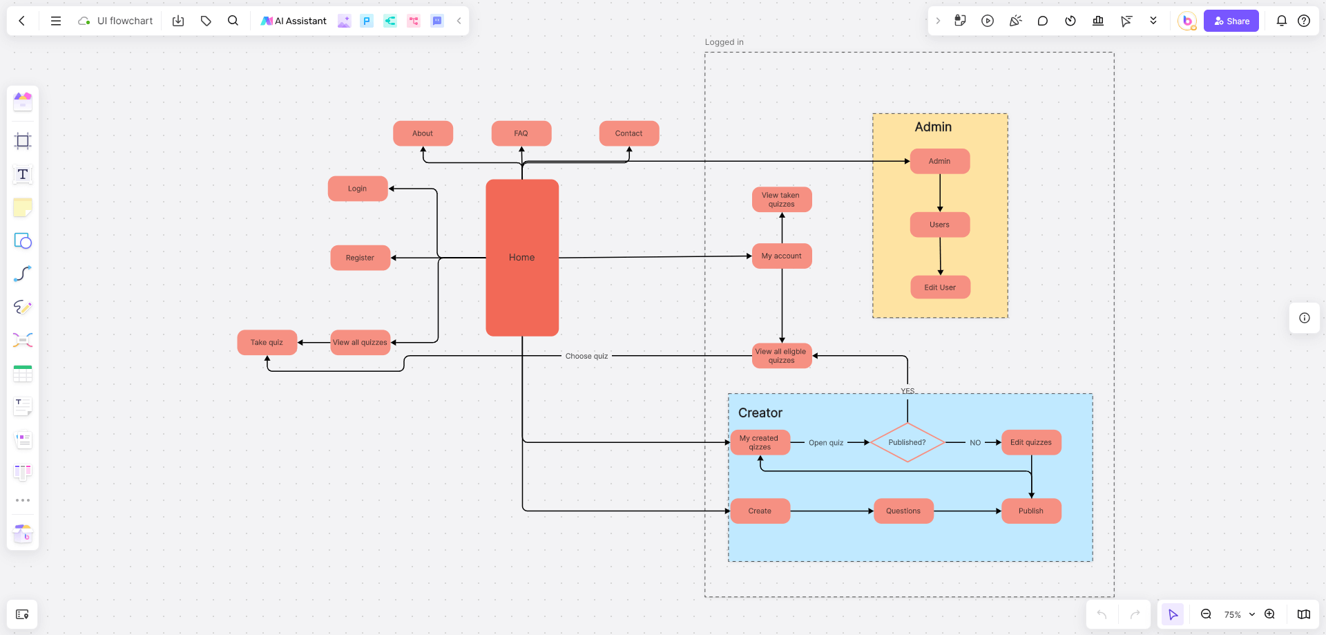
Before drawing a single wireframe, most designers need to understand the path a user will actually take — what screens exist, what decisions branch the flow, and where it can go wrong. This is usually the very first thing that goes on the whiteboard.
What this looks like in practice: Simple boxes represent screens or states, connected by arrows representing user actions (tap, submit, swipe). Decision points — like a login attempt succeeding or failing — get represented as branches. The goal isn't visual accuracy; it's making sure every path a user could take has been accounted for, including edge cases like errors, empty states, and cancellations.
Why this matters: Skipping this step is one of the most common reasons high-fidelity prototypes need major rework later — a flow gap that would have taken thirty seconds to spot as boxes and arrows can take hours to fix once it's built out as actual screens.
Tooling tip: A flowchart-friendly whiteboard with smart connectors (lines that stay attached as you move boxes around) saves significant time here, since flows get rearranged constantly during this exploratory stage.
Stage 2: Low-Fidelity Wireframing
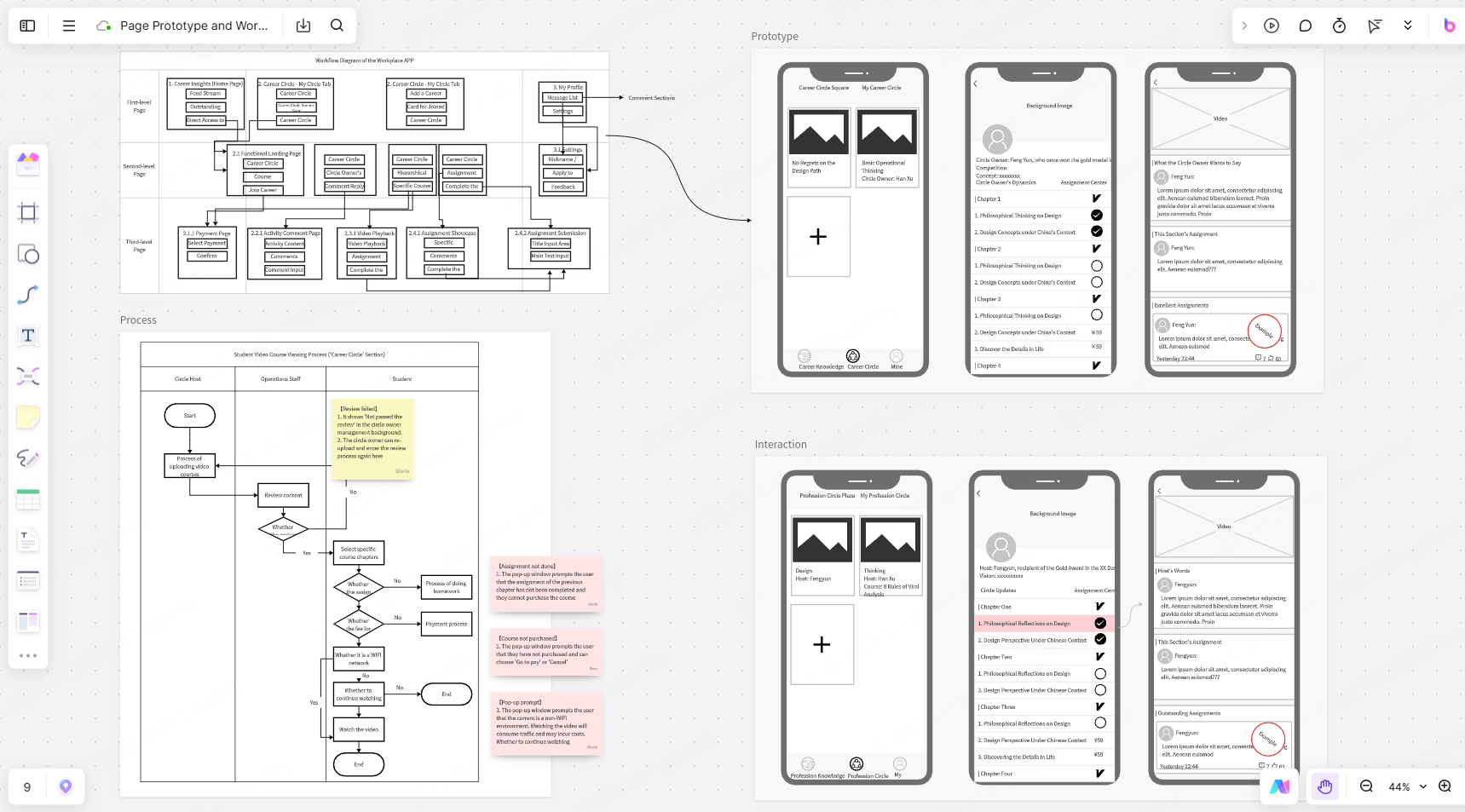
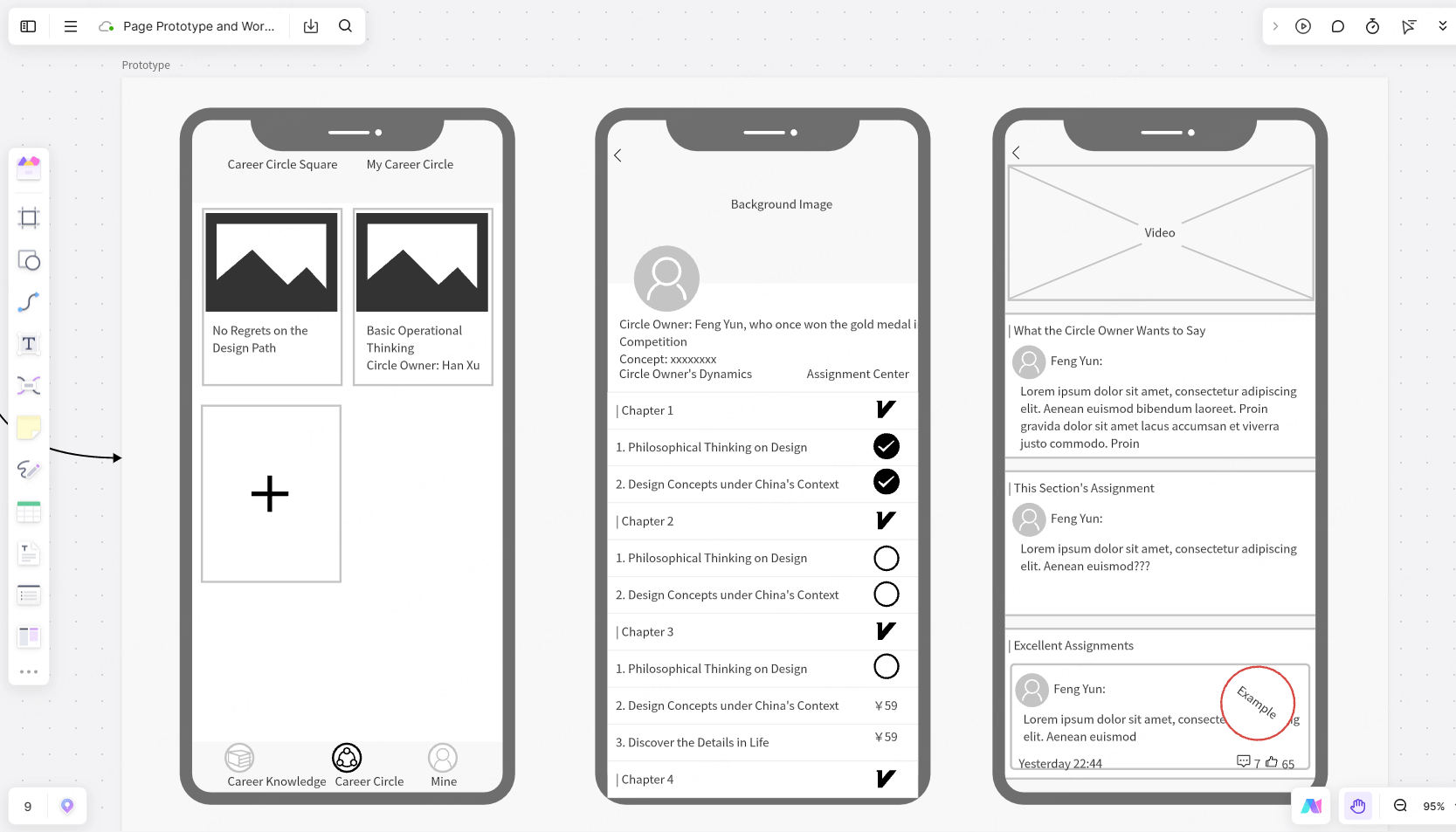
Once the flow is roughly settled, designers start sketching what each screen actually contains — but still at a rough, low-fidelity level. Think gray boxes, placeholder text, and simple shapes rather than real content or styling.
What this looks like in practice: A header bar represented as a simple rectangle, navigation as a row of boxes, content areas as blocks with an "X" through them or placeholder labels like "hero image" or "CTA button." The intentional roughness is a feature, not a shortcut — it keeps early feedback focused on layout and hierarchy instead of visual details that aren't decided yet.
Why designers do this on a whiteboard rather than in Figma: Working at low fidelity on an infinite canvas makes it trivial to sketch five different layout directions side by side and compare them directly — something that's slower to do in a tool built around precise components and design systems. It also means non-designers on the team can annotate or suggest changes directly on the board without needing design tool access.
Tooling tip: Basic wireframe shape libraries (buttons, input fields, navigation bars, placeholder images) speed this stage up considerably compared to drawing every element by hand. Some AI-assisted whiteboard tools, including Boardmix, can also generate a rough wireframe layout from a short text description — useful for quickly getting a starting structure onto the canvas before refining it manually.
Stage 3: Rapid Ideation and Divergent Thinking
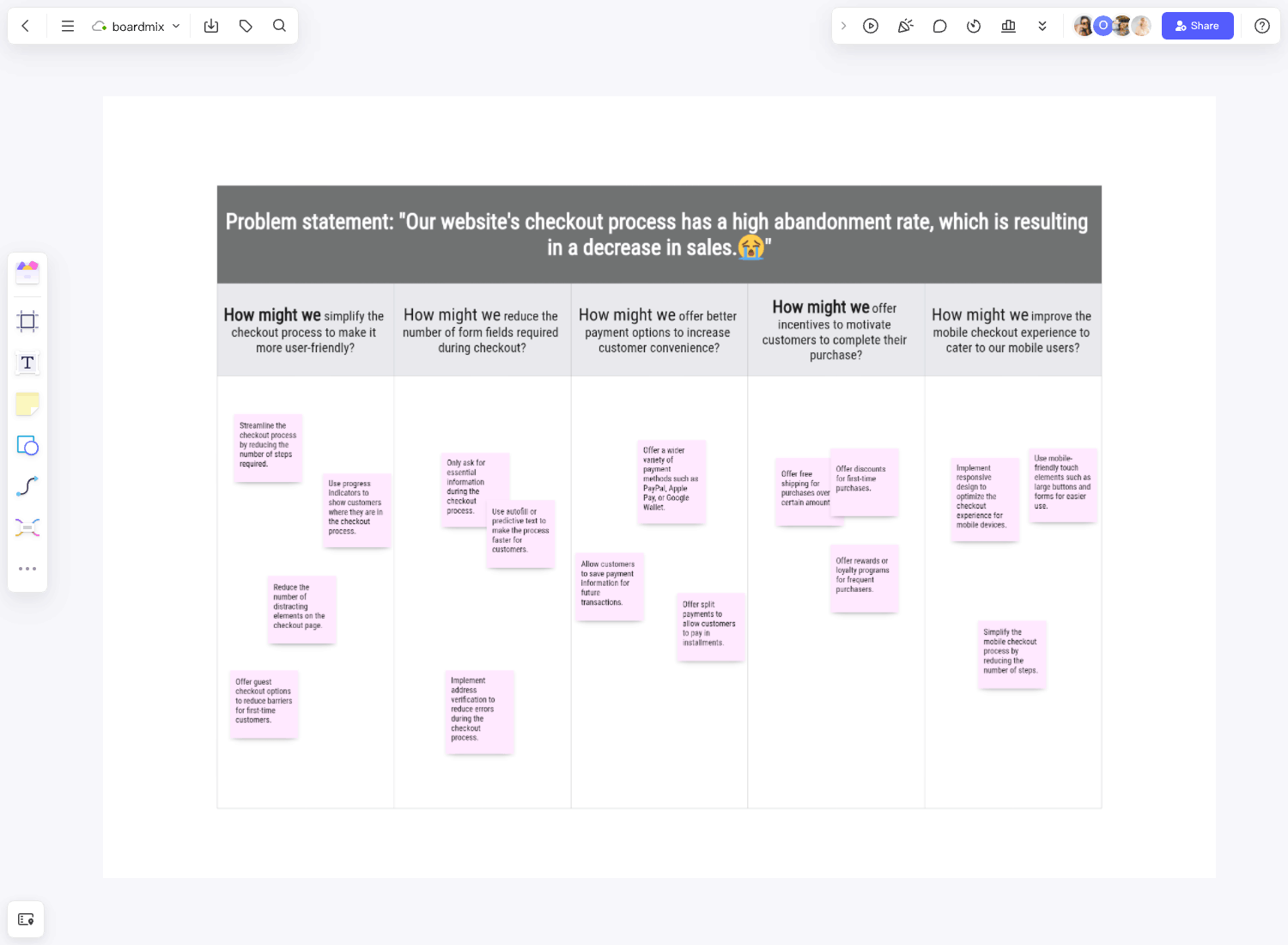
Good UX work usually involves generating more ideas than you need, then narrowing down — a process often called divergent and convergent thinking. Whiteboards are particularly well suited to the divergent phase, where the goal is volume and variety, not correctness.
Common exercises run directly on a whiteboard:
- Crazy 8s — rapidly sketching eight variations of a screen or concept in a short, timed session, then discussing which elements are worth combining.
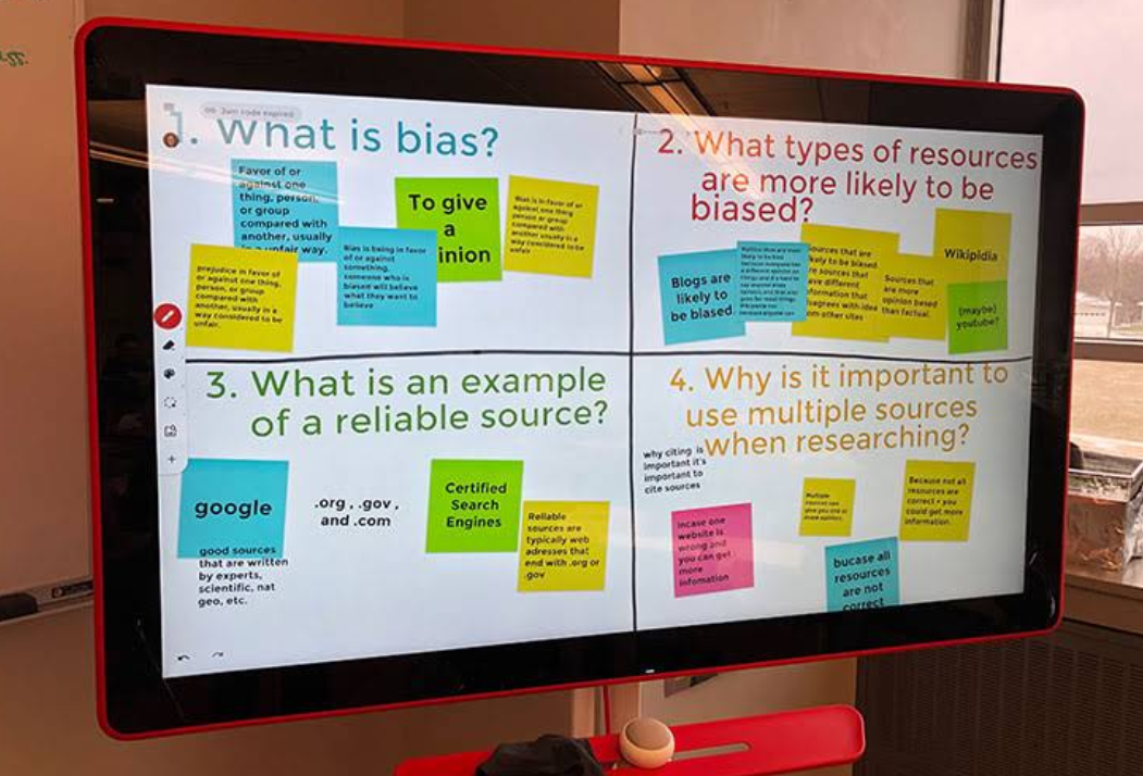
- "How Might We" brainstorms — turning research insights into open-ended design questions, clustered by theme.
- Design studio sessions — multiple designers (or cross-functional teammates) independently sketch solutions to the same problem, then present and critique as a group.
Why this works better as a group activity on a shared canvas: Seeing everyone's rough sketches side by side — rather than one at a time in separate files — makes it much easier to spot patterns, borrow strong ideas from weaker overall concepts, and reach a converged direction faster.
Tooling tip: Built-in timers are genuinely useful for these exercises, since time pressure is often what keeps sketches loose and prevents perfectionism from creeping in too early.
Stage 4: Testing Ideas Before They're Fully Built
One of the most underused whiteboard capabilities is early-stage testing — getting reactions to a concept before investing in a clickable prototype. This isn't a replacement for formal usability testing with real prototypes, but a cheap way to catch obvious problems early.
A few lightweight ways designers do this on a whiteboard:
- Walkthrough narration: Presenting the rough flow to a stakeholder or teammate and narrating what a user would do at each step, watching for places where the logic doesn't hold up or a step feels confusing even in concept form.
- Dot voting on concepts: When multiple layout directions exist side by side, quick voting can surface a team's collective intuition before committing design time to just one.
- Annotated critique sessions: Teammates leave comments or sticky notes directly on specific parts of a wireframe, making feedback specific and easy to trace back to the exact element it refers to.
- Guerrilla-style reactions: Some teams share a rough wireframe board with a handful of real users or colleagues outside the project and ask for first impressions — not a full usability test, but often enough to catch confusing labeling or an unclear primary action.
The point of this stage is catching structural or logical problems while they're still cheap to fix — well before a flow gets built into a high-fidelity, interactive prototype.
Stage 5: Knowing When to Move to a Dedicated Prototyping Tool
Whiteboards are not meant to replace tools like Figma, Axure, or other high-fidelity prototyping platforms — they're meant to make sure the time spent in those tools is well spent. A few signals that it's time to move on from the whiteboard:
- The core user flow has stayed stable through a couple of rounds of feedback, rather than shifting significantly each time.
- The team needs to test actual interactions (taps, transitions, animations) rather than just layout and flow logic.
- Stakeholders need to see something that looks close to the final visual design for buy-in or approval.
- The next step involves usability testing with real users, which typically requires an interactive, clickable prototype rather than a static wireframe.
Many design tools now support importing images or exporting wireframes that can be traced into higher-fidelity software, which makes the whiteboard-to-prototype handoff smoother than it used to be — though most designers still rebuild screens natively in their design tool rather than importing wireframes directly, since native components and design systems tend to produce cleaner results.
Online Whiteboard for Designers's Rapid UX Work
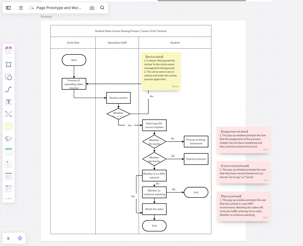
Not every online whiteboard is equally suited to this kind of design work. A few things worth prioritizing if UX prototyping is a core use case for your team:
- Wireframe and flowchart shape libraries — pre-built UI elements and smart connectors save significant manual drawing time.
- Freehand sketching alongside structured shapes — the best sessions often mix rough hand-drawn annotations with cleaner wireframe blocks on the same canvas.
- Fast, low-friction collaboration — since this stage often includes non-designers, the tool needs to be usable without training.
- AI-assisted layout generation — increasingly useful for quickly producing a starting wireframe from a text prompt, especially under time pressure.
- Commenting and annotation — critique and feedback need to be attachable to specific elements, not just left as general notes.
- Easy export or handoff — the ability to export a wireframe as an image or shareable link makes it easier to reference once the team moves into a dedicated design tool.
Boardmix supports this workflow directly, with wireframe shape libraries, flowchart connectors, and freehand sketching available on the same infinite canvas — so a designer can move fluidly between mapping a user flow, sketching rough screens, and annotating feedback without switching tools. Its AI features can also generate a starting wireframe layout from a short text description, which is useful for quickly getting ideas onto the canvas during a fast-moving ideation session.
A Sample Rapid Prototyping Workflow on a Whiteboard
- Map the flow: Rough boxes and arrows outlining every screen and decision point a user could encounter.
- Sketch low-fidelity wireframes: Placeholder layouts for each key screen, focused on hierarchy rather than visual polish.
- Run a divergent ideation exercise: Generate multiple layout directions quickly, using a timed sketching exercise if working in a group.
- Walk through the flow with a teammate or stakeholder: Narrate the experience step by step, noting confusing points or logic gaps.
- Iterate directly on the board: Adjust flow, layout, or content based on feedback — cheap to change at this stage.
- Move to a dedicated prototyping tool: Once the flow and rough layout have stabilized, rebuild the validated structure at high fidelity for interactive testing.
Frequently Asked Questions
Can I do all my UX design work on a whiteboard tool?
Whiteboards are best suited for the early, exploratory stages of design — flow mapping, low-fidelity wireframing, and ideation. For interactive, high-fidelity prototypes and formal usability testing, a dedicated design tool like Figma is generally still necessary, since whiteboards typically don't support clickable, production-accurate interactions.
What's the difference between wireframing on a whiteboard versus in Figma?
Wireframing on a whiteboard is faster and intentionally rougher, which keeps early feedback focused on structure and flow rather than visual details. Figma wireframes are typically more precise and easier to evolve directly into a high-fidelity design, but take longer to iterate on when big structural changes are still likely.
How do I run a Crazy 8s exercise on an online whiteboard?
Set a timer (commonly 8 minutes for 8 sketches, though teams adjust this), have each participant sketch quick variations of a screen or concept in a designated area of the board, then bring everyone together to review and discuss the results as a group.
Do non-designers need training to contribute to a whiteboard prototyping session?
Generally no — this is one of the main advantages of low-fidelity whiteboarding. Simple shapes, sticky notes, and freehand drawing tools have a low enough barrier that product managers, engineers, and stakeholders can meaningfully contribute without design tool experience.
Is AI-generated wireframing accurate enough to use directly?
AI-generated wireframes are best treated as a fast starting point rather than a final layout — useful for quickly getting a rough structure onto the canvas, which a designer then refines based on the specific context and constraints of the project.
Final Thoughts
The best UX work rarely starts with a polished screen — it starts with a rough flow, a handful of boxes, and a willingness to throw most of the first ideas away. Online whiteboards give designers a space built for exactly that kind of fast, low-stakes exploration, before the real time investment of high-fidelity design and interactive prototyping begins.
If your team's early-stage UX process is still happening in scattered sketches or directly inside a high-fidelity design tool, moving that work to a dedicated whiteboard stage is one of the simpler process changes that tends to pay off quickly. Try Boardmix's wireframe and flowchart tools to map your next user flow, sketch low-fidelity screens, and gather feedback before moving into detailed design.