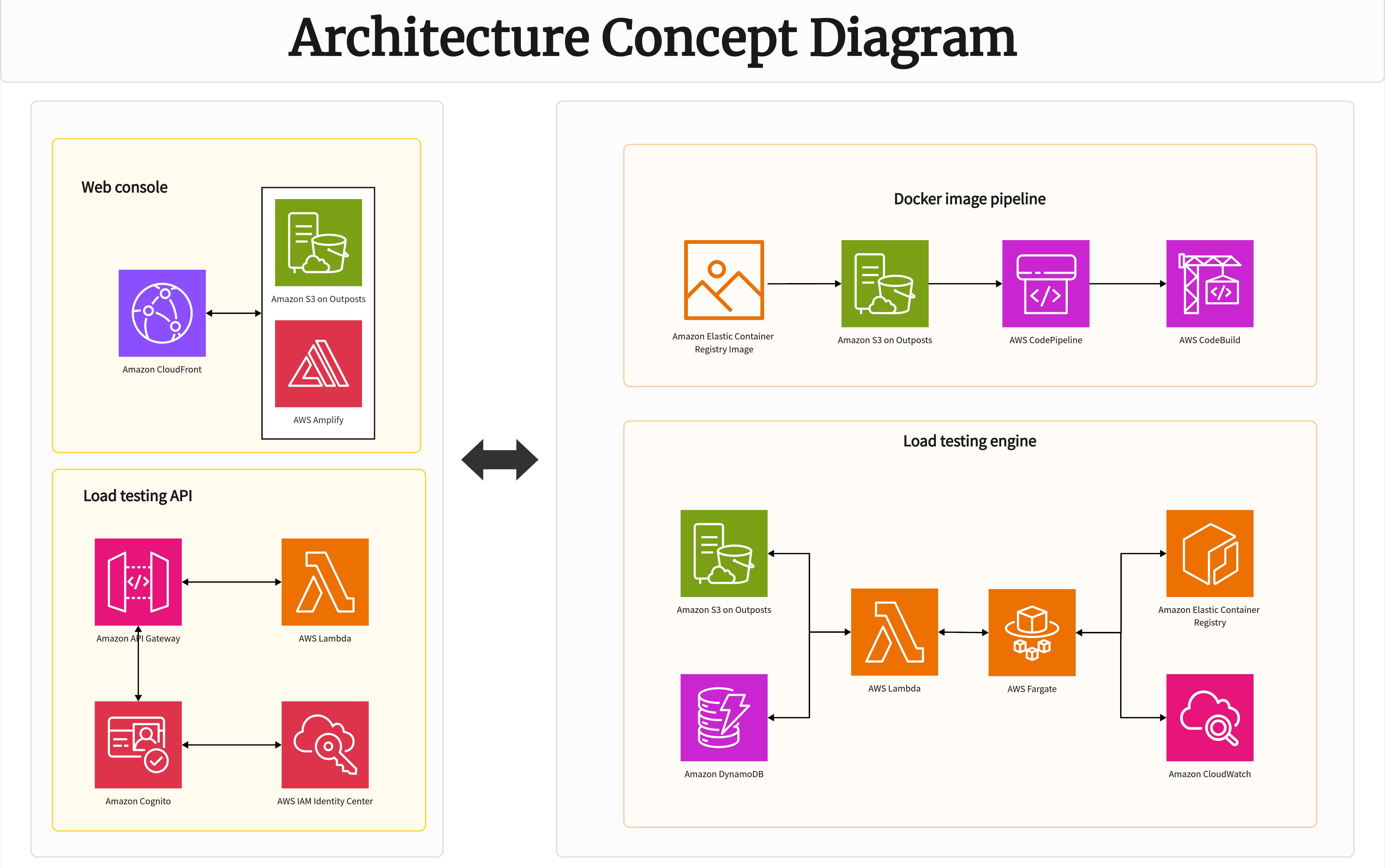




Every engineer has opened a "system architecture" diagram at some point and immediately regretted it — a tangle of boxes and crossing lines that technically contains all the right information, but tells you nothing at a glance. System diagramming is one of those skills that looks simple until you try to represent something genuinely complex: a distributed microservices architecture, a multi-team data pipeline, or an infrastructure layout with dozens of interdependent components.
Online whiteboards have become a popular home for this kind of work, largely because an infinite canvas and flexible connectors handle complexity better than rigid, page-bound diagramming software. But space alone doesn't guarantee clarity — a complex system diagrammed poorly is still unreadable, just with more room to be unreadable in. This guide covers practical approaches to diagramming complex systems on a whiteboard, common pitfalls, and how to keep a large diagram legible as it grows.
Why System Diagrams Get Complicated Fast
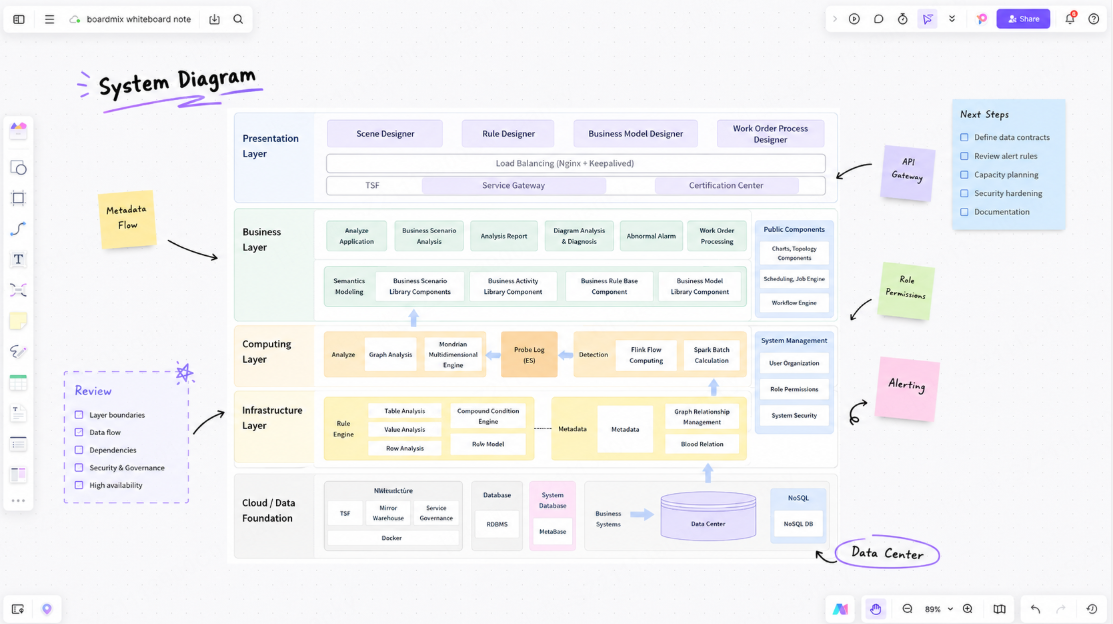
Real systems rarely stay simple for long. A service that started as three components talking to each other tends to grow into a dozen services, several databases, a message queue, a handful of external APIs, and multiple environments (dev, staging, production) — each with its own topology. A diagram that made sense at three components often becomes unreadable at fifteen, not because the tool failed, but because the diagramming approach didn't scale with the system.
A few reasons complexity spirals out of control on a diagram:
- Everything lives at one zoom level. Cramming an entire system — from high-level architecture down to individual API calls — into a single flat diagram forces incompatible levels of detail onto the same canvas.
- Connectors cross constantly. As more components get added without a clear layout strategy, connecting lines start overlapping, making it hard to trace which line belongs to which relationship.
- No visual hierarchy. Without deliberate grouping or color-coding, every component looks equally important, even though some are core infrastructure and others are minor supporting services.
- Diagrams go stale. Systems change faster than documentation gets updated, and an outdated diagram can be more dangerous than no diagram, since it actively misleads whoever relies on it.
Principle 1: Diagram in Layers, Not One Flat View
The single most effective technique for managing complexity is separating a system into layers of detail, rather than trying to represent everything on one diagram. This mirrors how architects and engineers actually think about systems — starting broad, then zooming into specific areas as needed.
A common layering approach:
- Layer 1 — Context diagram: The system as a single box, showing its relationship to external actors, users, and other systems. This answers "what does this system connect to?" without any internal detail.
- Layer 2 — Container/component diagram: The system broken into its major services, databases, and infrastructure pieces, showing how they interact. This is usually the most commonly referenced diagram for engineering discussions.
- Layer 3 — Detailed diagrams per component: Zoomed-in views of specific services — their internal modules, data flows, or sequence of operations — useful for engineers working directly on that piece.
On an infinite canvas, this layering can live on the same board as linked frames, letting someone start at the high-level context view and drill into a specific service's detail without needing to open a separate file. This is one of the clearest advantages an online whiteboard has over static diagramming tools that box each diagram into its own isolated page.
Principle 2: Group Related Components Visually
Once a diagram has more than a handful of components, grouping becomes essential for readability. Rather than scattering all services flatly across the canvas, cluster related components into visually distinct sections — by team ownership, by architectural layer (frontend, backend, data), or by deployment environment.
Practical grouping techniques:
- Use frames or bounding boxes to visually contain related services, making ownership and boundaries obvious at a glance.
- Color-code by category — for example, all data stores in one color, all external APIs in another — so the diagram communicates structure even before anyone reads a single label.
- Keep consistent spacing between groups, so the eye can distinguish "these are related" from "these just happen to be near each other."
Grouping does double duty: it makes the diagram easier to read, and it also tends to reveal structural issues in the system itself — an oddly placed dependency crossing between two otherwise unrelated groups is often worth a second look.
Principle 3: Minimize Crossing Connectors
Few things kill diagram readability faster than a web of crossing lines. While some crossing is inevitable in genuinely interconnected systems, deliberate layout choices can reduce it significantly:
- Arrange components in a logical flow direction (left to right, or top to bottom) that mirrors how data or requests actually move through the system, rather than placing boxes arbitrarily.
- Route connectors around groups, not through them, keeping related clusters visually intact rather than cutting connector lines straight through unrelated boxes.
- Use consistent connector styles — solid lines for synchronous calls, dashed lines for asynchronous or event-driven communication, for example — so relationship types are distinguishable without needing a label on every single line.
- Accept that some complexity can't be flattened. If a component genuinely has ten connections, no layout trick will make that look simple — in these cases, it's often better to pull that component into its own detailed sub-diagram rather than forcing it to stay legible at the top level.
Principle 4: Label for the Reader, Not Just the Author
A diagram that makes perfect sense to the person who built it often means very little to someone encountering it for the first time. Labeling with a future reader in mind — a new engineer, a stakeholder, or even the diagram's author six months later — makes a meaningful difference:
- Label connectors with what actually flows across them (a request type, a data format, an event name) rather than leaving unlabeled arrows that require guessing.
- Include a short legend explaining color codes, line styles, and any shorthand notation used across the diagram.
- Add a title and date to each major diagram, along with a brief note on what it represents and its intended audience (engineering-only detail vs. a stakeholder-friendly overview).
Principle 5: Keep Diagrams Alive, Not Static
A system diagram that's accurate on the day it's created and never touched again quietly becomes a liability. Systems evolve constantly — services get added, deprecated, or refactored — and a diagram that doesn't keep pace can actively mislead someone relying on it during an incident or onboarding process.
A few practices that help diagrams stay current:
- Assign clear ownership. A diagram with no owner tends to drift out of date quickly; assigning responsibility for keeping it accurate — even informally — makes updates far more likely to happen.
- Review during major changes. Treat significant architecture changes as a trigger to update the relevant diagram, the same way code changes trigger documentation updates in a healthy engineering culture.
- Keep the diagram accessible where people actually look. A diagram buried in an old file share rarely gets referenced or updated; linking it from onboarding docs or a team wiki keeps it visible and in active use.
Common System Diagram Types Worth Knowing
Different diagram types answer different questions about a system. Choosing the right one for the situation avoids trying to force a single diagram to do too much:
- Architecture diagrams — the overall structure of a system's components and how they connect, typically the default diagram type engineers reach for first.
- Data flow diagrams — how data moves through a system, from input sources through processing to storage or output, useful for understanding pipelines and ETL processes.
- Sequence diagrams — the order of interactions between components for a specific process, valuable for debugging distributed systems where timing and order matter.
- Network diagrams — the physical or virtual infrastructure layout, including servers, load balancers, and network boundaries.
- Dependency graphs — which components rely on which others, useful for understanding blast radius before a change or during incident response.
How Boardmix Supports Complex System Diagramming
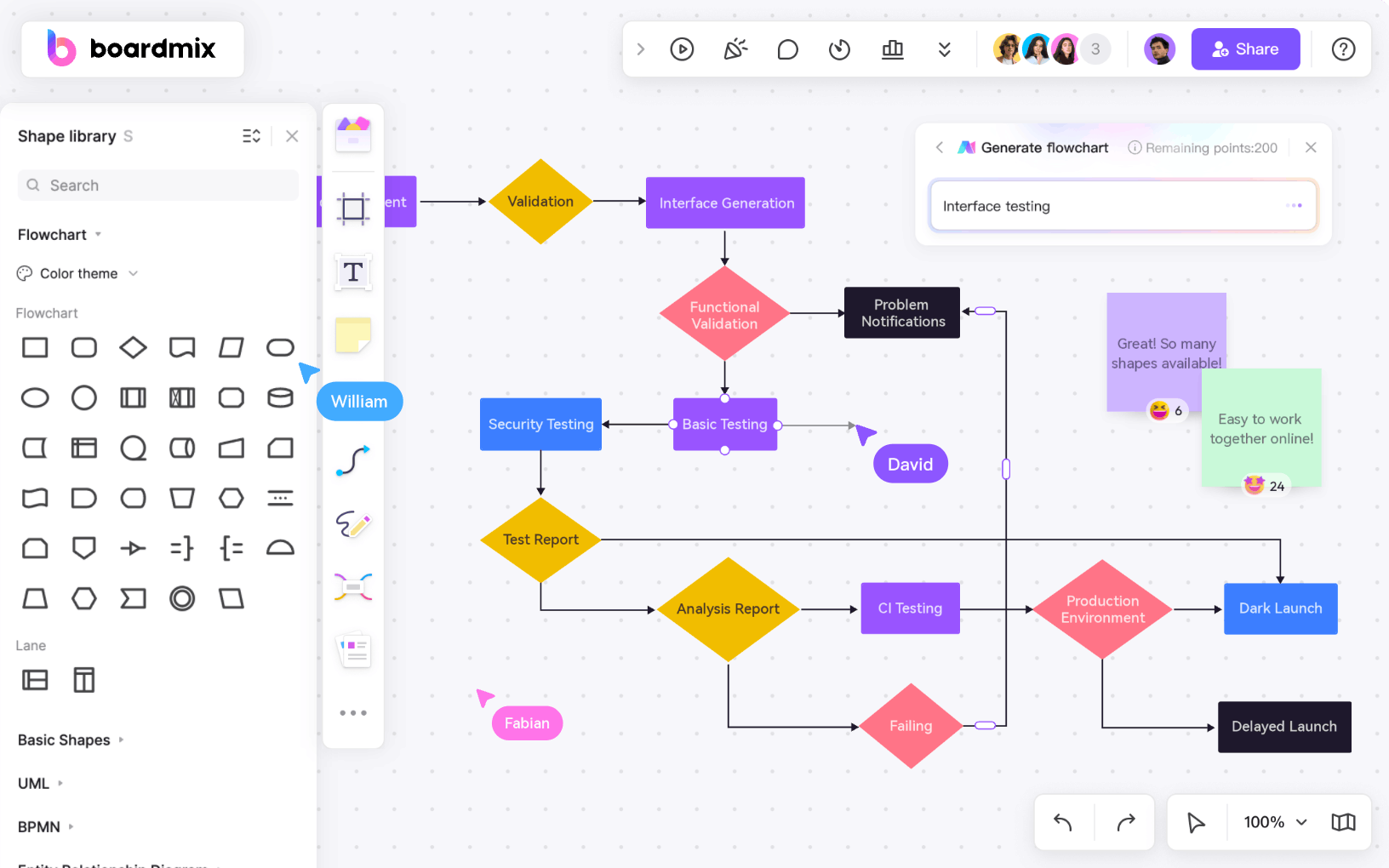
Boardmix combines an infinite canvas with structured diagramming tools specifically to handle this kind of layered complexity without forcing everything onto one flat, cluttered view:
- Frames for layered diagrams: High-level context diagrams and detailed component views can live as separate, named frames on the same board, letting viewers navigate from overview to detail without leaving the canvas or hunting through separate files.
- Smart connectors: Lines stay attached to components as they're moved or reorganized, making it much easier to refine a cluttered layout without manually redrawing every connection.
- Shape libraries for architecture and UML: Pre-built shapes for common system components, along with UML notation for class and sequence diagrams, reduce the manual work of building diagrams from scratch.
- Color-coding and grouping tools: Visual grouping and consistent color schemes are straightforward to apply and maintain across large diagrams, supporting the layering and grouping principles above.
- Real-time collaboration: Architecture reviews often involve multiple engineers weighing in simultaneously — Boardmix supports live co-editing, so a diagram can be refined together rather than passed around sequentially.
- AI-assisted diagram generation: Boardmix's AI can generate a starting diagram structure from a text description, useful for quickly sketching a rough architecture before refining the details with the team.
The underlying discipline — layering, grouping, minimizing crossing lines, labeling for the reader — matters more than any specific tool. But having a canvas that makes those techniques easy to apply, rather than fighting against them, is what separates a diagram that stays useful from one that gets abandoned the first time it grows past a dozen components.
Frequently Asked Questions
What's the best way to diagram a microservices architecture with dozens of services?
Layering is essential here — a single flat diagram with dozens of services will almost always be unreadable. Start with a high-level context diagram showing service groups or domains, then create separate detailed diagrams for each group that engineers can drill into as needed.
How often should system diagrams be updated?
As a general rule, diagrams should be revisited whenever a significant architectural change happens — a new service added, a major dependency removed, or a data flow rerouted. Teams that wait for a scheduled review cycle (quarterly, for example) often find the diagram has already drifted noticeably out of date by the time the review happens.
Should system diagrams be built by one person or the whole team?
Both approaches have value at different stages. An initial draft is often faster to produce with one person taking a first pass, but reviewing and refining it as a group — particularly for architecture-level diagrams — tends to catch inaccuracies and surface disagreements about the system's actual structure that a single author might miss.
What's the difference between an architecture diagram and a sequence diagram?
An architecture diagram shows the static structure of a system — what components exist and how they're connected. A sequence diagram shows the dynamic behavior — the specific order of interactions between components during a particular process. Most complex systems benefit from having both available, since they answer different questions.
Final Thoughts
Diagramming a complex system well isn't about cramming as much detail as possible onto one canvas — it's about deciding what level of detail belongs where, and giving the reader a clear path through it. Layering, grouping, and thoughtful labeling turn an overwhelming tangle of boxes and lines into something a new engineer can actually learn from, and something the team can trust during an incident rather than second-guess.
Try Boardmix's diagramming tools to map your next system architecture, data flow, or service dependency graph, with layered frames and smart connectors that keep even a large diagram readable.